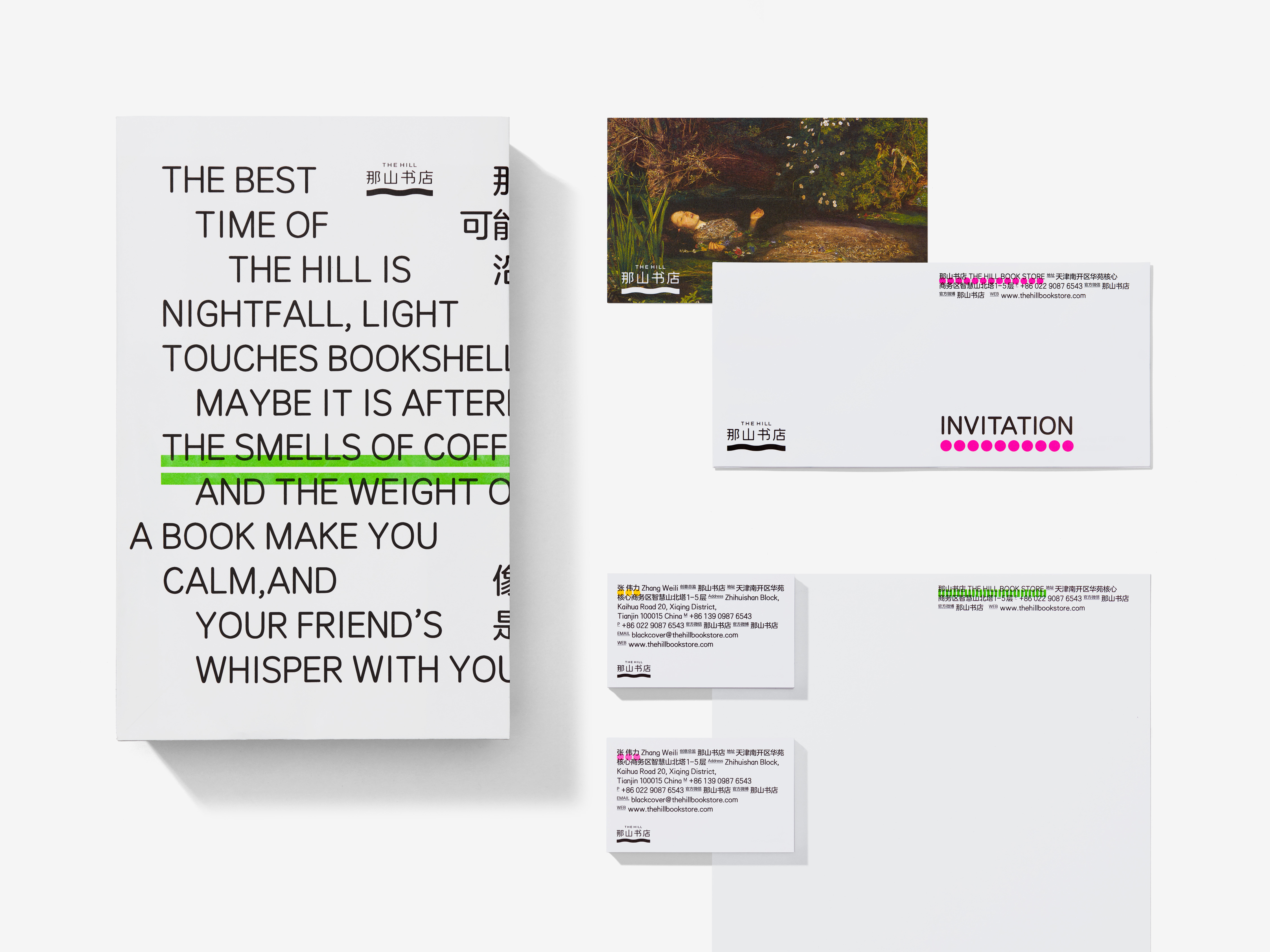
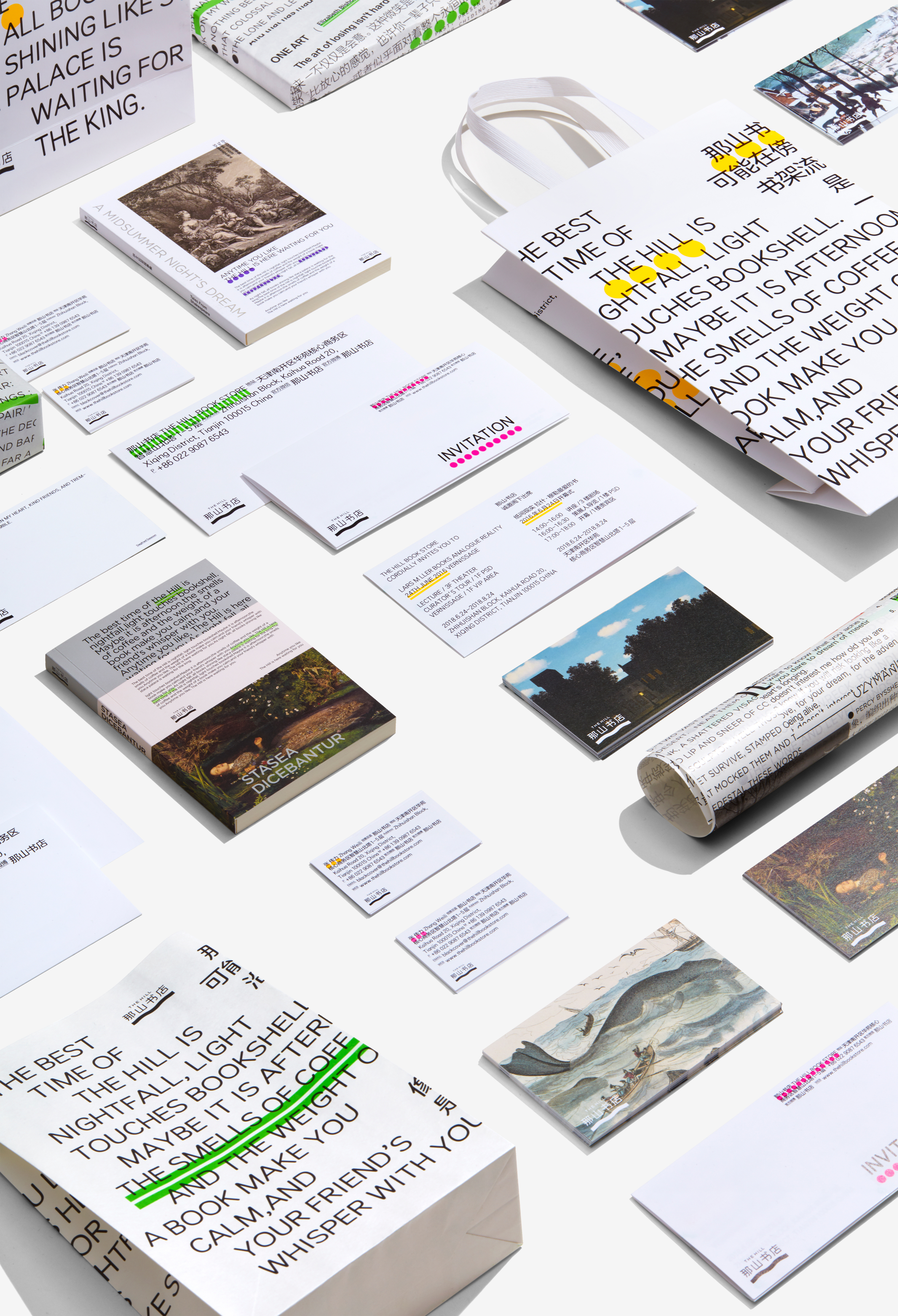
The Hill
Read Between the Lines
The bookstore is a cultural landmark in the city, centered around "reading" and offering a multidimensional space within today's commercial venues. When designing the bookstore's image, it's important to incorporate elements related to reading, while avoiding being limited to the property of "books." The goal of the design is to create a sense of "reading pleasure" that can seamlessly integrate into the commercial atmosphere.
Most bookstore designs focus on books, but I believe that reading is a way of life rather than just about books. As an avid reader, I enjoy highlighting and underlining passages as I read. These marks create a beautiful hill-like pattern, which inspired the name of the brand: The Hill. So, I designed the bookstore's brand with a highlighter mark to showcase its unique charm that will resonate with all book lovers.
ART DIRECTOR: Nod Young / Guang Yu
DESIGNER: Yan
YEAR: 2018
CLIENT: THE HILL