Z:SEA
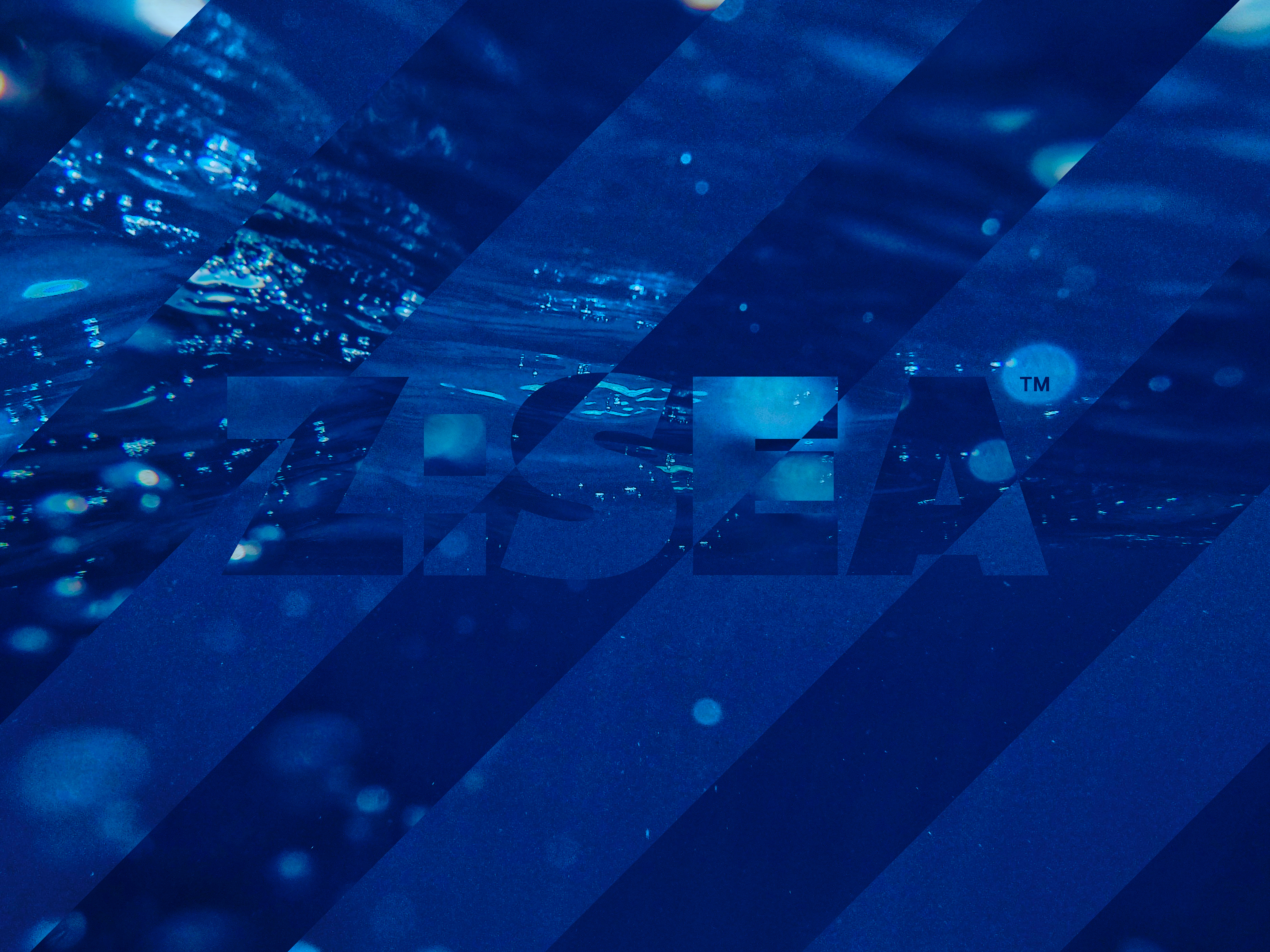
Sea: Dark Blue & Light Blue
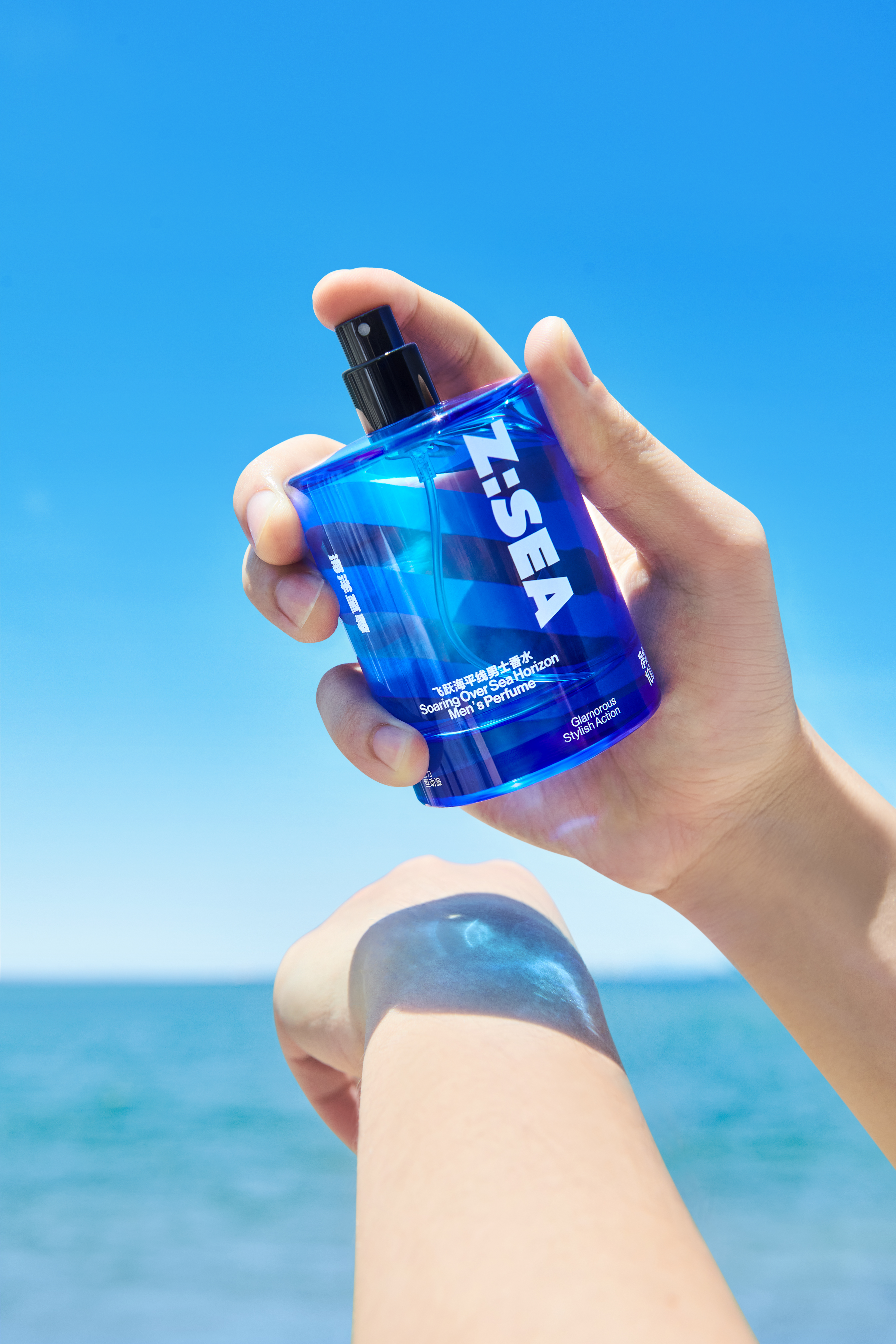
In the realm of skincare, men's needs mirror those of women - cleansing, moisturizing, hydrating, controlling oil, and tackling acne. Yet, men devote less time to their skincare routine, opting for clear and direct communication when selecting products. Recognizing these distinctive traits of male users, we embarked on the design journey of Z: Sea, firmly believing that the brand's vitality should be vividly expressed in a straightforward yet impactful manner.
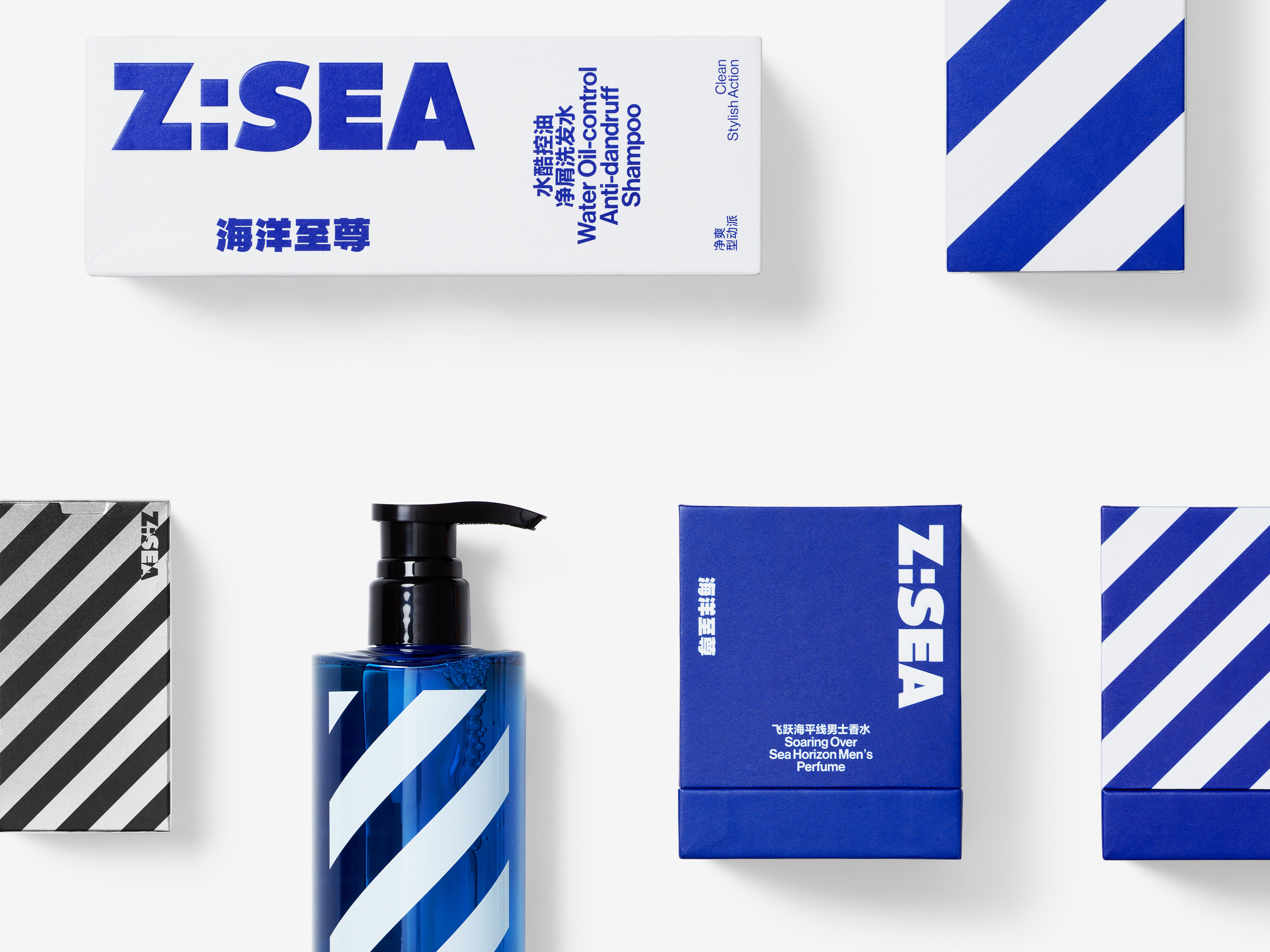
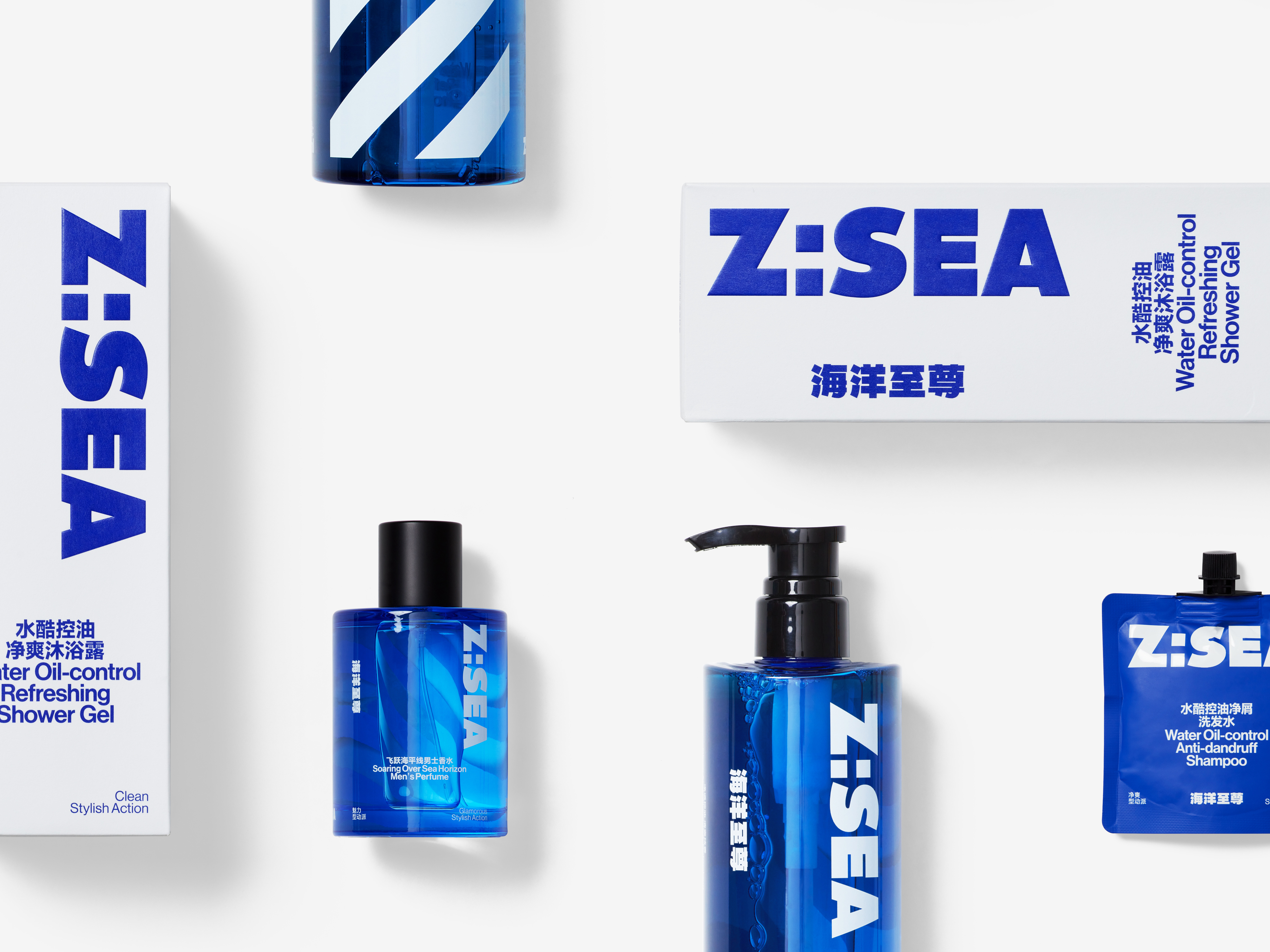
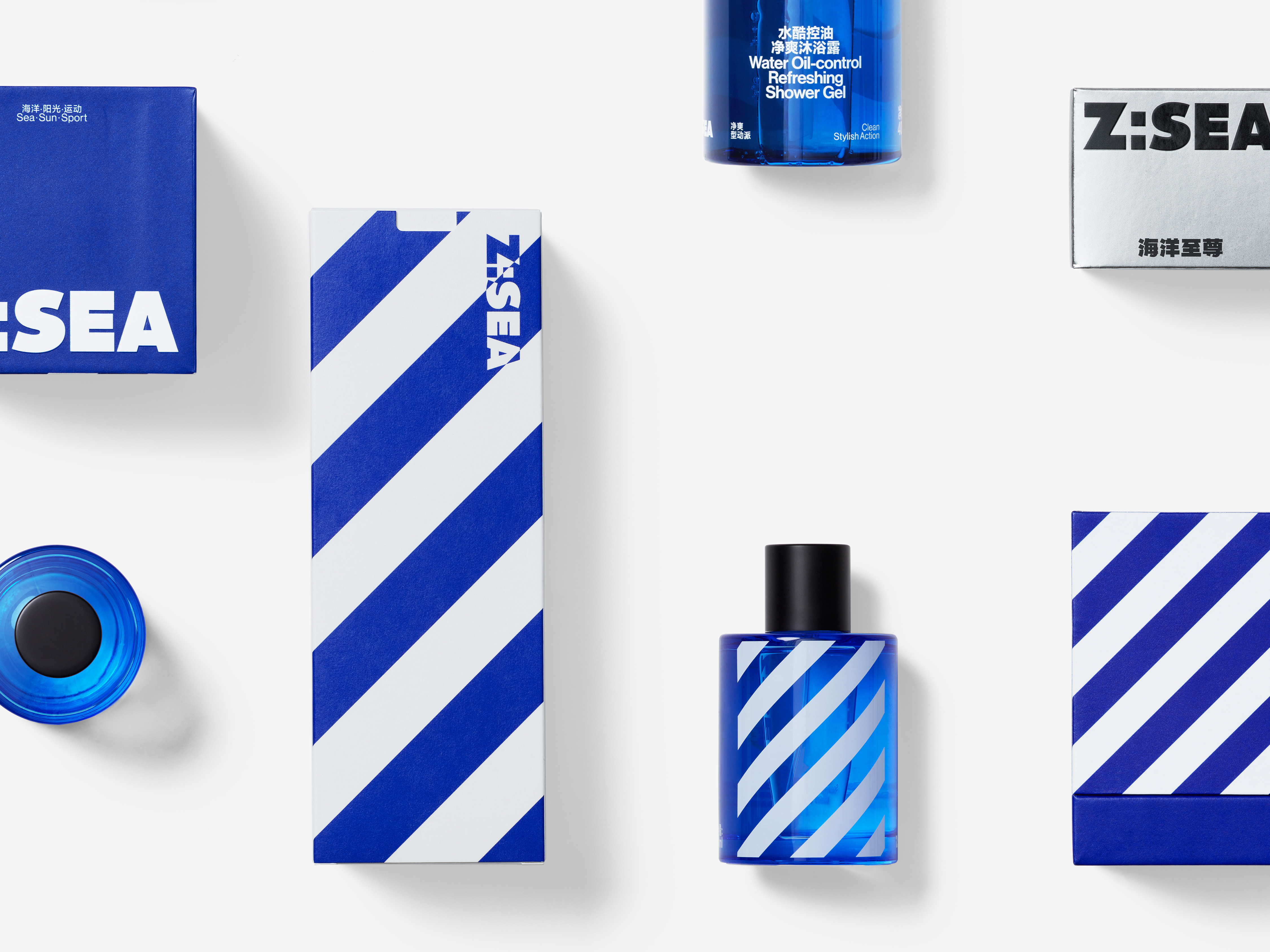
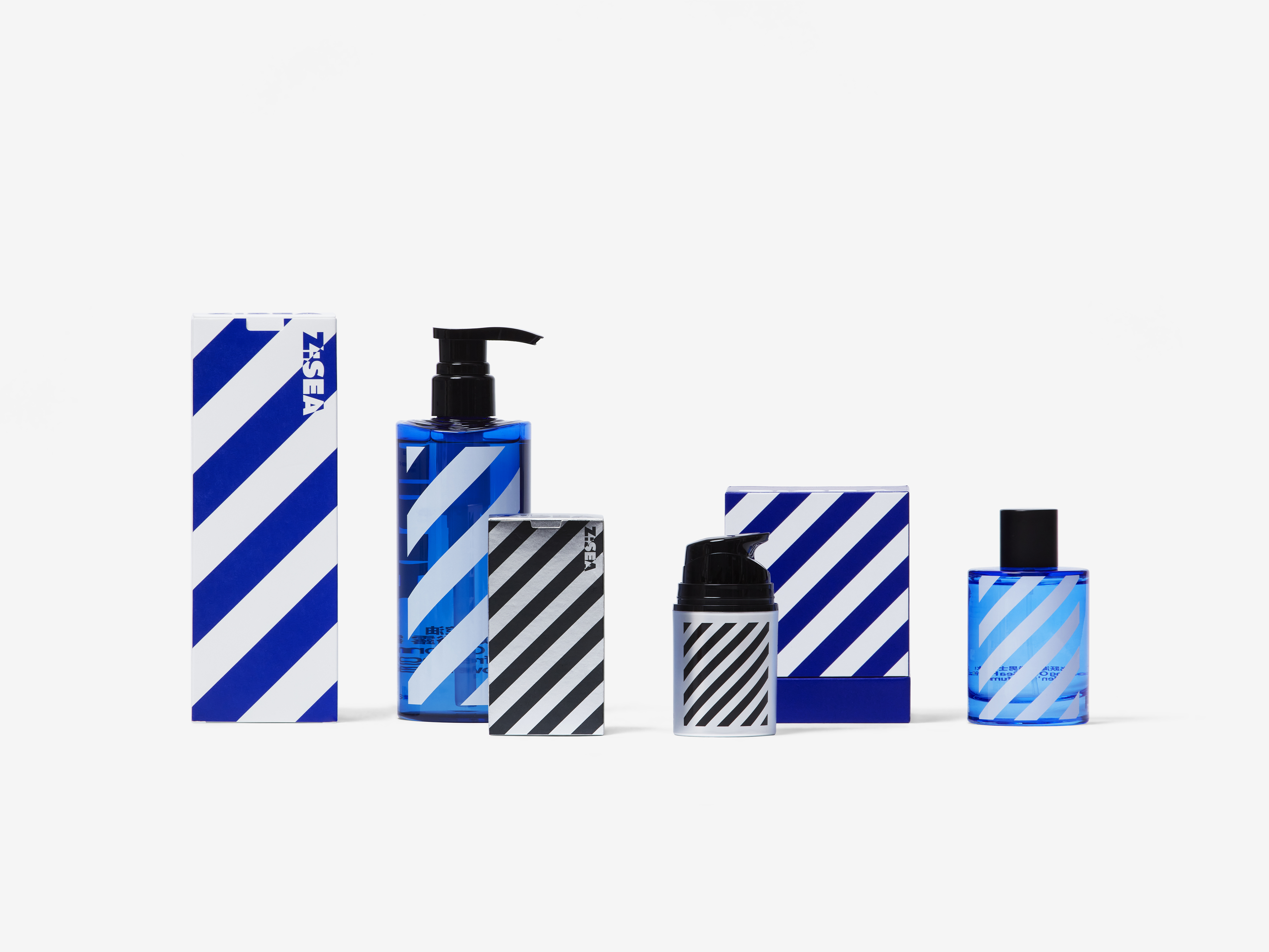
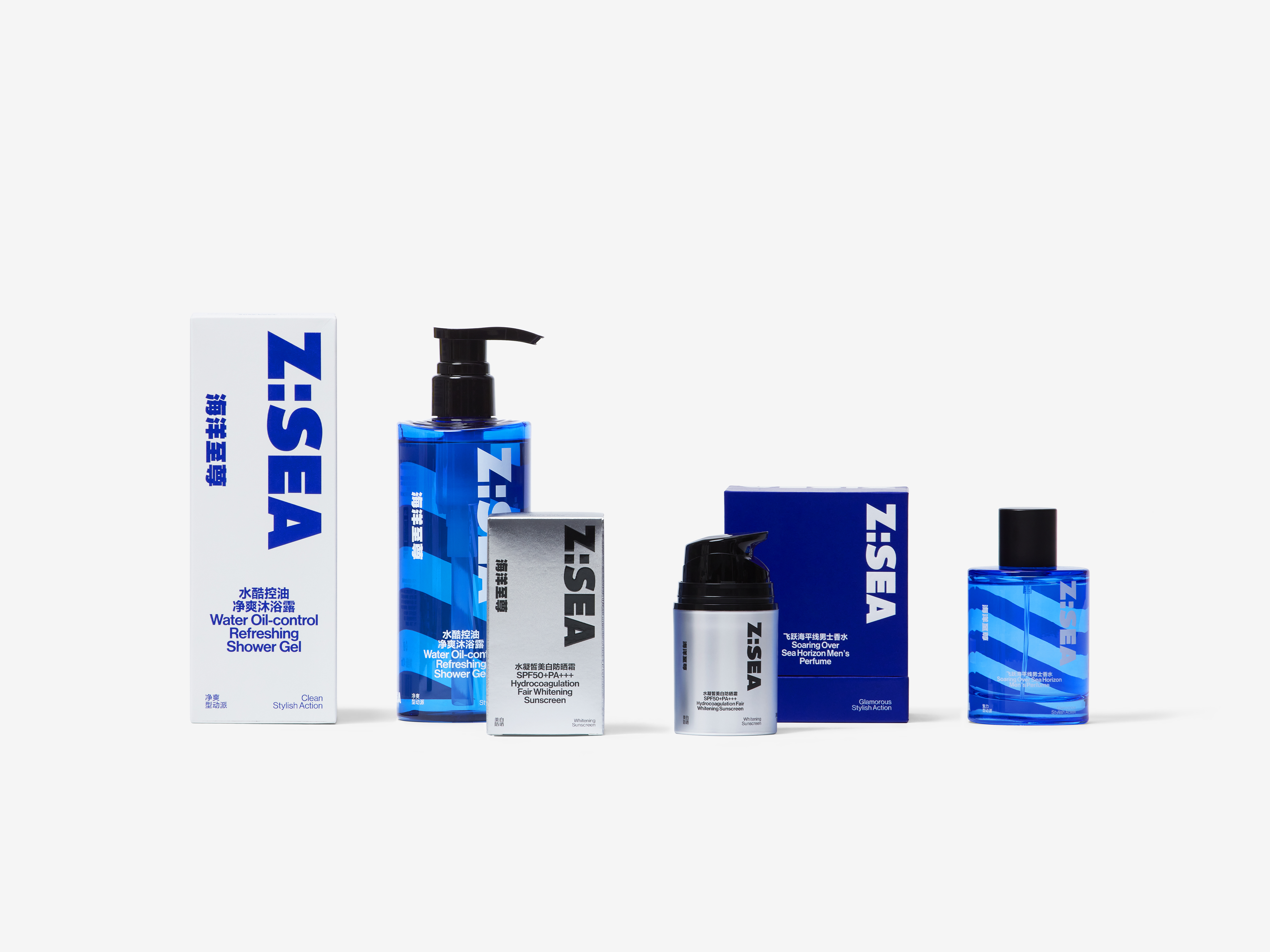
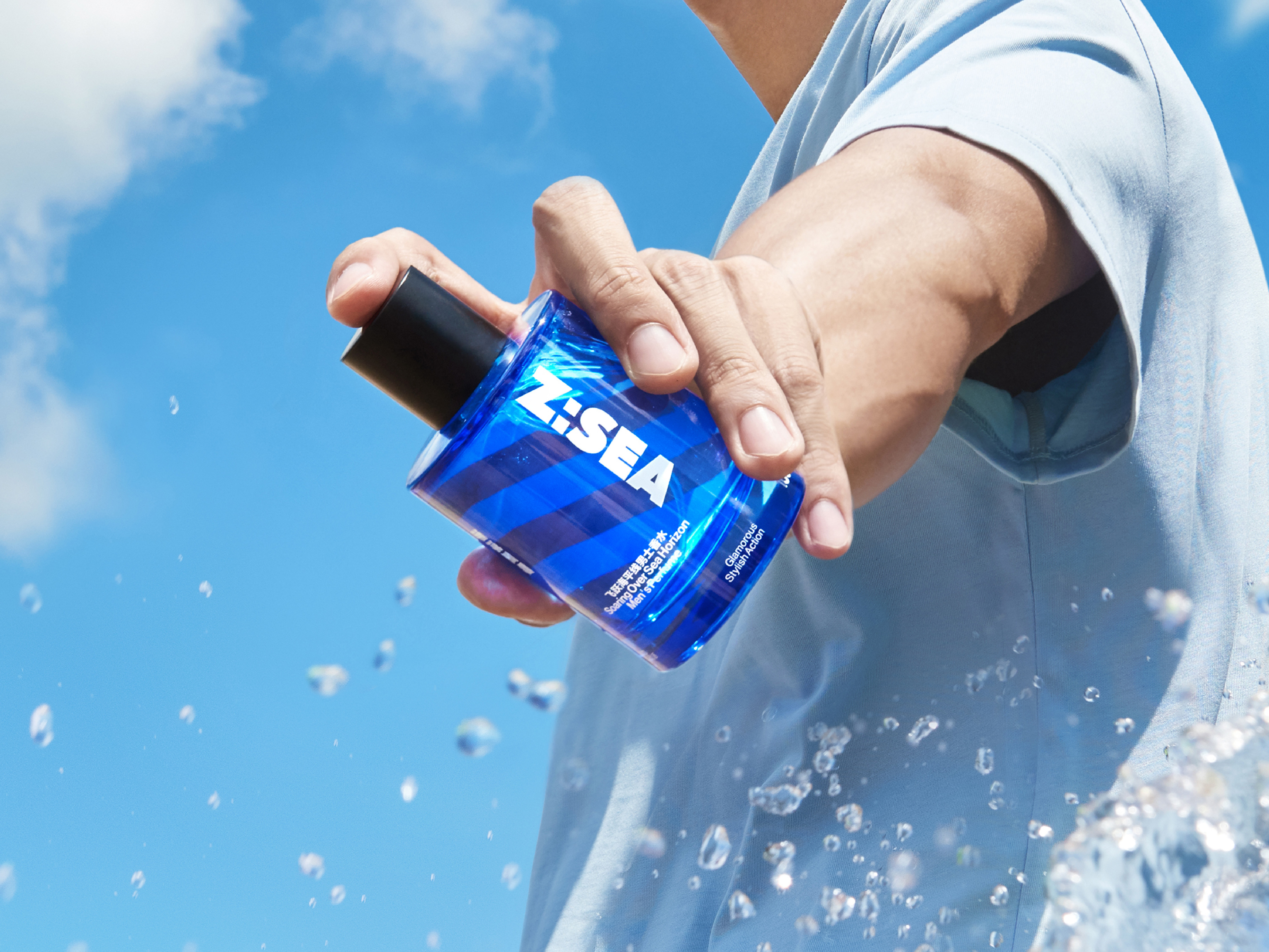
At the heart of Z: Sea's identity lies the bold letter Z, serving as the brand's primary emblem. Drawing inspiration from its slash, we extended it throughout the entire visual identity system. Infusing the design with a robust and sporty essence, we harnessed the dynamic, decorative slanted grain to complement the English logo of Z: Sea, culminating in a harmonious visual experience.
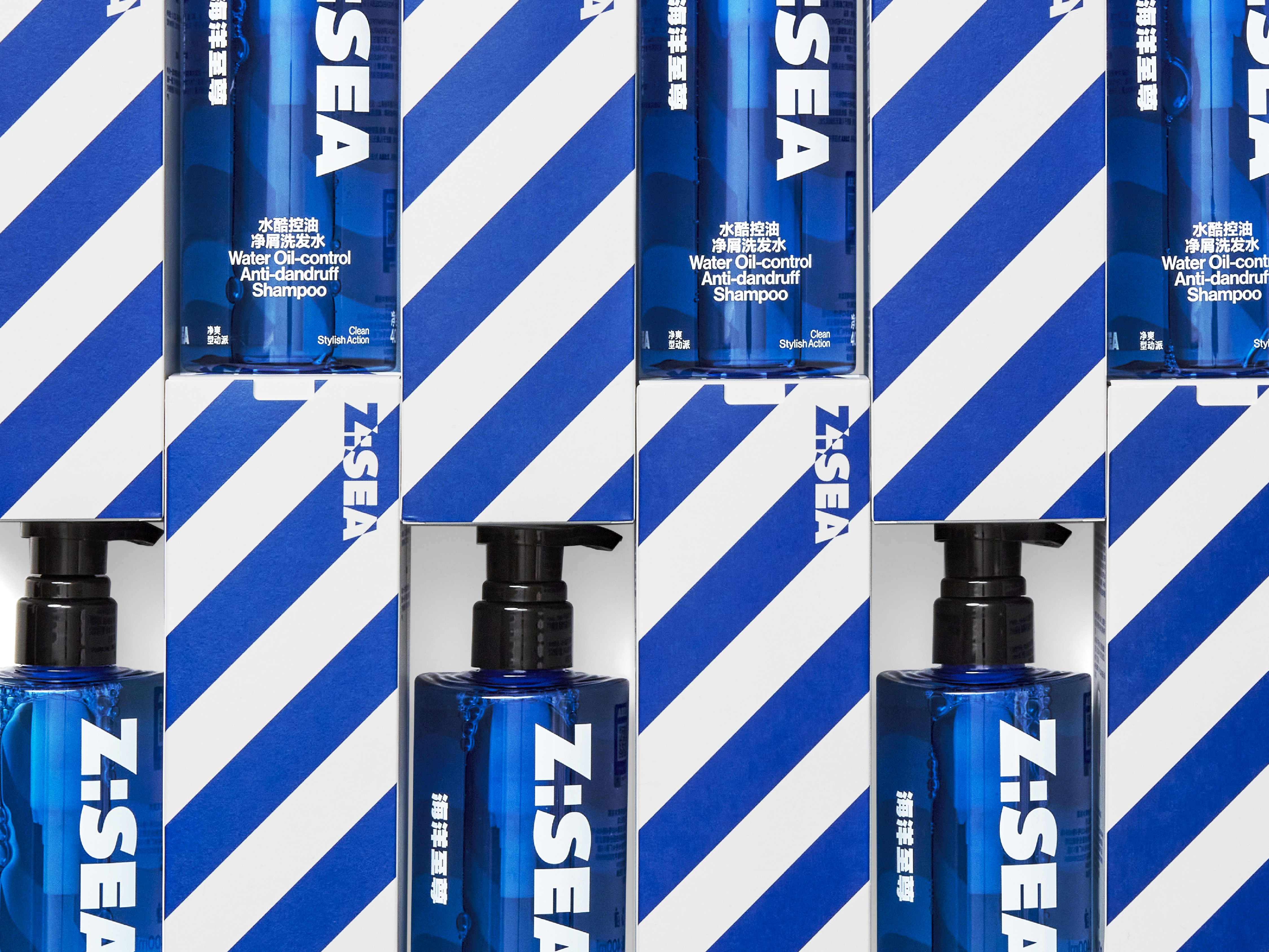
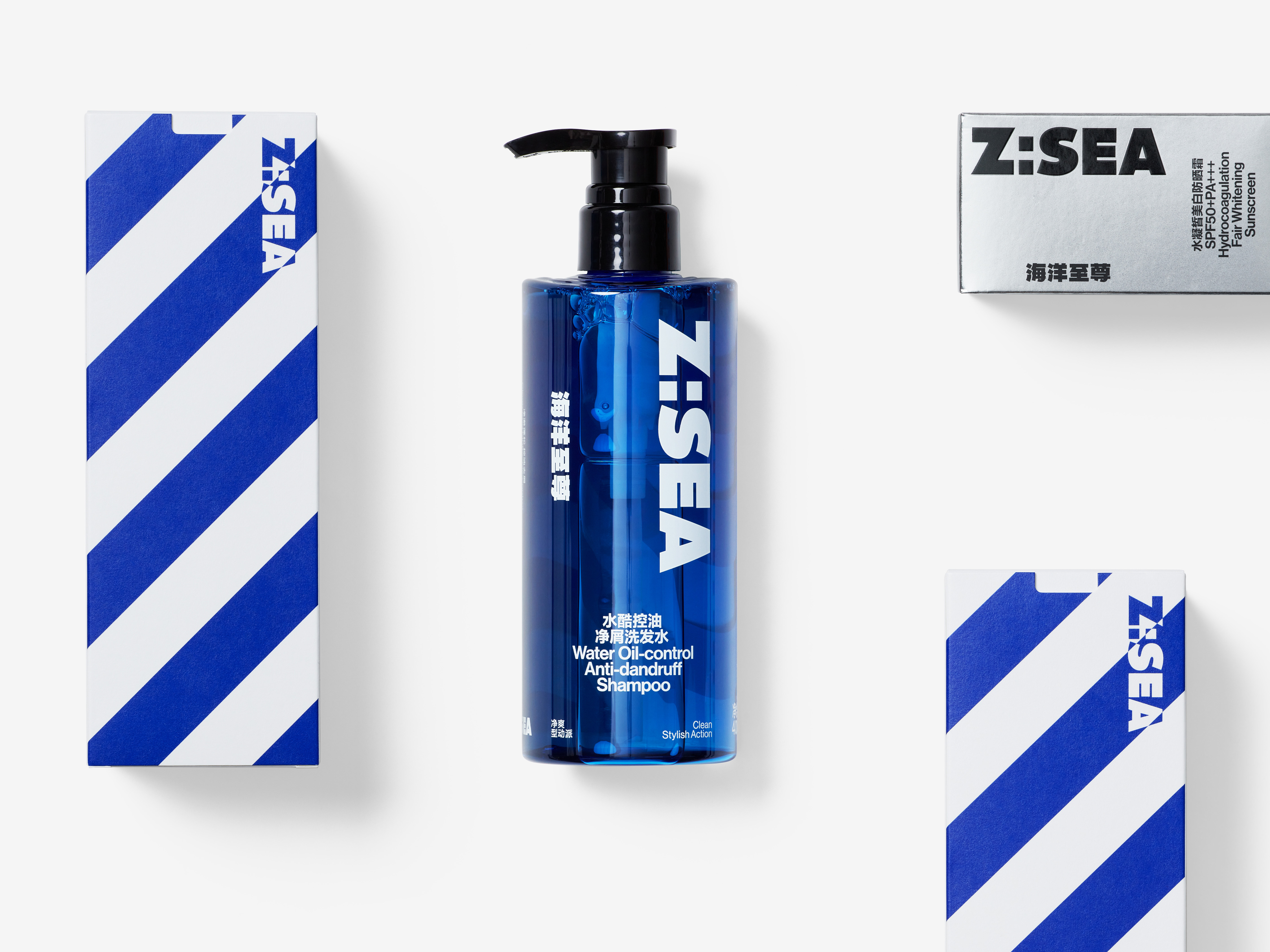
In packaging and bottle design, the main logo and product name proudly take center stage on the front, while the prominent decorative sloping grain adorns the opposite side, forging a captivating interplay with the front-facing information. This strategic arrangement ensures efficient and unambiguous information delivery while infusing the products with a sense of motion and refinement.
Diversifying product classification, we adopted a thoughtful color scheme, transitioning from silver and black to blue and white, and eventually to dark blue and light blue. Each distinct color group corresponds to specific product demands, infusing the entire product family with life and character. Through this vibrant spectrum, we artfully encapsulate the vast and profound depths of Z: Sea, reminiscent of the boundless sea.
In conclusion, Z: Sea's design philosophy embodies the essence of simplicity and efficacy, resonating with the male audience's preference for clear communication. Leveraging the iconic letter Z as the central motif and the dynamic slanted grain, our visual identity celebrates the energy and vitality encapsulated in our products, while the thoughtfully crafted color palette reflects the vastness of the sea that Z: Sea represents.
DIRECTOR: Nod Young / Guang Yu
ART DIRECTOR: Han Lu
DESIGNER: Han Lu
YEAR: 2022
CLIENT: Z:Sea