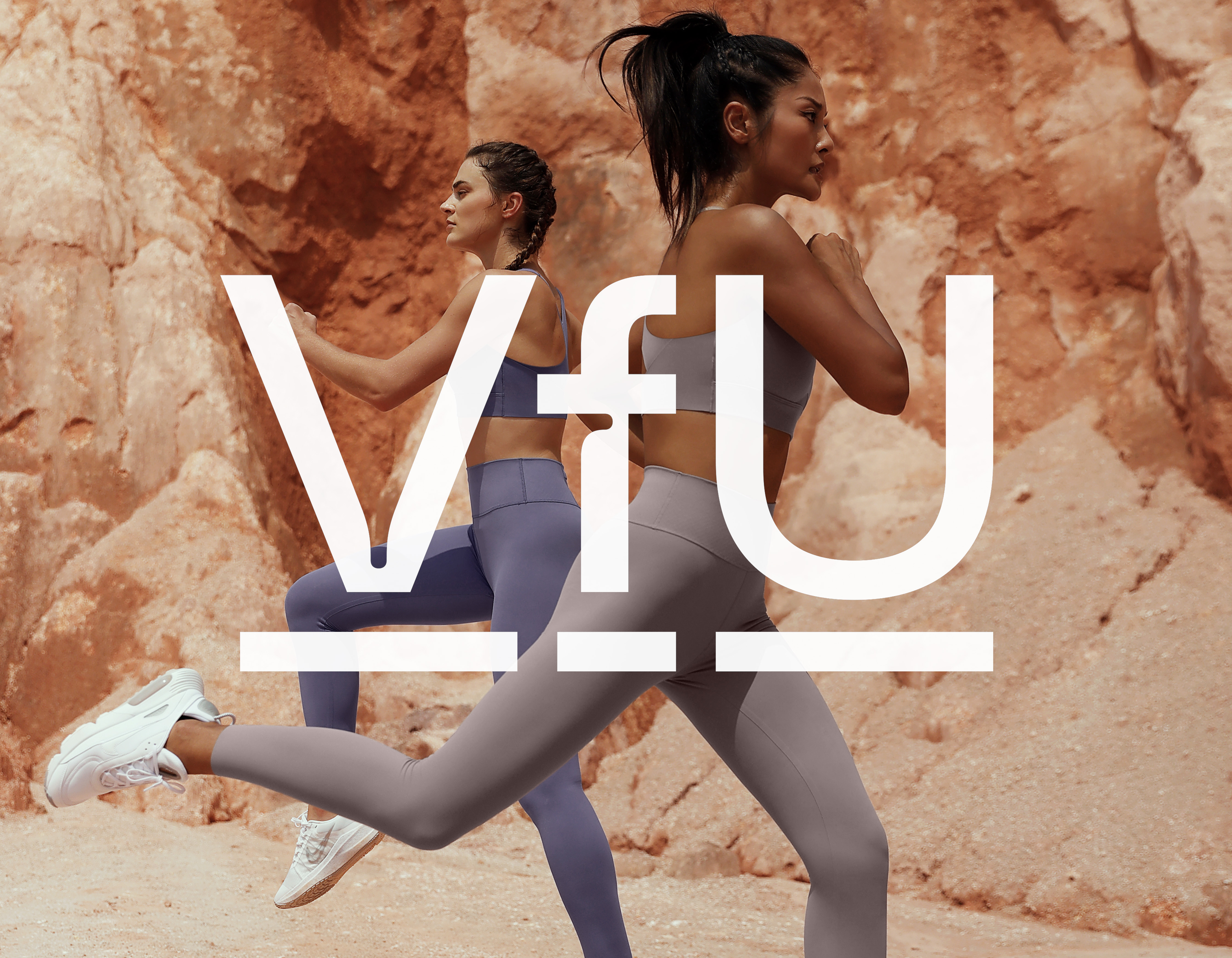
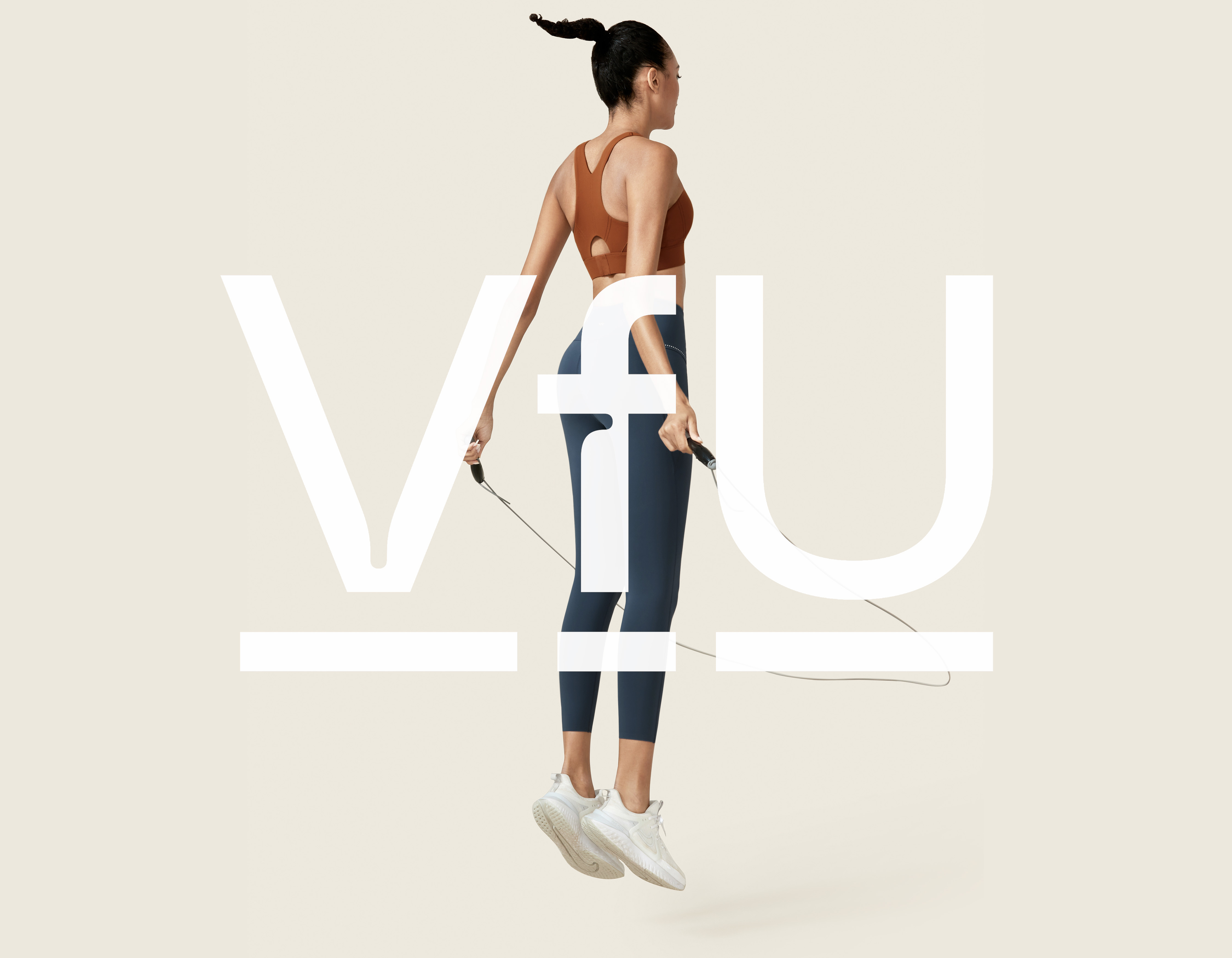
VfU
INNER STRENGTH
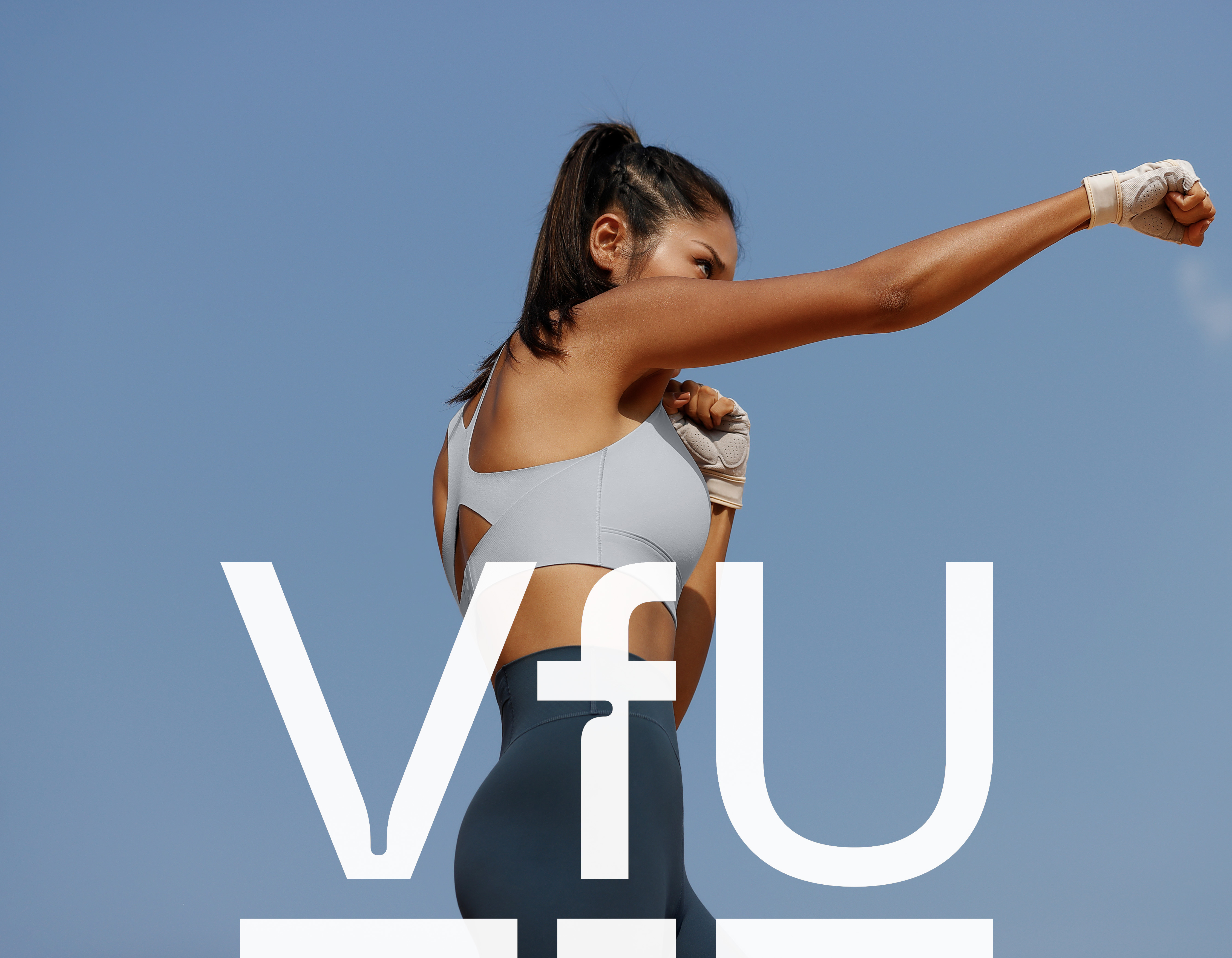
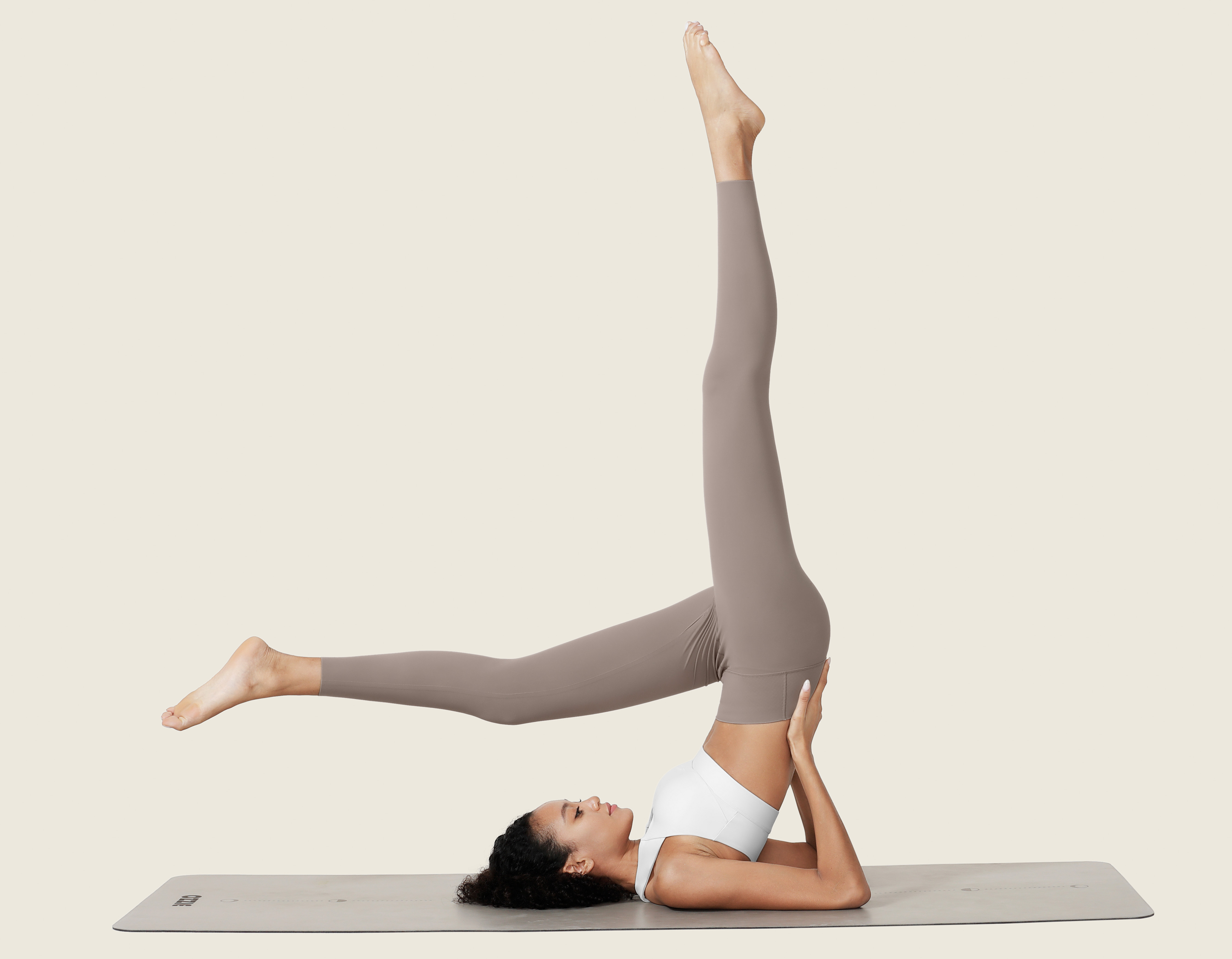
VfU stands as an exceptional sportswear brand tailored for urban women. It is, in our perspective, a true marvel among national brands, maintaining a remarkable track record of excellent sales despite the relentless waves of competition—a feat that is nothing short of awe-inspiring. VfU's brand persona exudes an unpretentious charm, with a touch of understated elegance and an air of independence that renders it utterly unique. Perhaps it is this distinctive blend that has struck a resounding chord with countless Chinese female users, who wholeheartedly embrace VfU as an embodiment of inner strength.
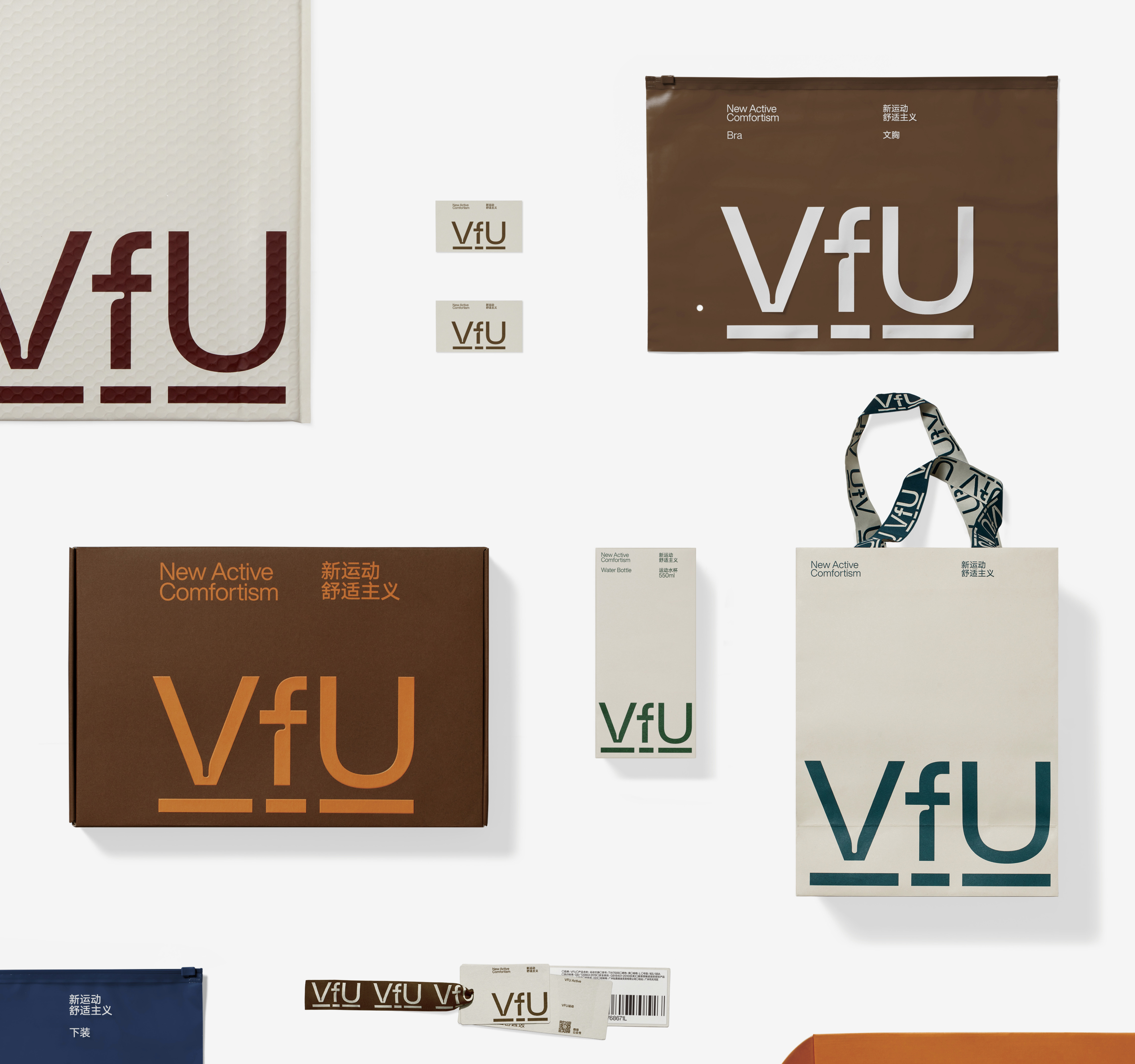
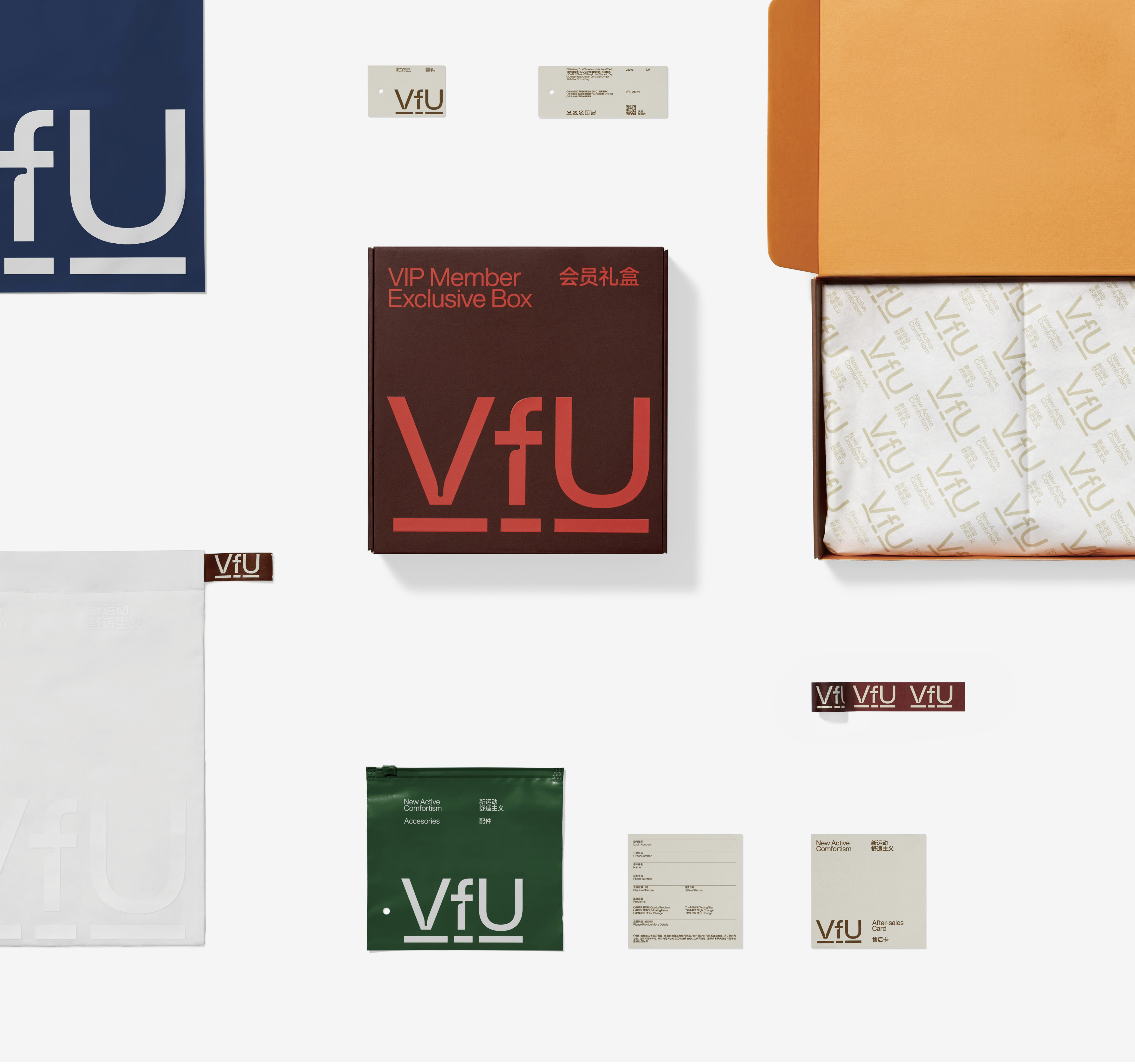
Drawing inspiration from the essence of VfU, we meticulously crafted a fresh visual identity that artfully blends restraint with a sporty flair in its intricate details. A pivotal transformation was the brand name itself, evolving from VFU to VfU, where the lowercase "f" imparts a sense of elastic stretch, gracefully interacting with the capital "V" and "U." Additionally, varying lengths of underscores adroitly capture users' attention, employing a non-intrusive, unobtrusive approach. In our visual identity system, we adhere to the principle of "stillness and slowness," employing a palette of low-profile colors that empowers the self through understated restraint.
Through this revitalized visual identity, VfU strides confidently forward, epitomizing the fusion of grace and athleticism, while celebrating the enduring power of inner resilience.
ART DIRECTOR: Guang Yu / Nod Young
DESIGNER: Wang Xiaoshuai / Liao Liao / Xu Mingru
YEAR: 2021
CLIENT: VfU