Snowplus
Create an addictive experience
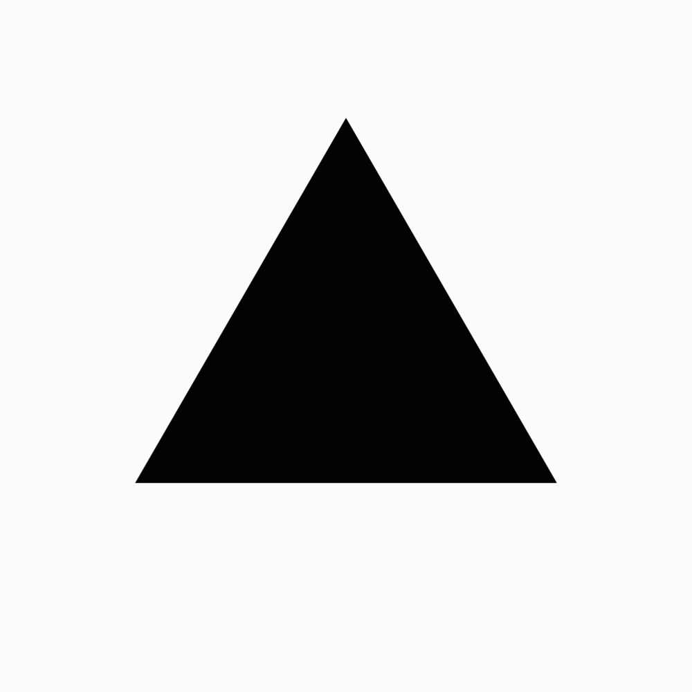
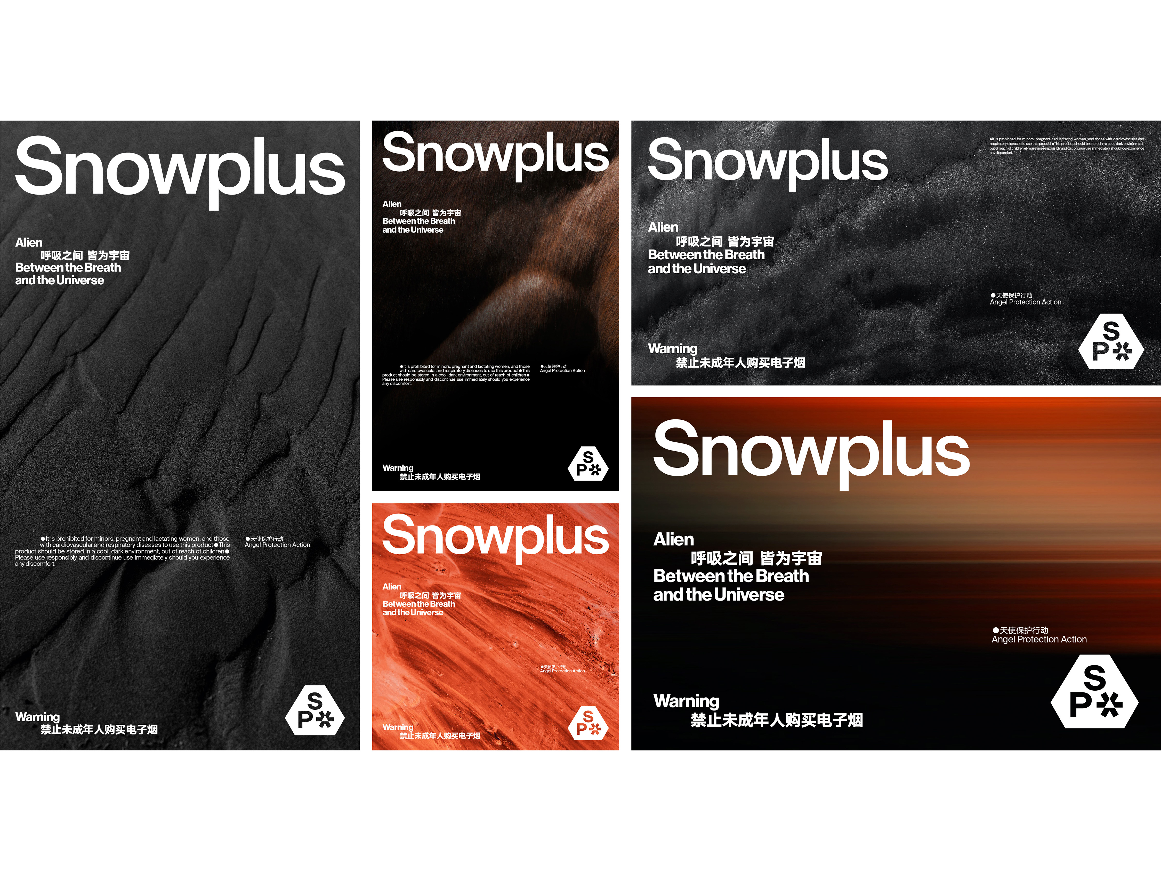
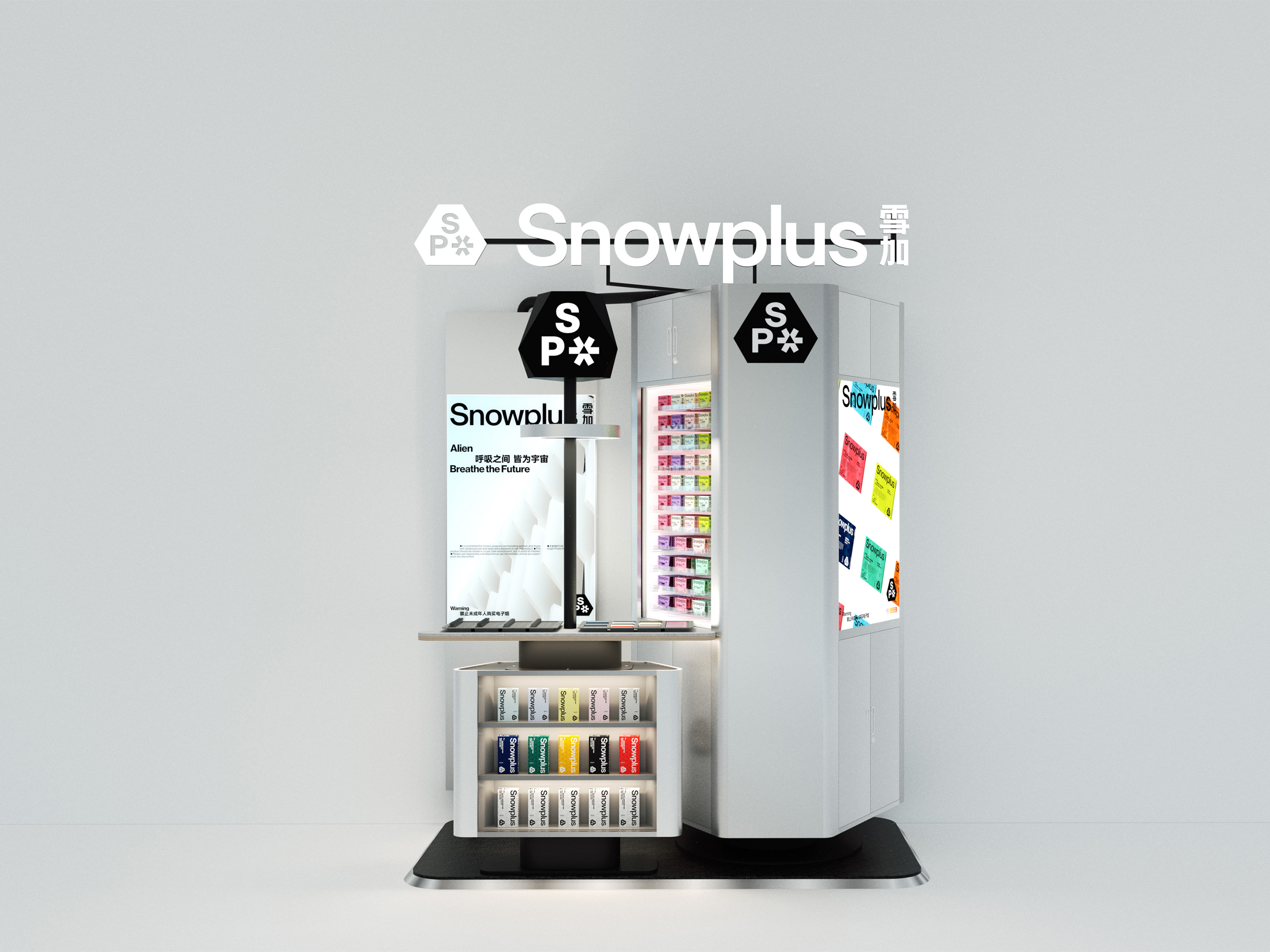
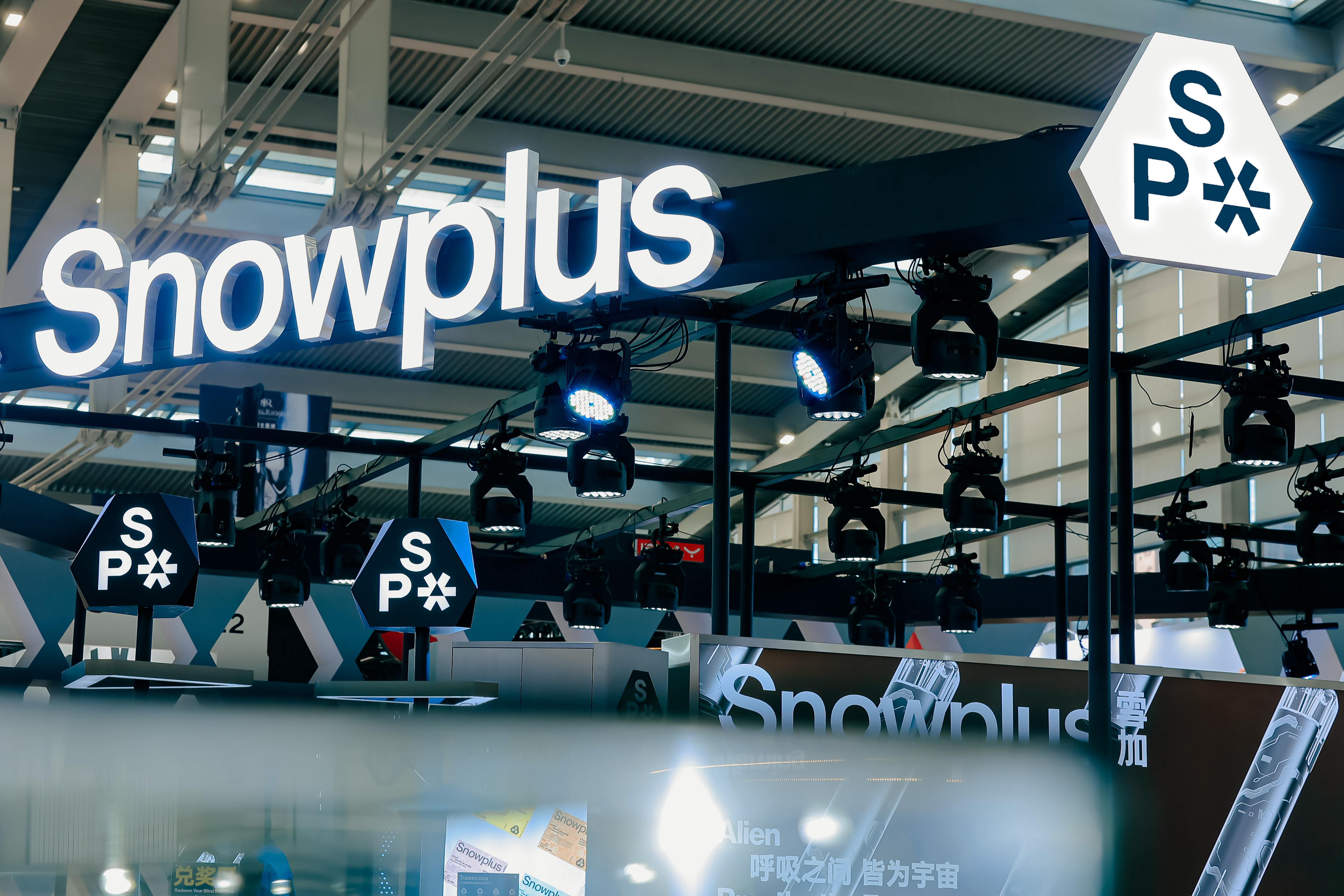
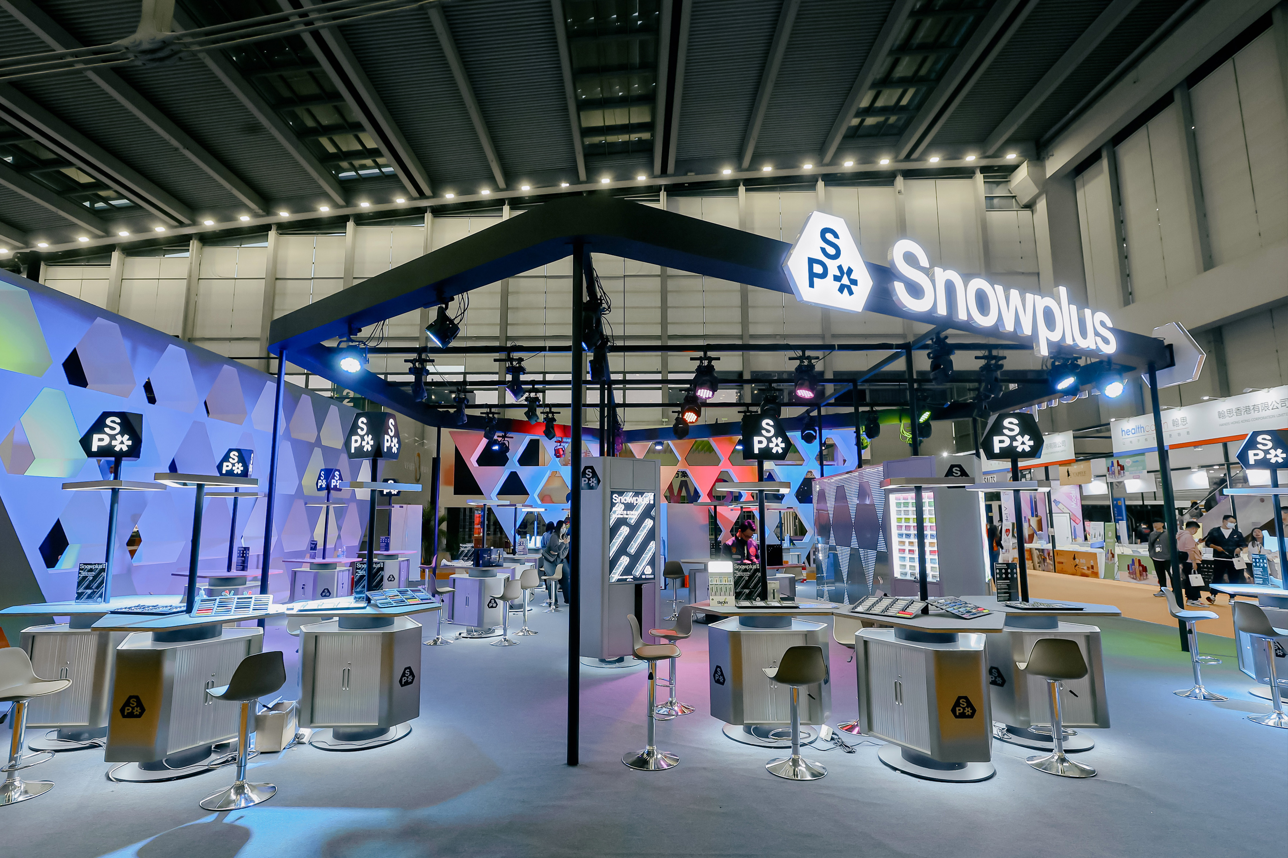
In design, the logic can sometimes defy common sense. Traditional and stable elements can better showcase innovation, while seemingly simple graphics can carry significant meaning. For Snowplus' design, the team chose the most stable shape, the triangle, and made morphological changes to it. After nearly a hundred revisions and comparisons, they settled on a visually comfortable and pioneering shape - Snowplus' unique irregular hexagon. The design also includes a small snowflake perfectly embedded according to the shape of the hexagon, forming the tight and stable "SP" logo. The polygonal shape and radial snowflake pay tribute to classic sci-fi.
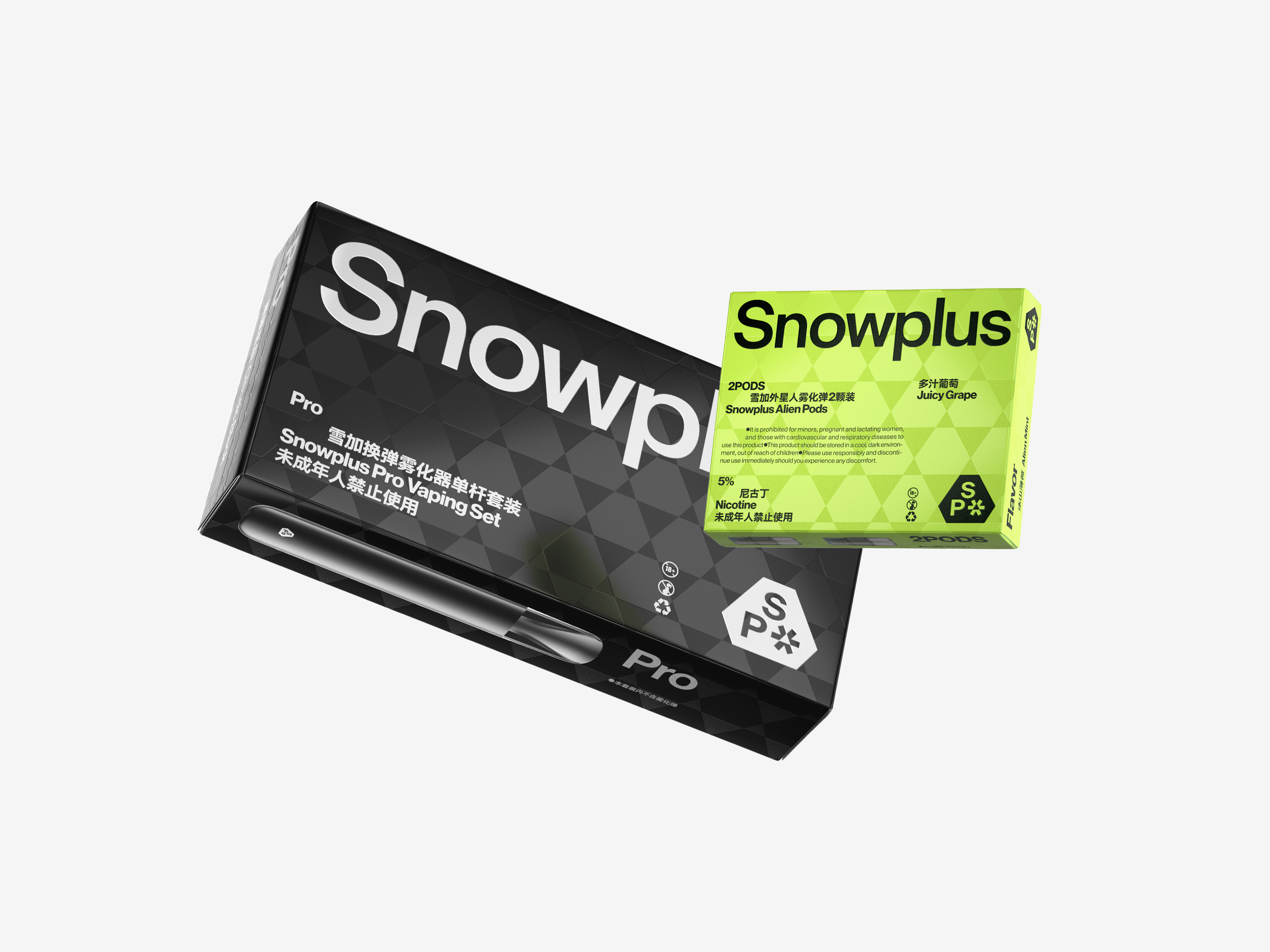
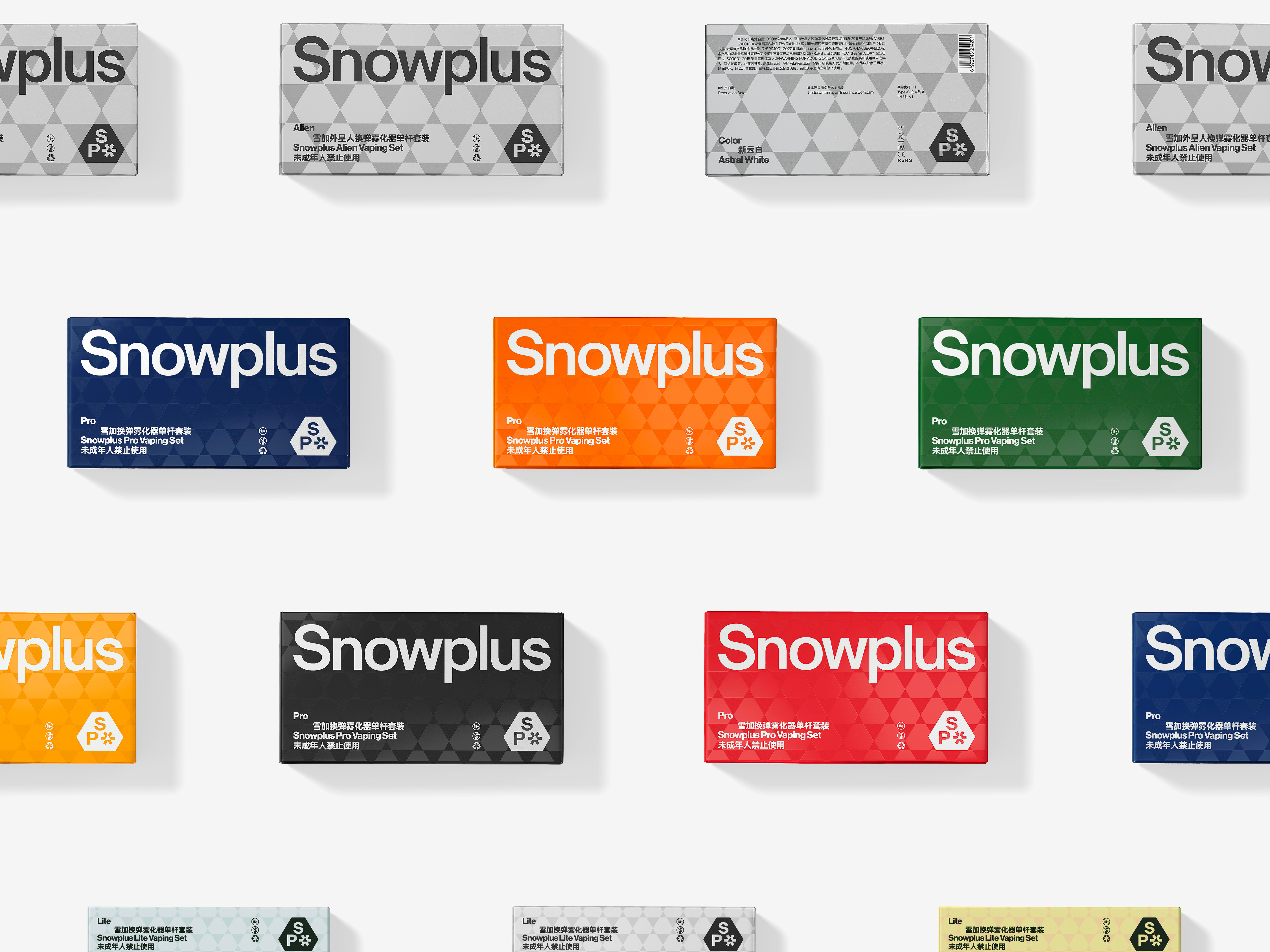
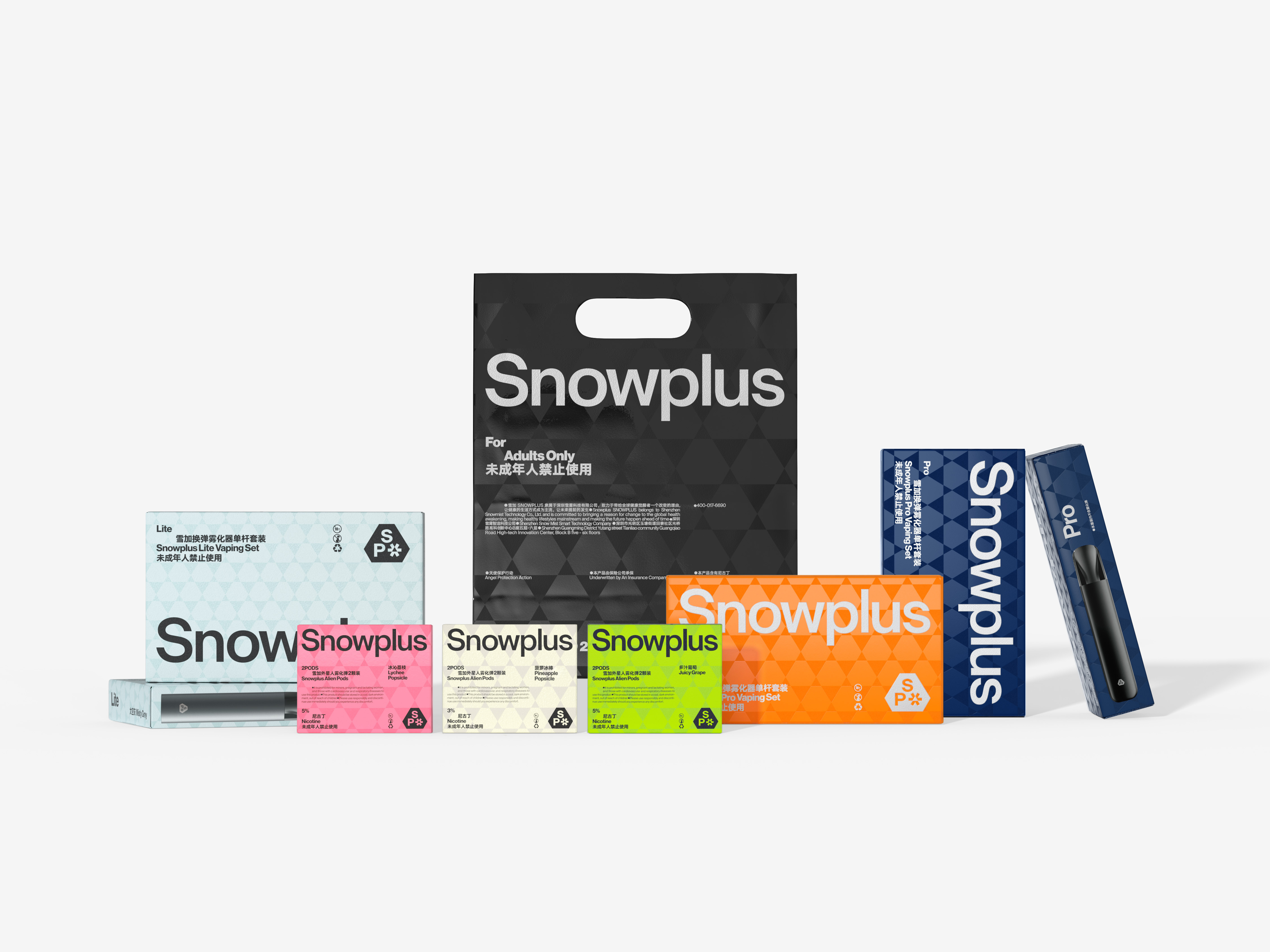
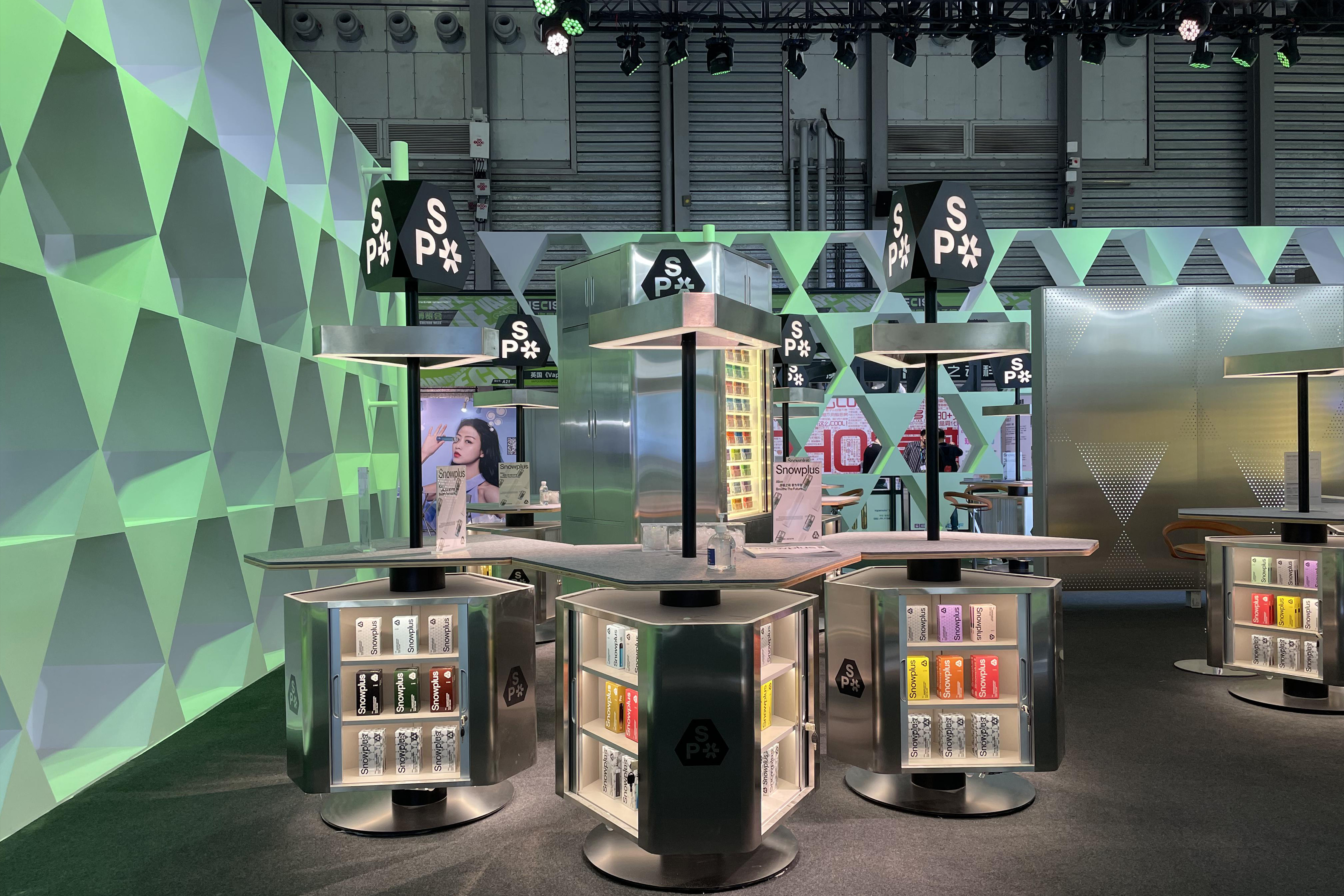
In packaging design, the team took Snowplus' technological aesthetic further by covering the packaging with a hexagonal pattern and using a special printing technology that makes it luminous and colorful under the light.
Since an electronic cigarette is an item that is held for a long time, Snowplus' design aimed to create a sense of refinement and technology. After the brand upgrade, Snowplus gained many new users and consolidated its market position.
ART DIRECTOR: Nod Young / Guang Yu
DESIGNER: Han Lu / Wang Xiaoshuai
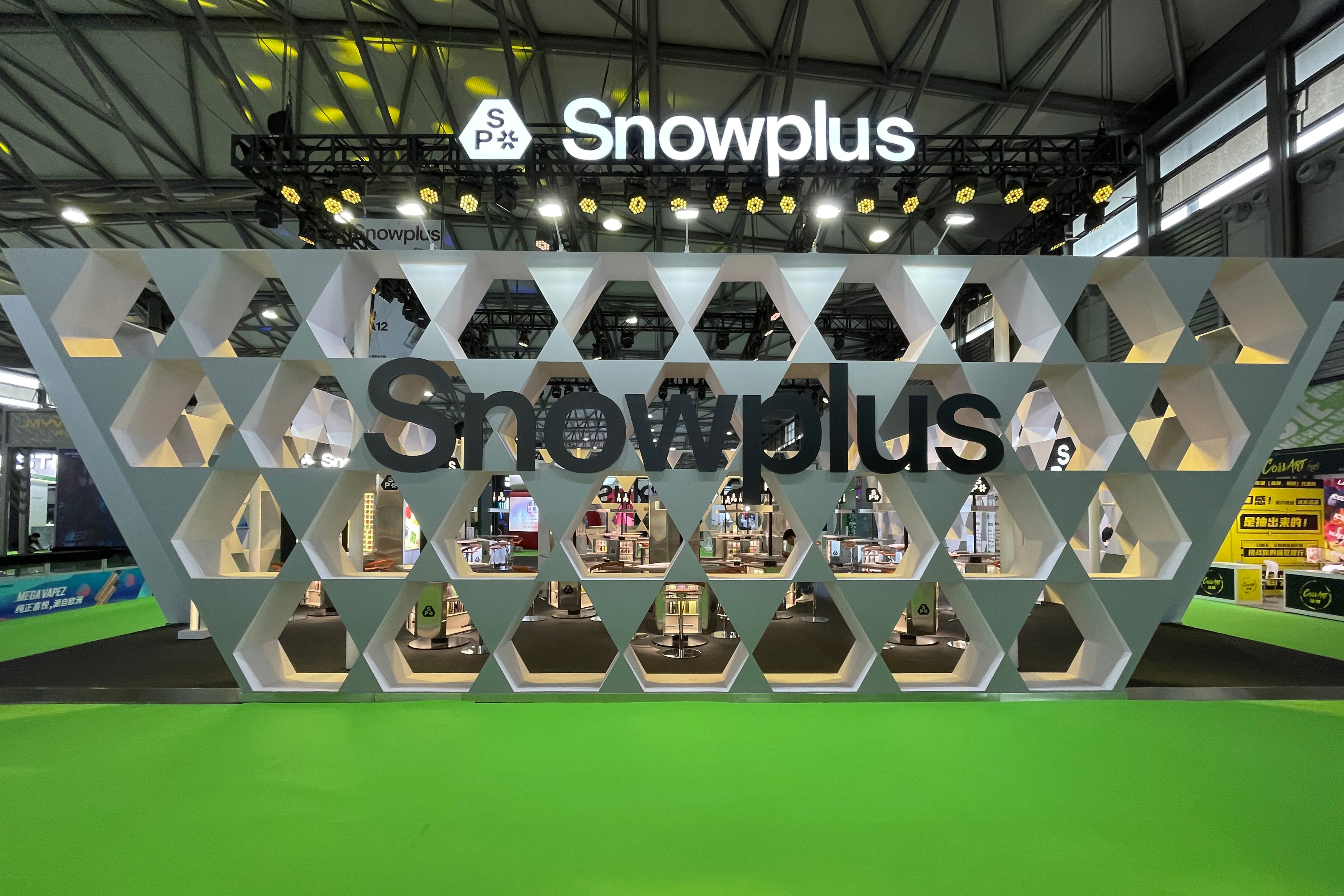
INTERIOR DESIGN: SPACESTATION
YEAR: 2021
CLIENT: Snowplus