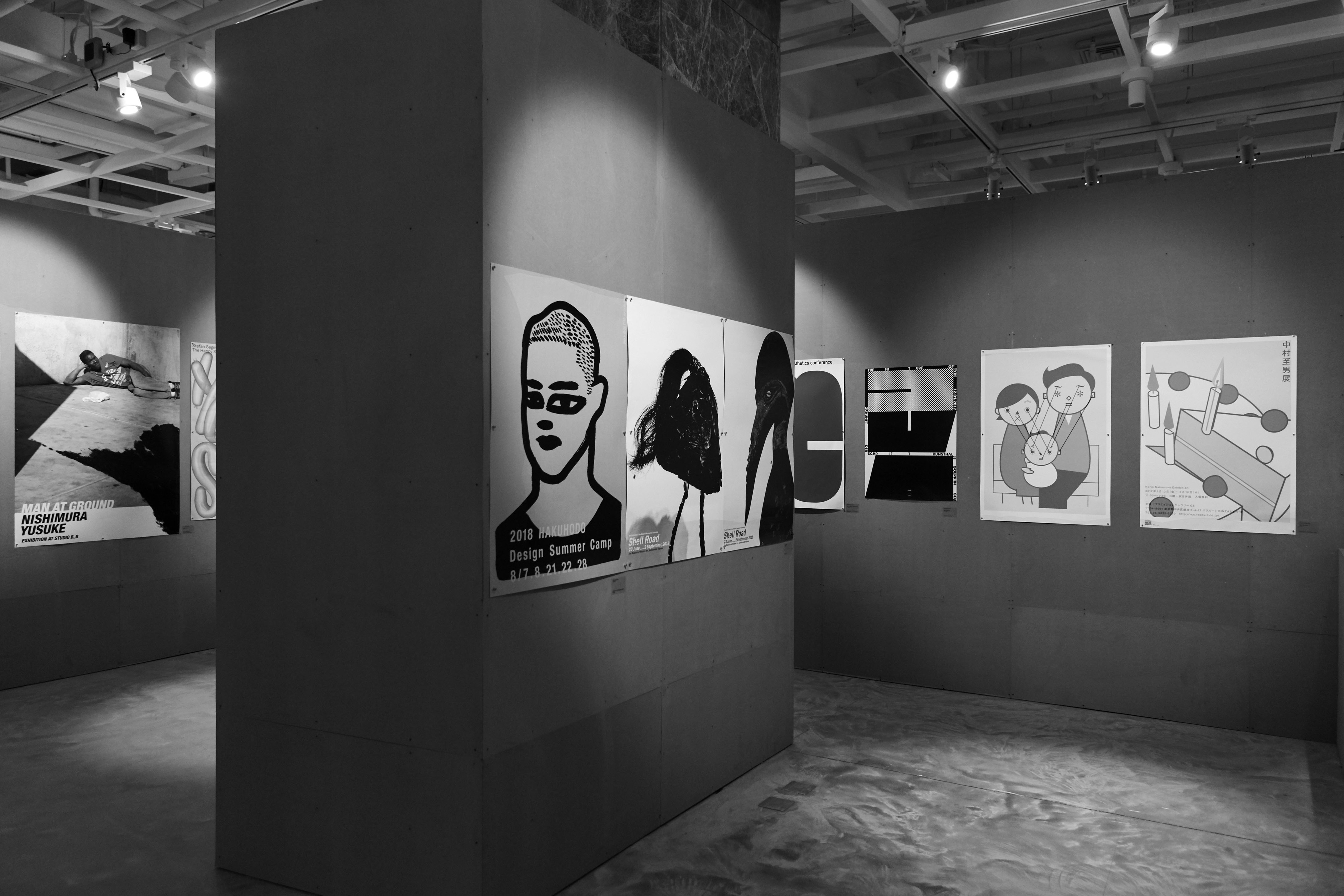
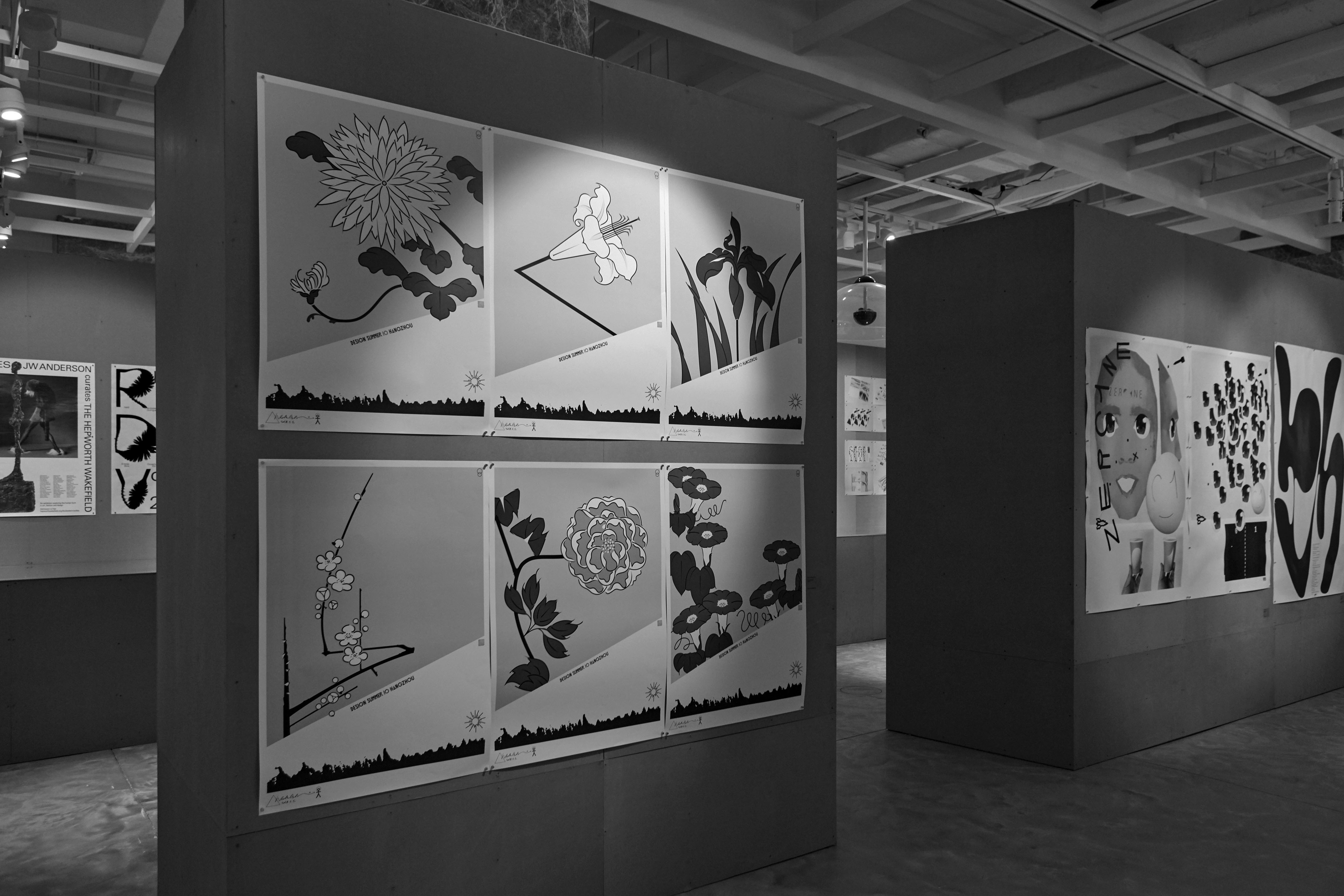
Typo Art Exhibition
Shape of the Type
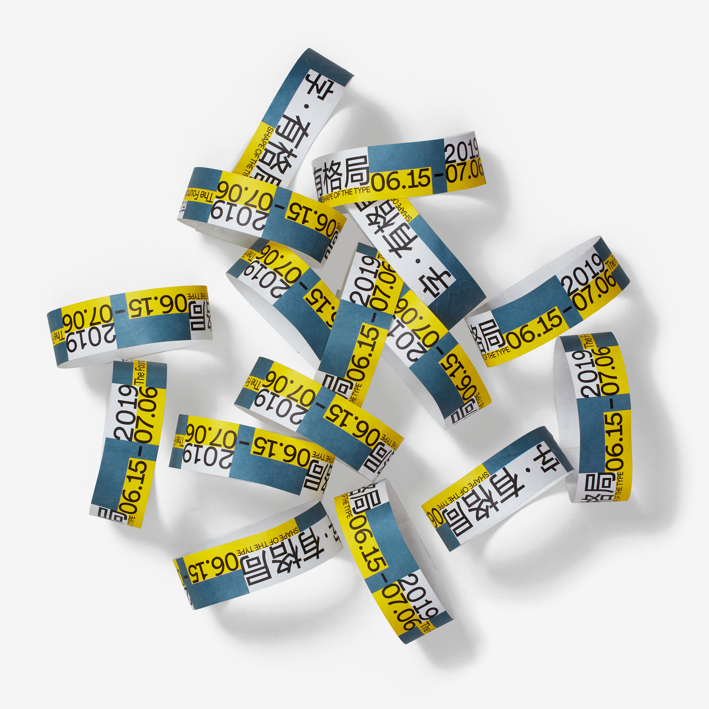
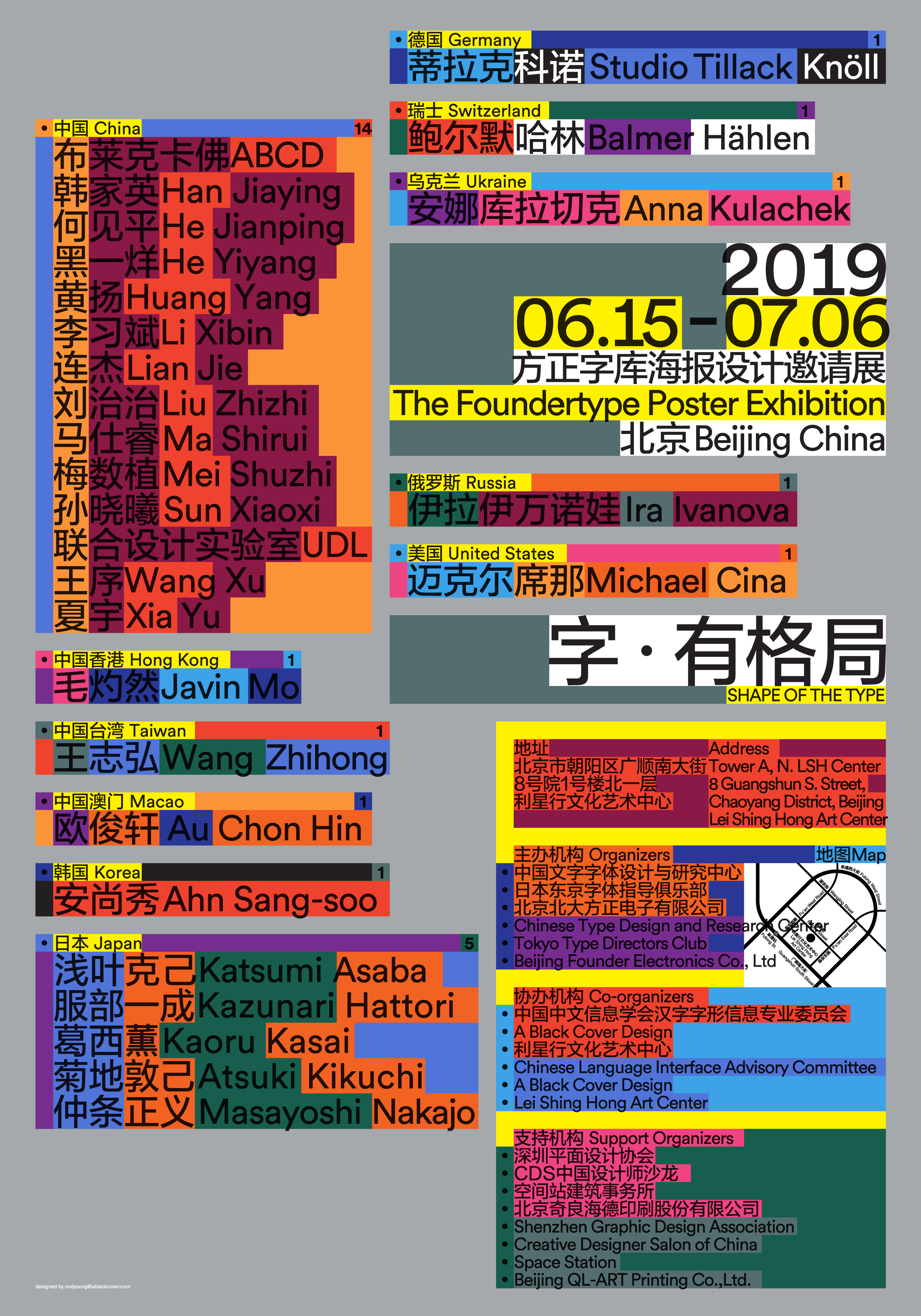
The key visual of the design and art exhibition is a very difficult job: How to convey the theme in a striking way and use the most contemporary language to express it. Chinese characters are fascinating because they are made up of small squares, one by one, which is a kind of visual understanding that everyone shares when they see them. This basic building block of Chinese characters inspired me to create a visual system that uses enlarged and extended small squares to create a highly recognizable layout.
The idea of using small squares as a design element is not only visually appealing, but it also conveys a sense of order, structure, and precision, which is essential in design and art. Each small square in a Chinese character has its own meaning and pronunciation, and together they form a complex and nuanced language. By playing with the arrangement and scale of these squares, we can create a wide range of visual effects and meanings, which is what makes them so fascinating and versatile.
As a designer, I am always looking for new ways to experiment with the basic elements of design, such as shapes, colors, and textures, to create something fresh and unique. The use of small squares in Chinese characters is just one example of how a simple and familiar concept can be reinterpreted and applied in a new context. Ultimately, the goal of design is to create something that is not only aesthetically pleasing, but also meaningful and relevant to the audience.
ART DIRECTOR: Nod Young / Guang Yu
DESIGNER: Nod Young
YEAR: 2019
CLIENT: Foundertype