MAKE SENSE
Rationality First, Then Cleanliness
MAKE SENSE was created to break the monopoly of imported brands in China's men's skin care market. To understand the local men's skin care culture, we believe that Oriental men tend to be more reserved and subtle in their preferences. The common design language in the market is too intense and stimulating, with elements such as ice cubes, rocks, and large color blocks. Therefore, MAKE SENSE has the opportunity to establish its unique aesthetic.
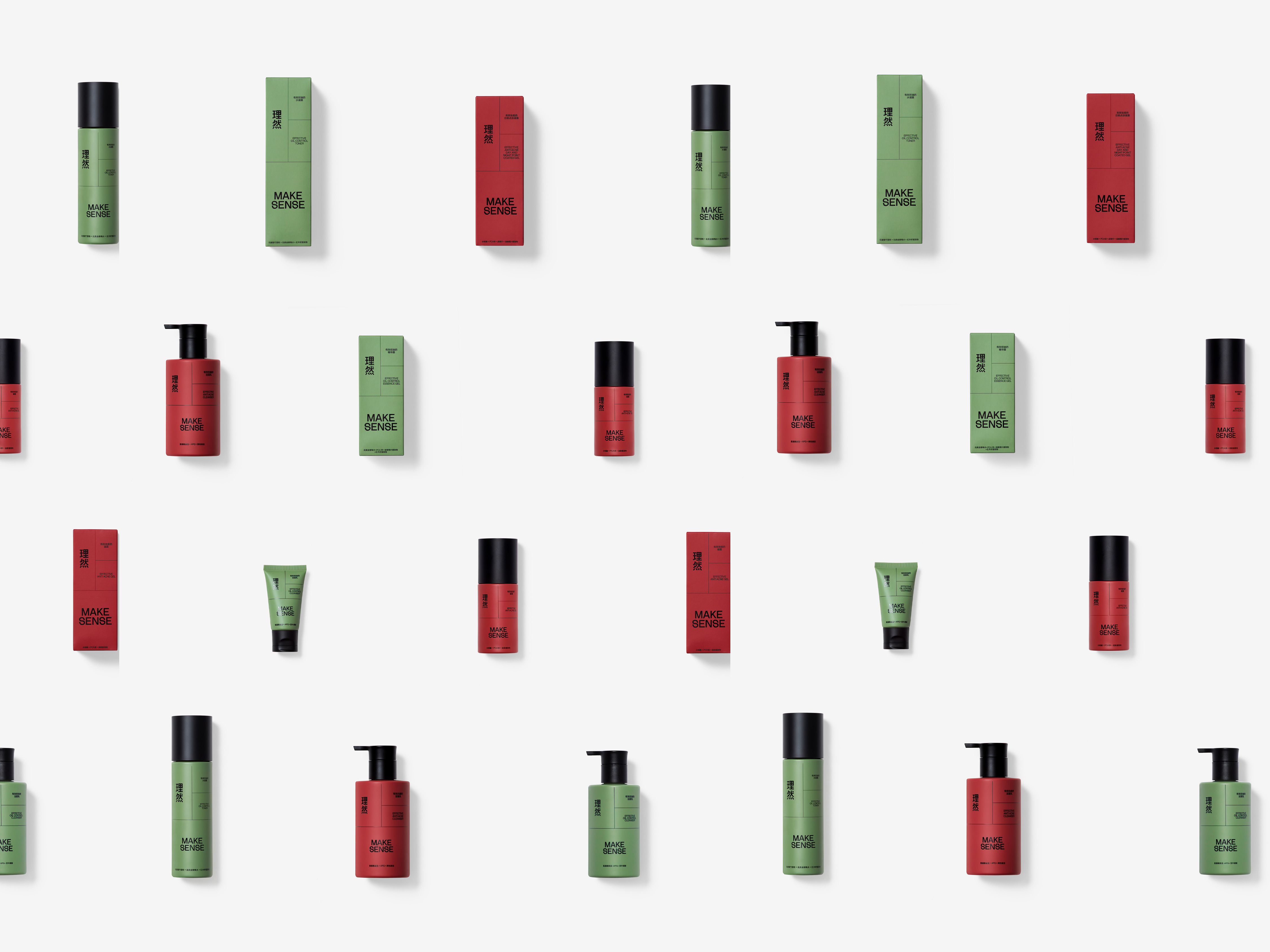
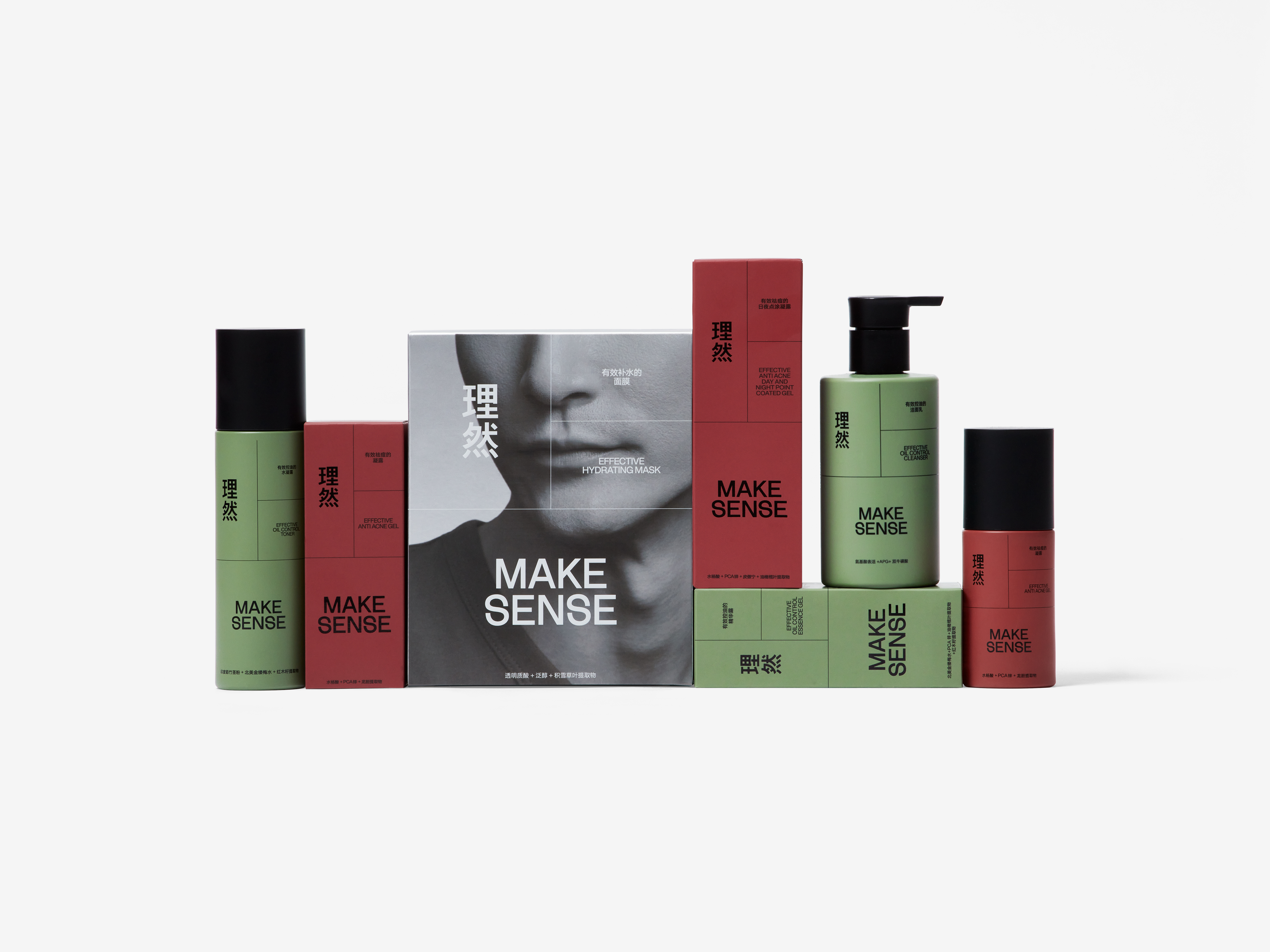
The design of MAKE SENSE's visual identity follows the principle of "Rationality First, Clean Later." In a highly competitive market, it is essential to enhance the design based on the product features and advantages. MAKE SENSE products provide a refreshing, clear, and relaxing experience while emphasizing the quality and logic of the formula. We have translated these product features into a simple and clear design that also conveys fun and interest, creating the unique style of MAKE SENSE.
The MAKE SENSE brand is represented by the Chinese characters "理然" (lǐ rán) followed by "MAKE SENSE" and the product name. The layout is divided into functional areas by fine lines, with each content arranged in an orderly manner. This design reflects our understanding of the refreshing and relaxing experience that men's skin care products should provide.
ART DIRECTOR: Guang Yu / Nod Young
DESIGNER: Liao Liao / Han Lu
YEAR: 2020-2022
CLIENT: MAKE SENSE