HAOYUAN
Modern Kitchen CultureHaoyuan, a distinguished thirty-year-old factory and a leading brand in the Chinese foil industry, has successfully established its presence among commercial customers worldwide. Now, in 2021, it sets its sights on entering the Chinese consumer market as a "to C" company. In shaping the brand image of Haoyuan, we ventured beyond the confines of conventional foil industry norms and instead turned our gaze toward the pulsating essence of the modern city, particularly the vibrant kitchen culture embraced by the younger generation. Recognizing that a significant portion of Haoyuan's user base includes avid cooks who regularly utilize aluminium foil and contemporary kitchen appliances like ovens, we intuitively grasped that forging a deeper connection with consumers would involve embracing the concept of 'modern kitchen culture' rather than merely focusing on 'kitchen tools'.
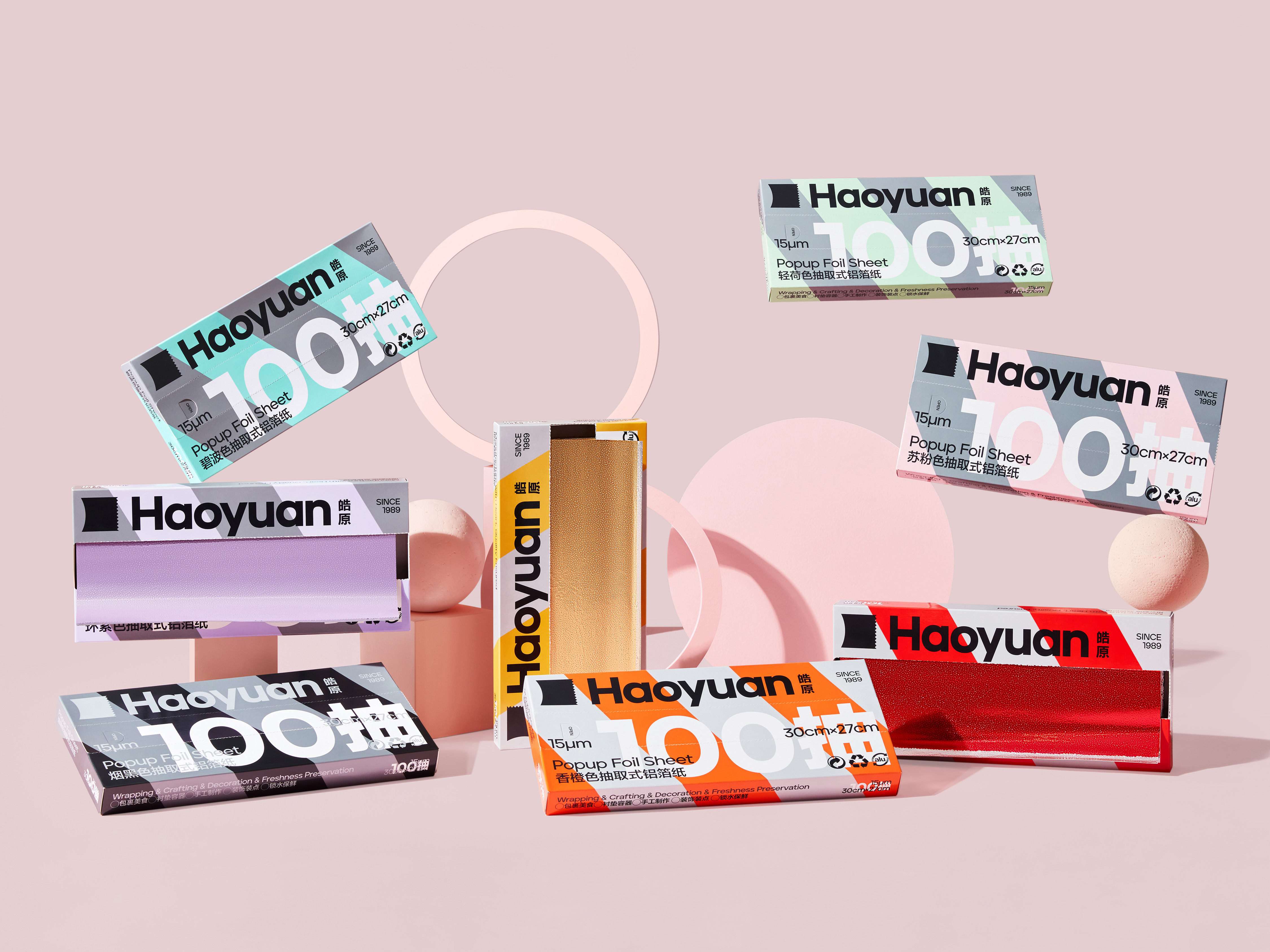
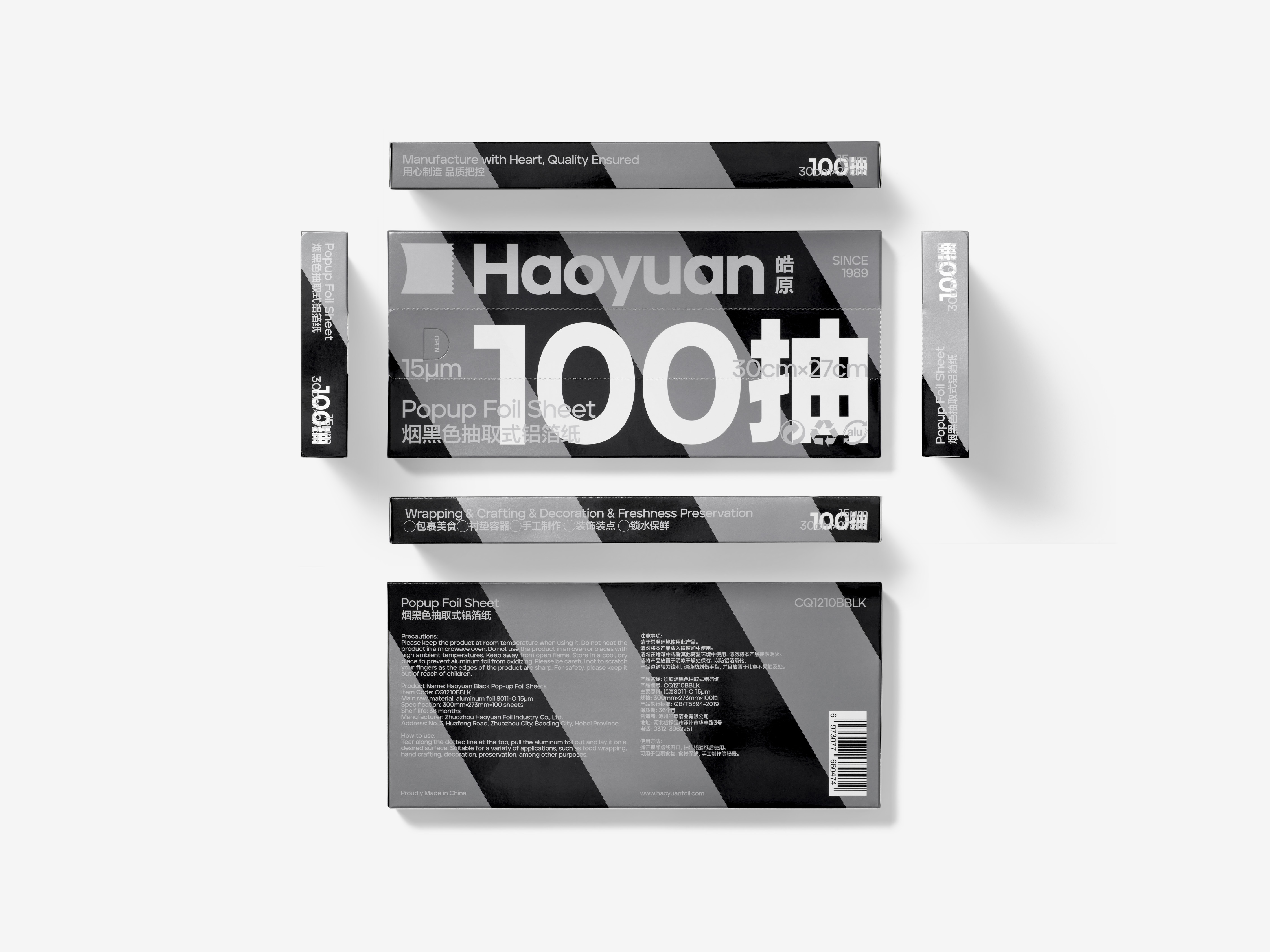
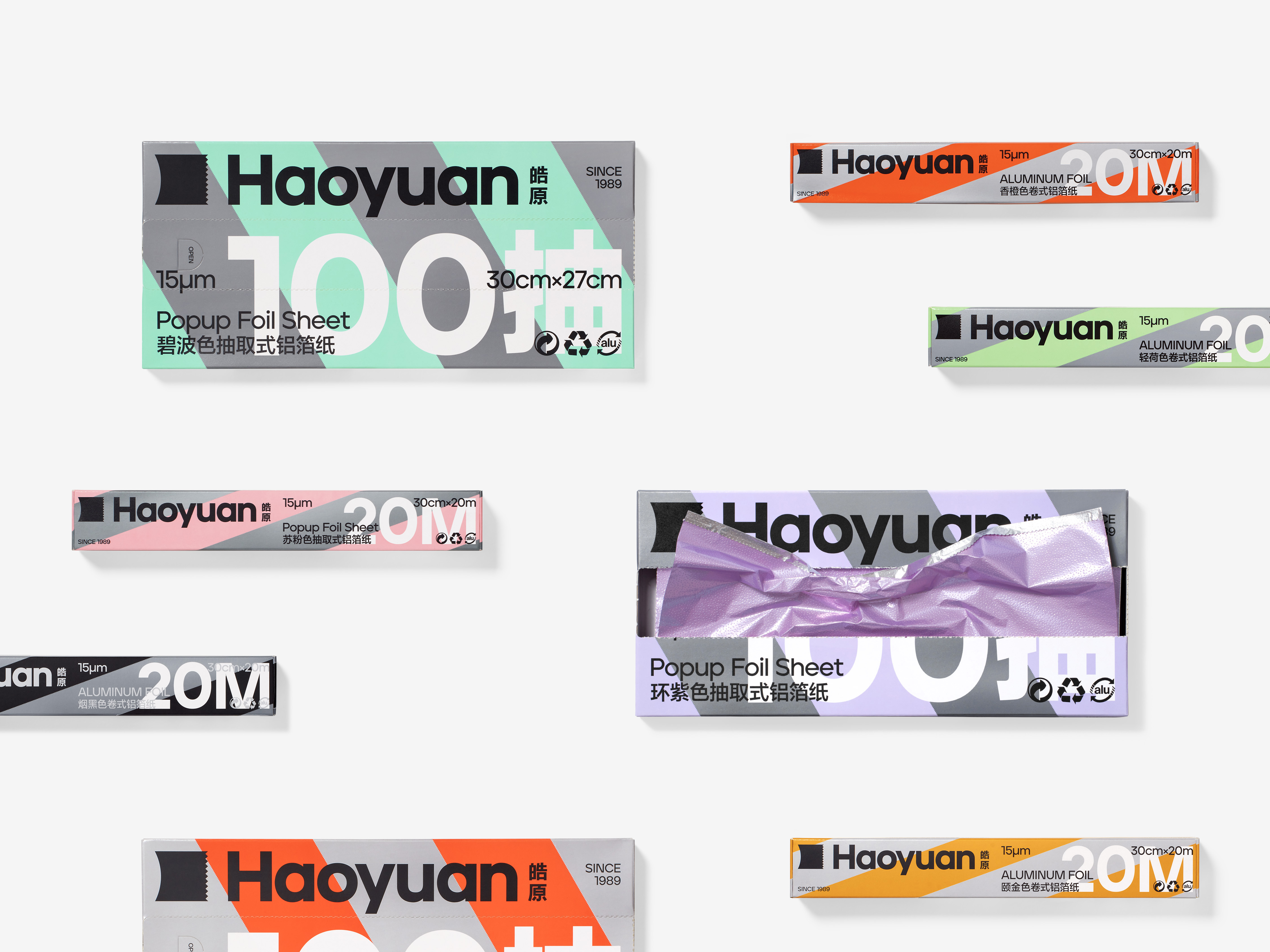
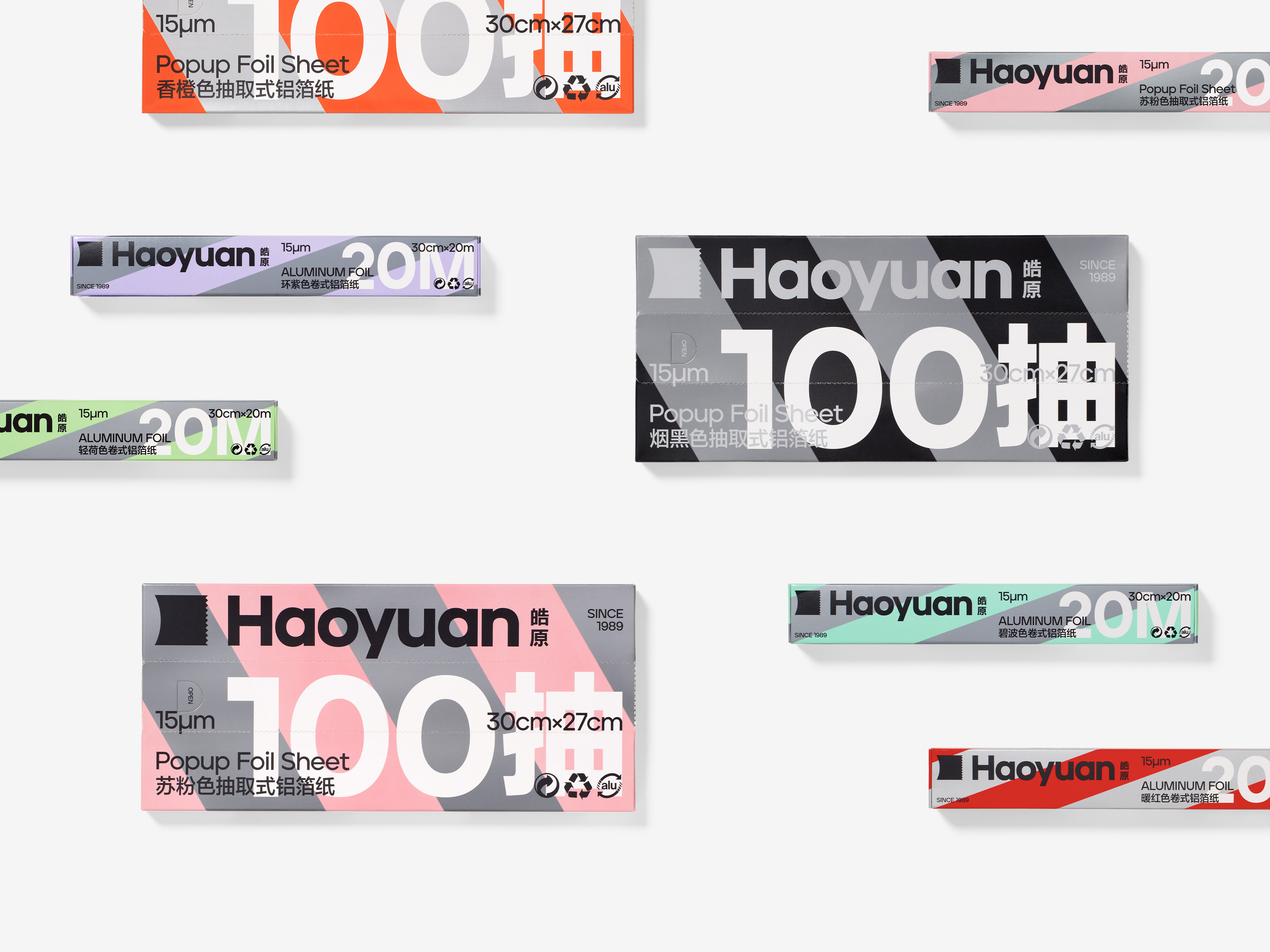
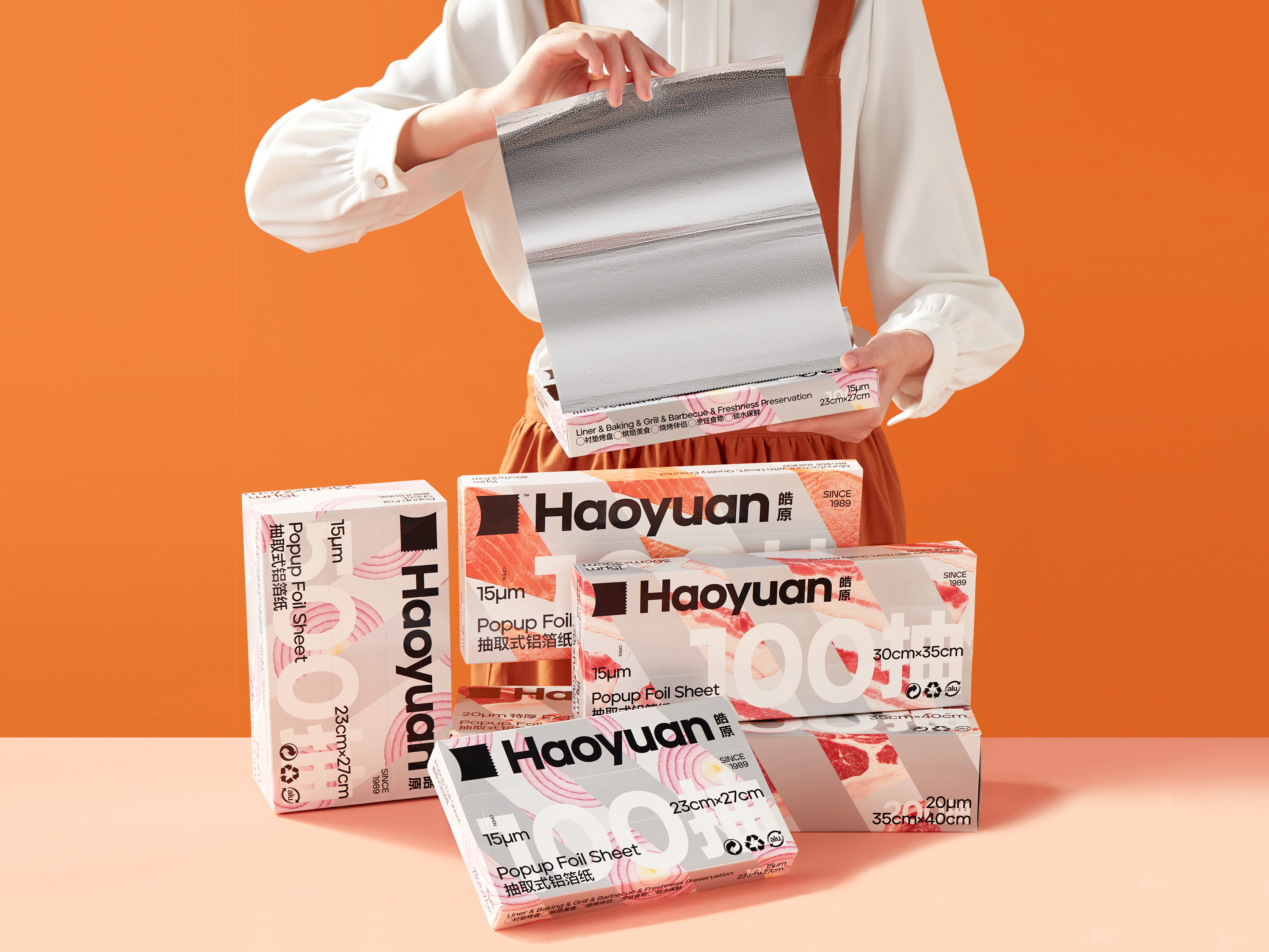
The Haoyuan logo is ingeniously fashioned as a sheet of Aluminium foil, tantalizingly awaiting extraction. The delicate serrations adorning the edges symbolize the foil in its pristine, uncut state. This meticulous attention to detail not only accentuates the exclusivity of Haoyuan's foil product but also underscores the company's unwavering commitment to craftsmanship. In our packaging design, we artfully introduce the concept of 'wrapping', elegantly enshrouding the ingredients with a touch of silver, gold, and color (representing the foil product's various shades). The packaging ingeniously showcases both the foil and the ingredients in a harmonious 50:50 ratio, allowing users to savor the delectable allure of the food while being enlightened about the distinctive characteristics of the foil. This thoughtful approach embodies our desire to "cultivate a modern kitchen culture rooted in a profound appreciation for Aluminium foil as an extraordinary product."
ART DIRECTOR: Guang Yu / Nod Young
DESIGNER: Han Lu / Hu Wen
YEAR: 2021
CLIENT: Haoyuan