gaga
Relaxed and happy has always been a highly sought-after state
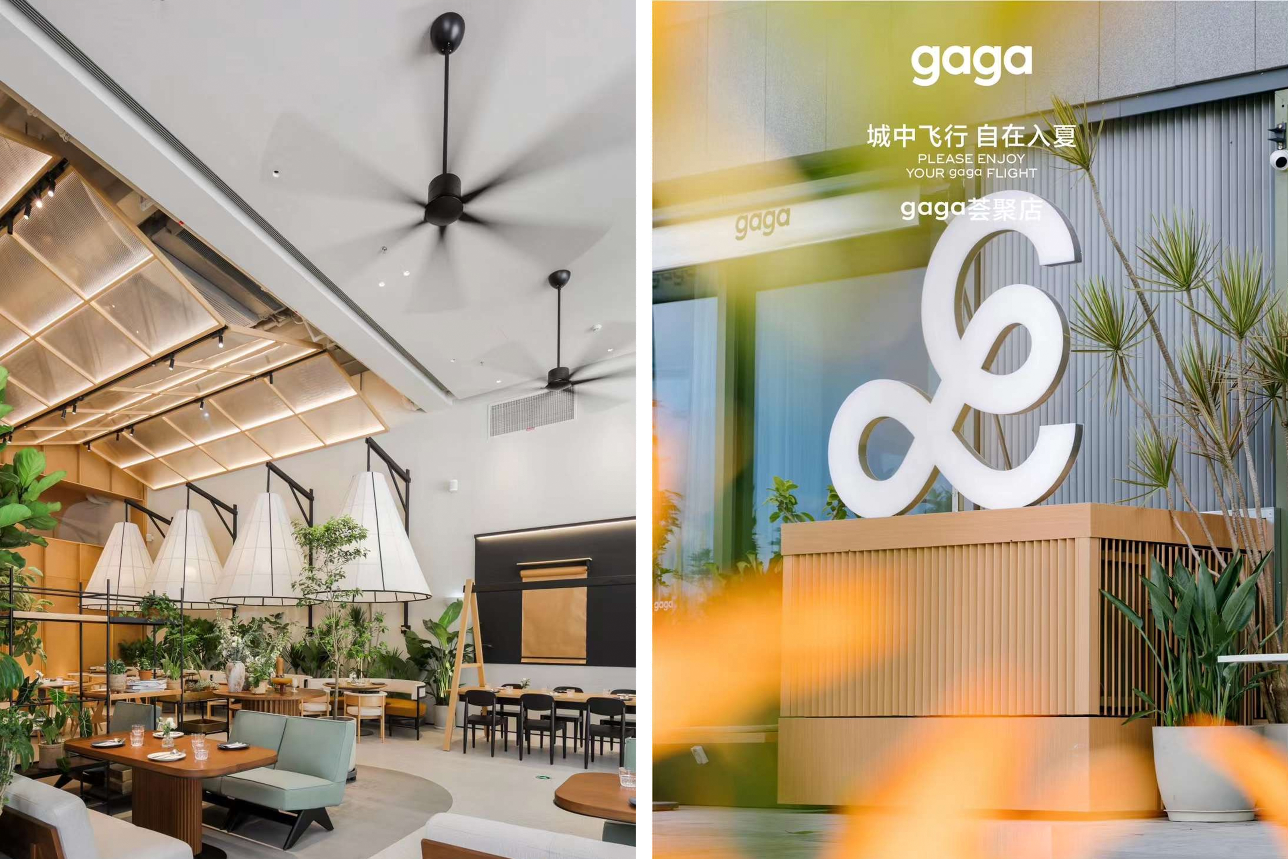
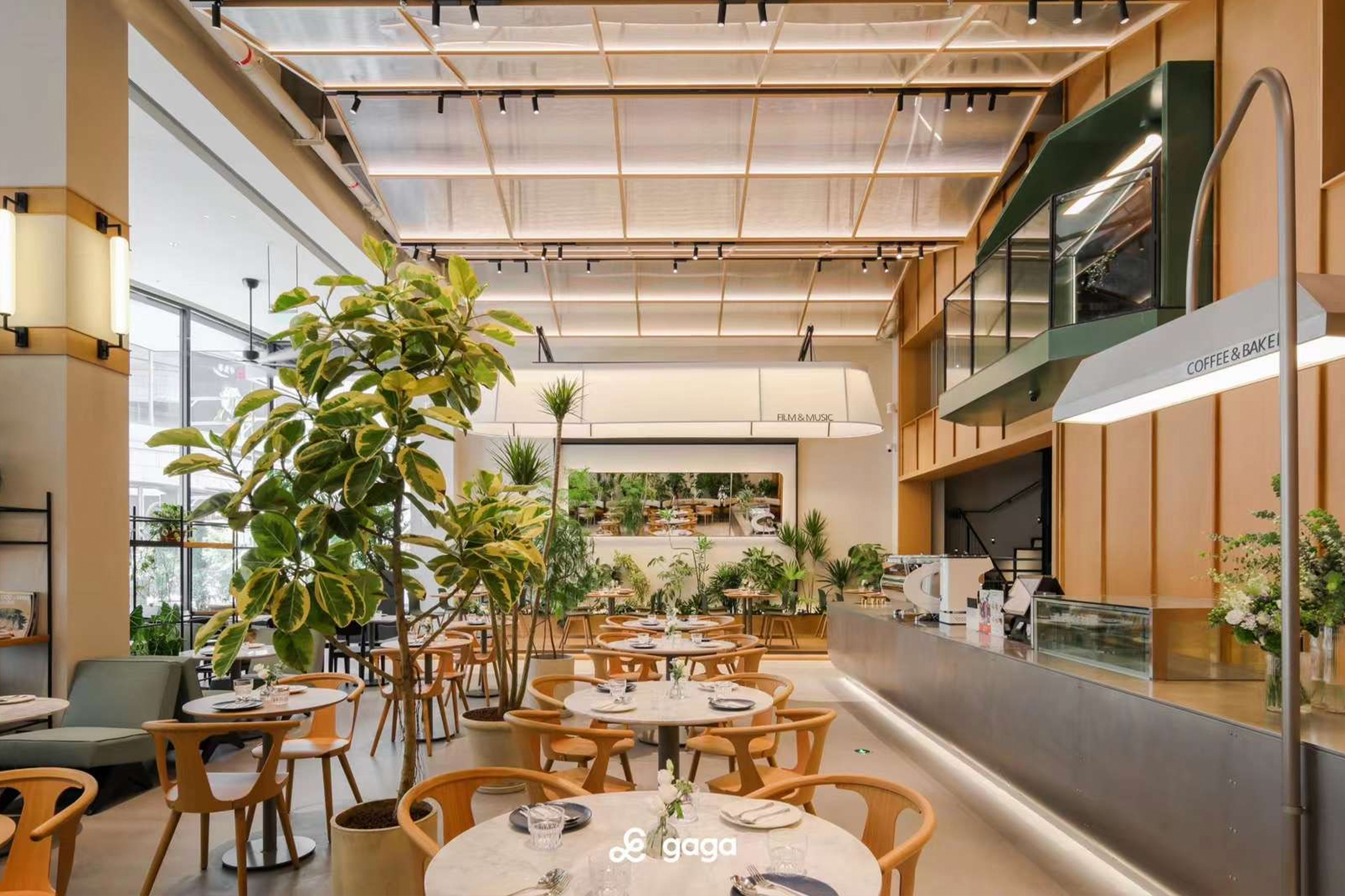
Chain restaurants face fierce competition, especially during the current global epidemic. Despite this, Gaga has managed to stand out from the competition with hundreds of successful stores in China and a strong reputation among consumers. This success is largely due to Gaga's relaxed and happy brand image, inspired by the founder's daughter, after whom the restaurant is named. The name Gaga embodies a mother's hope for her child to be warm, friendly, and family-oriented.
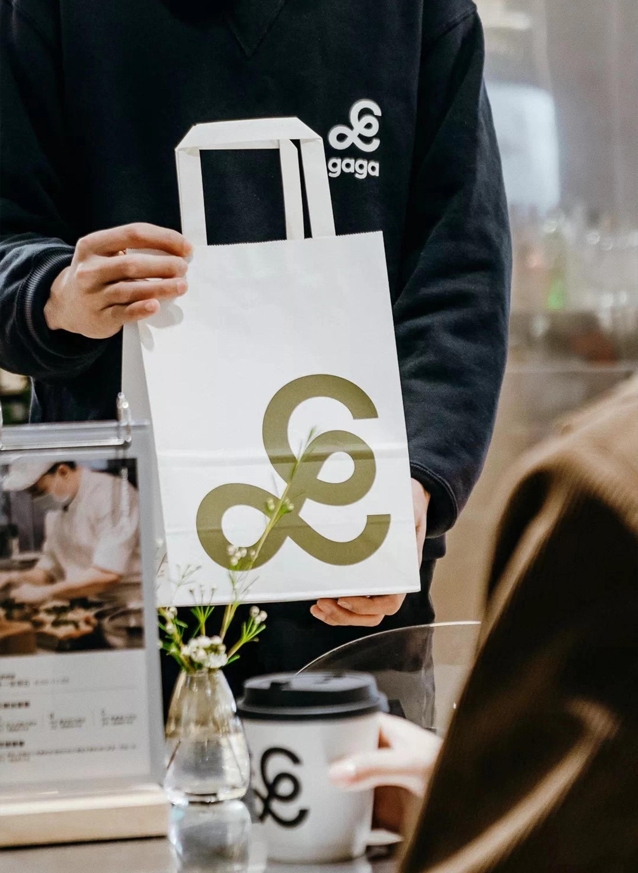
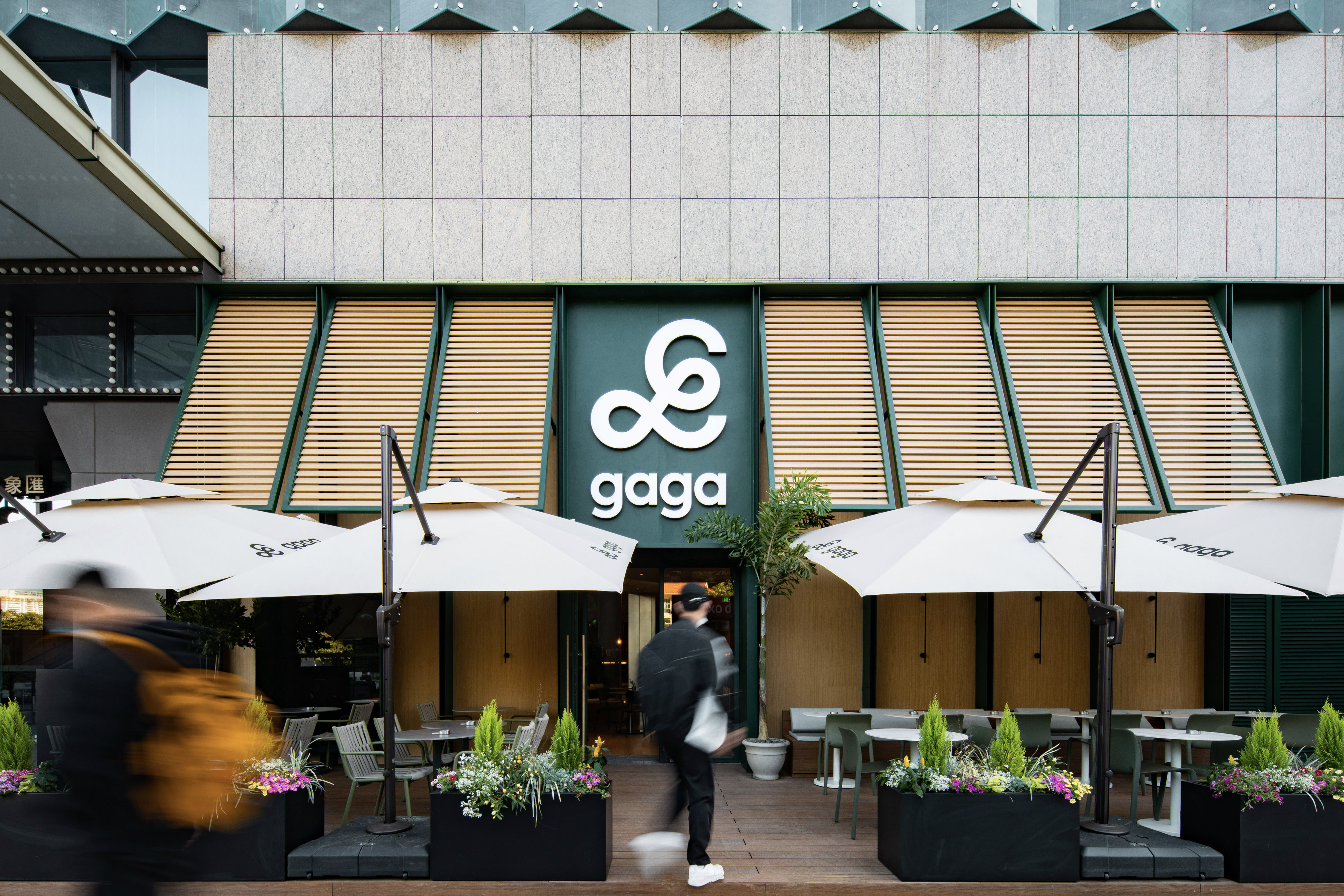
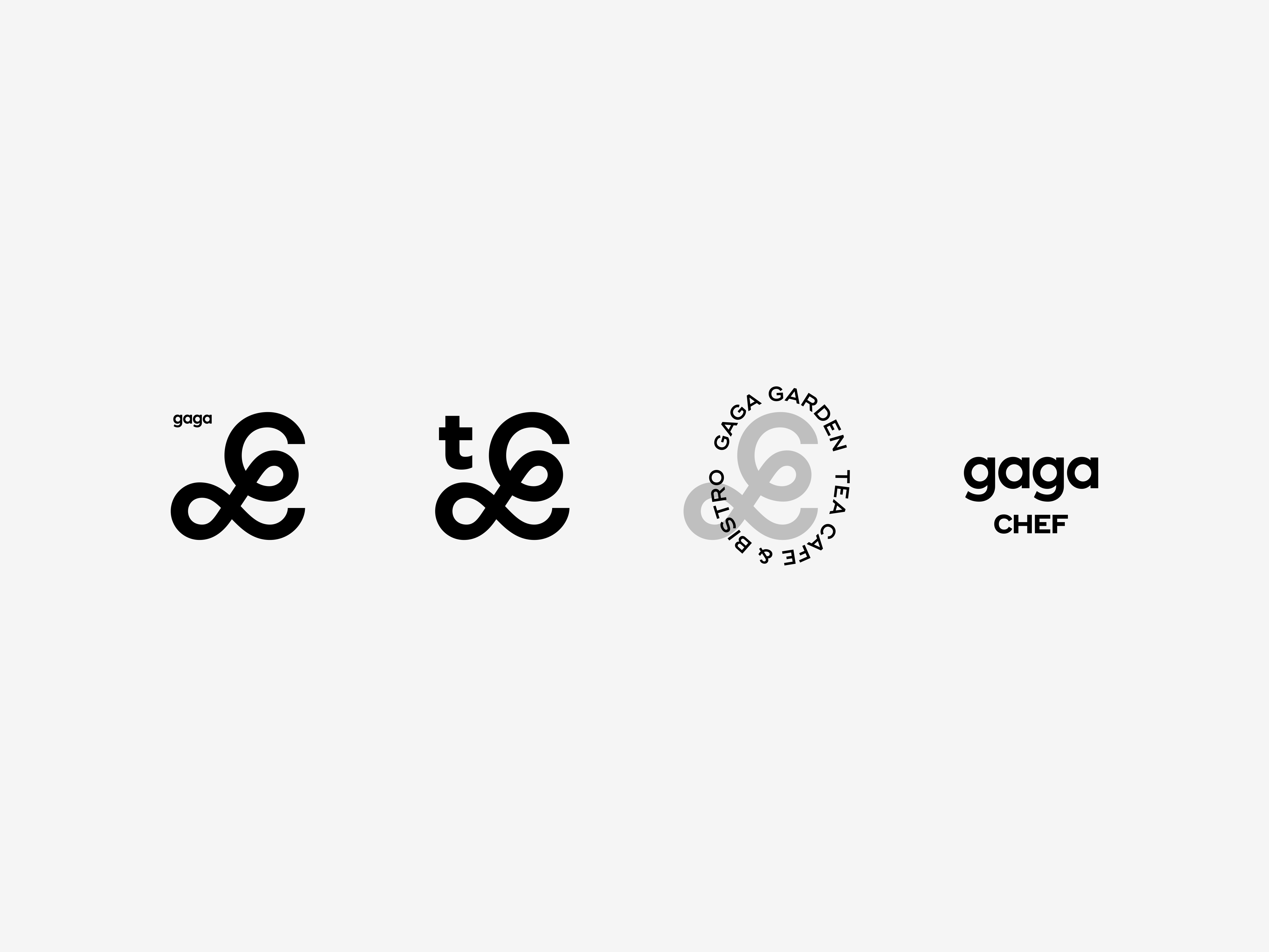
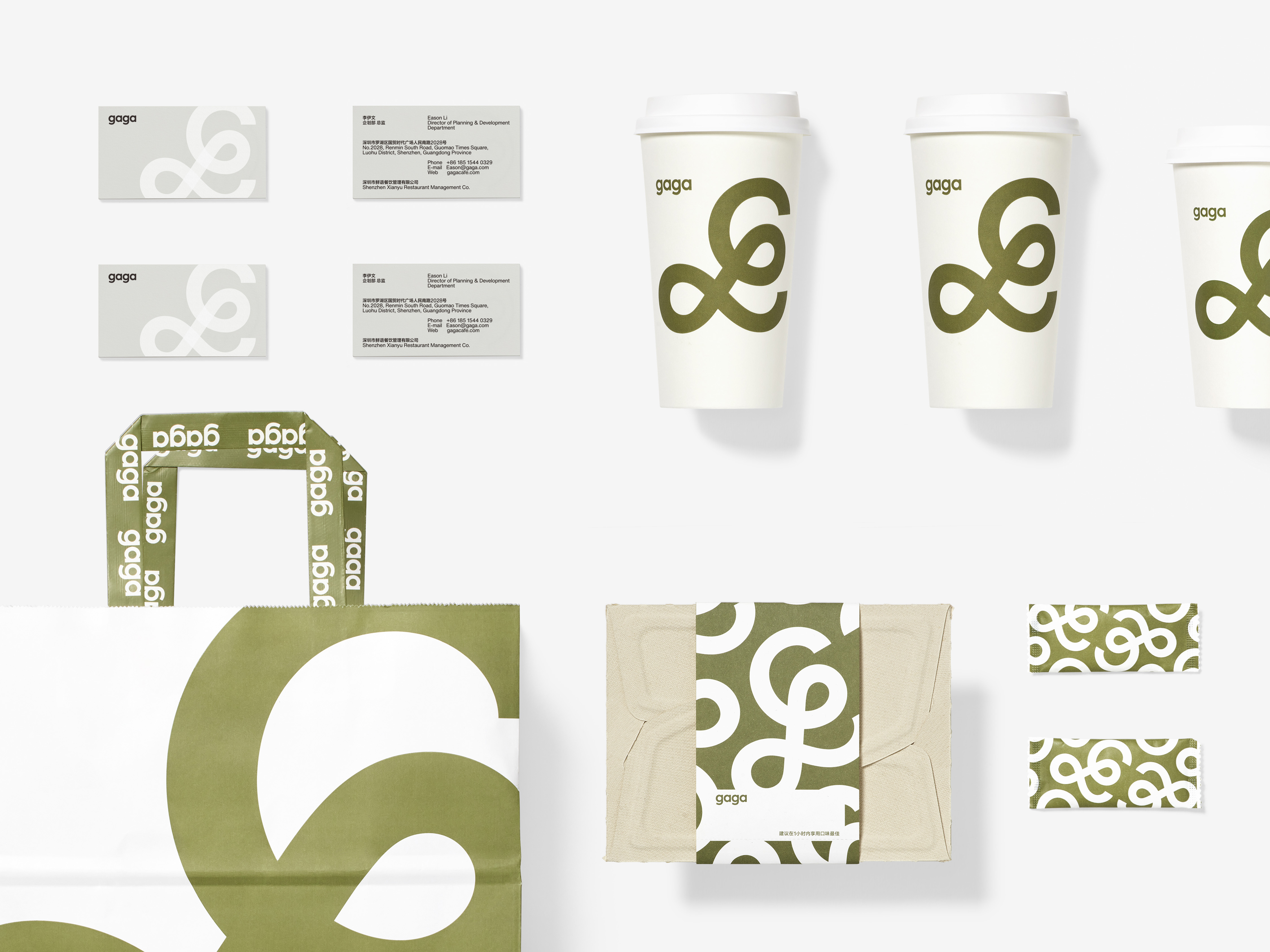
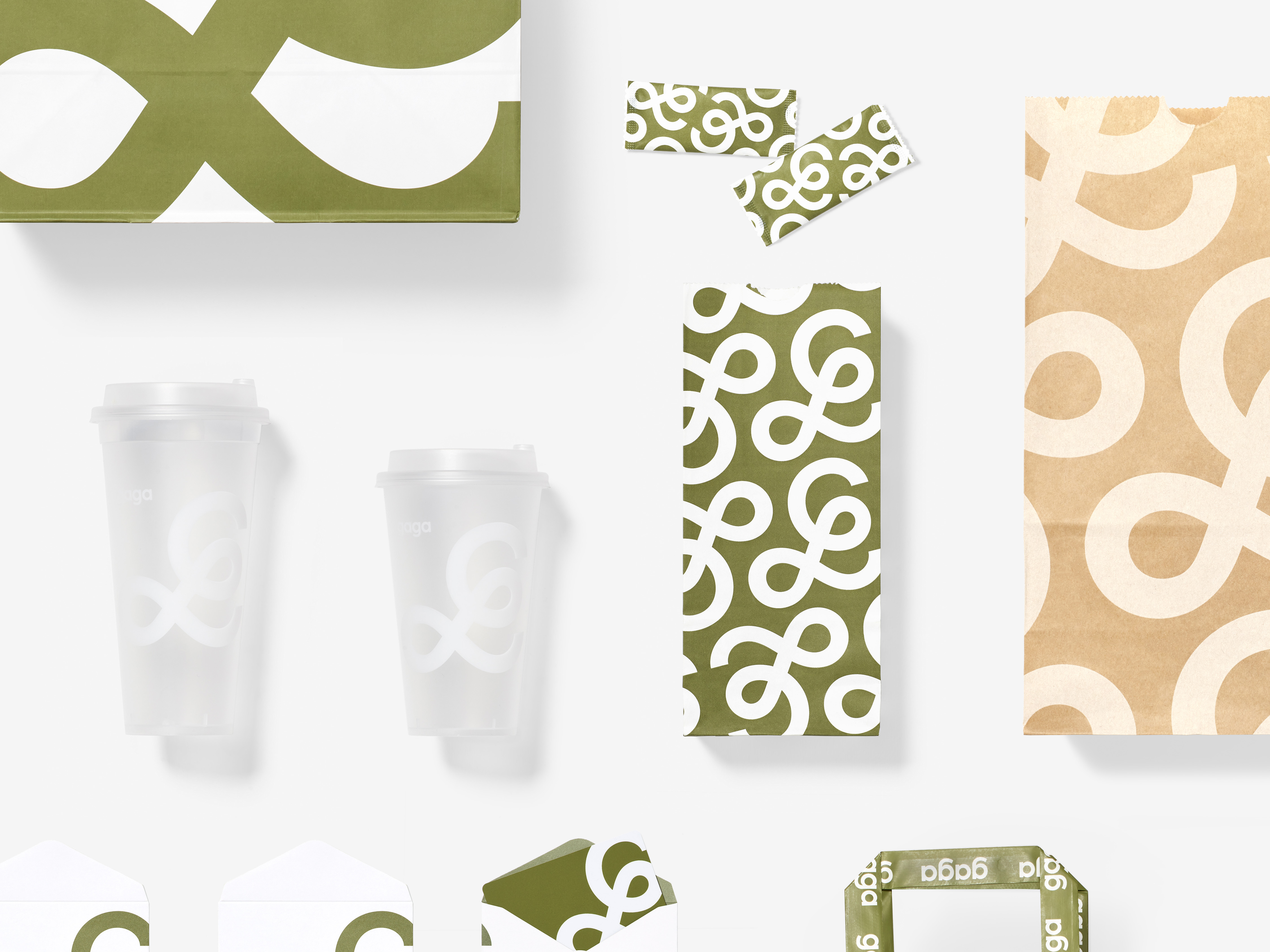
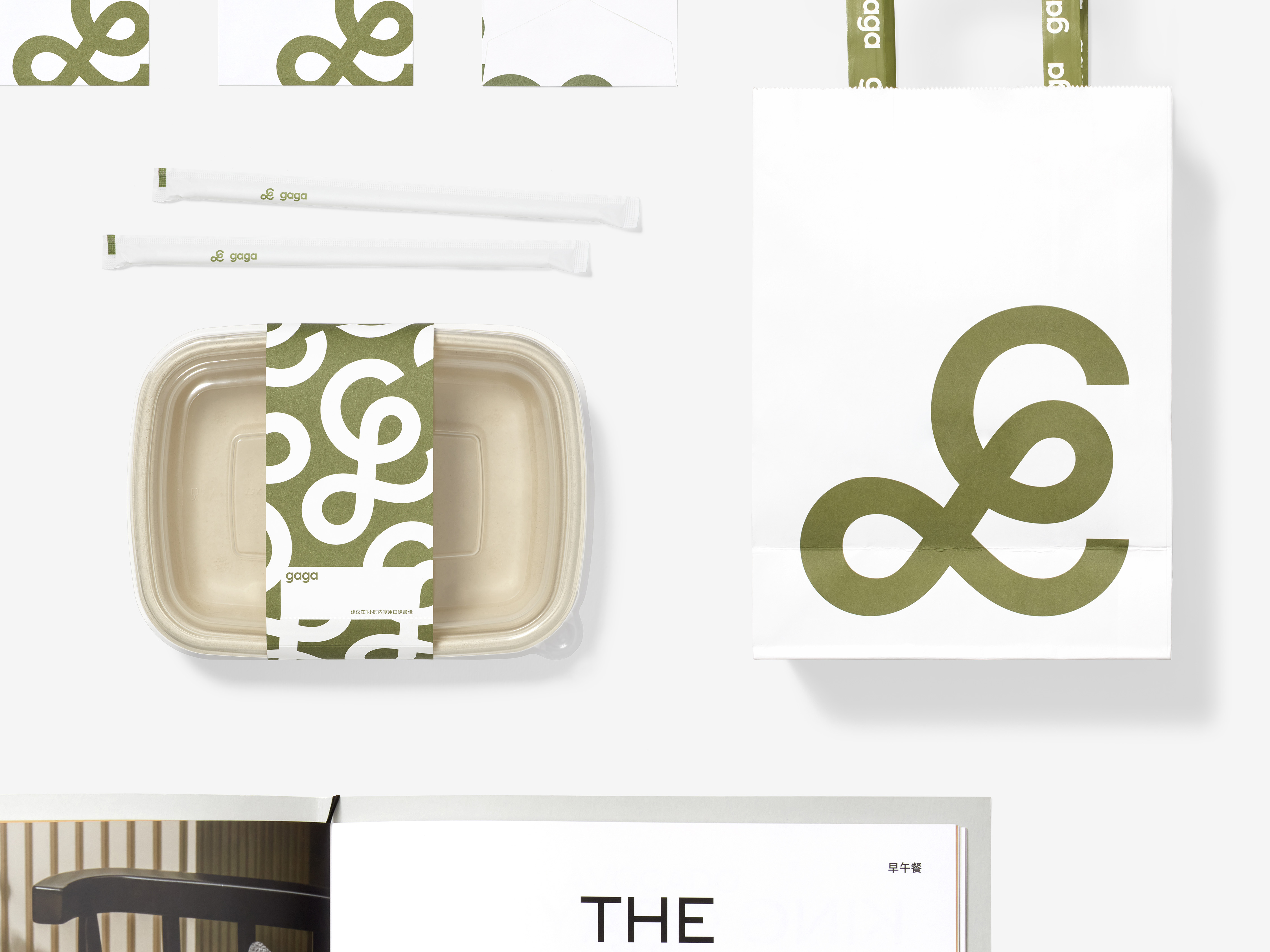
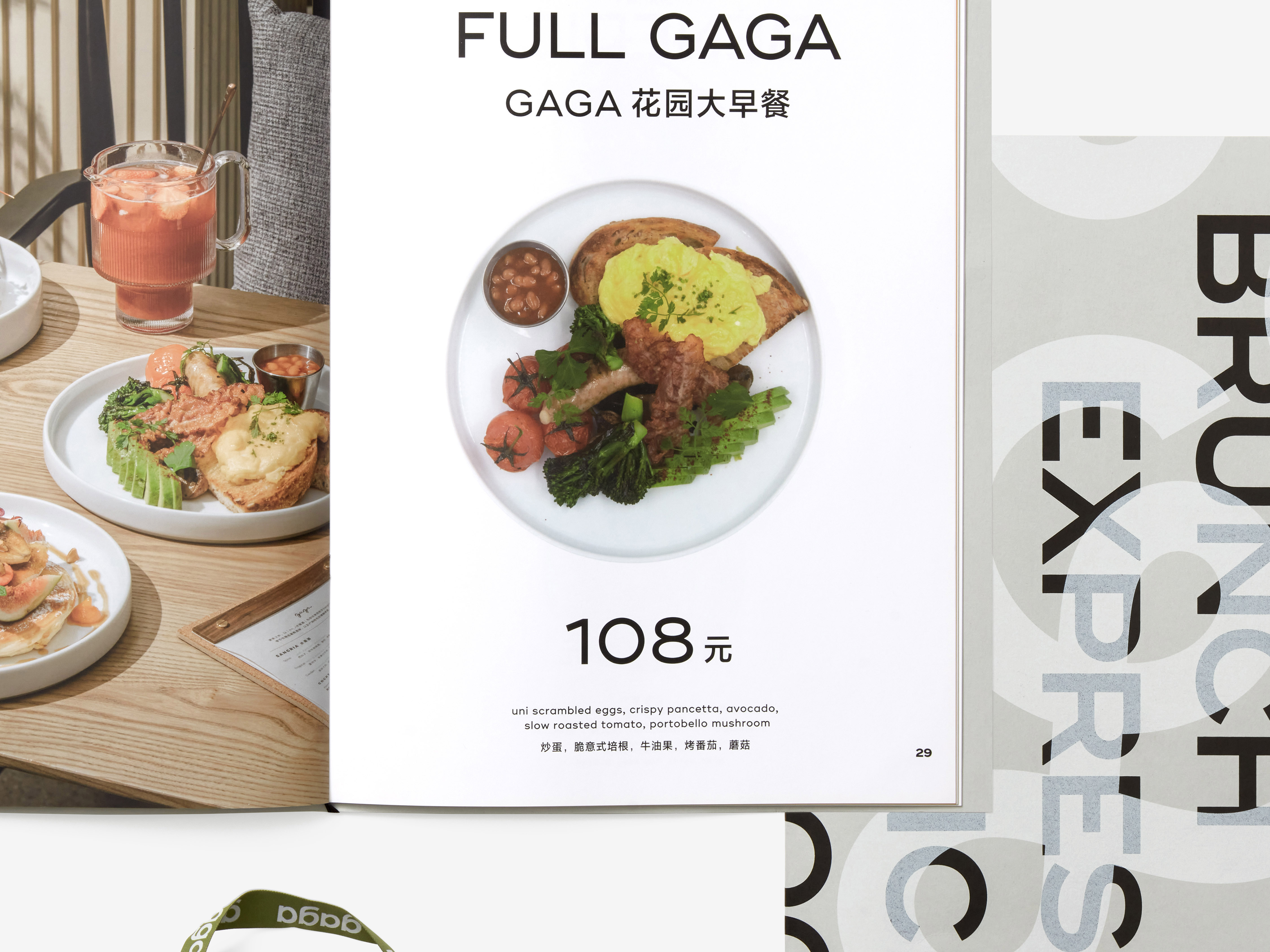
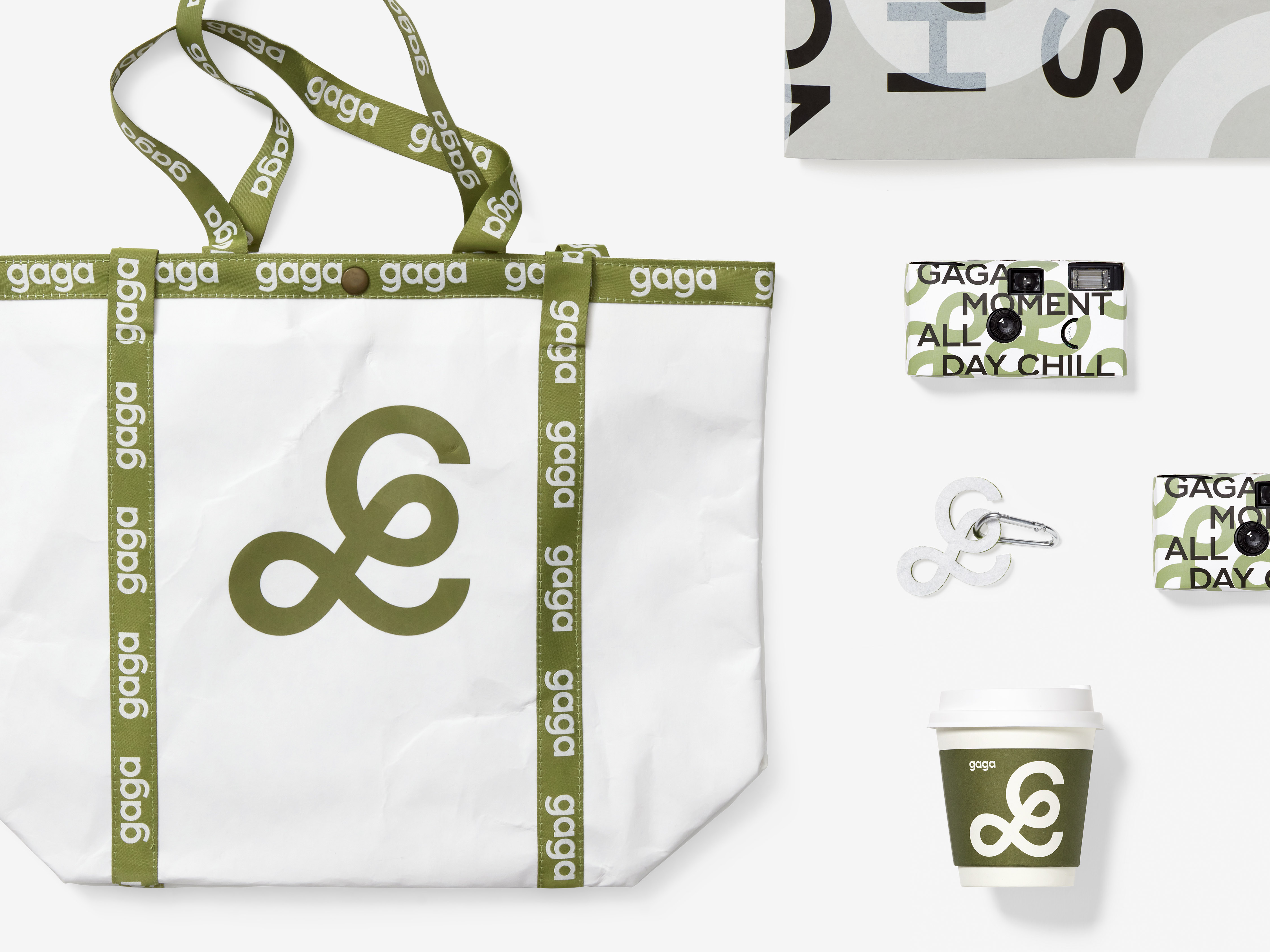
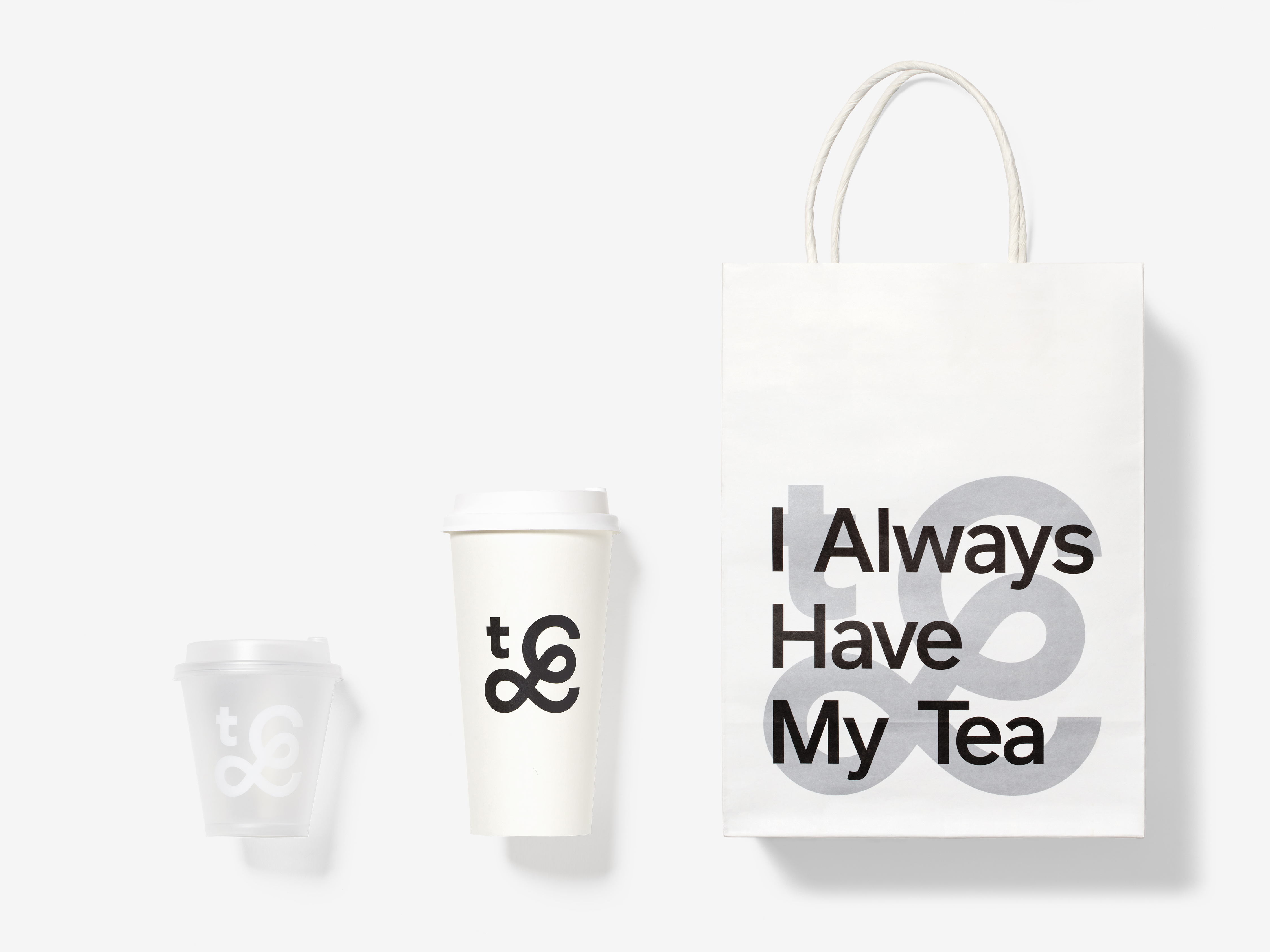
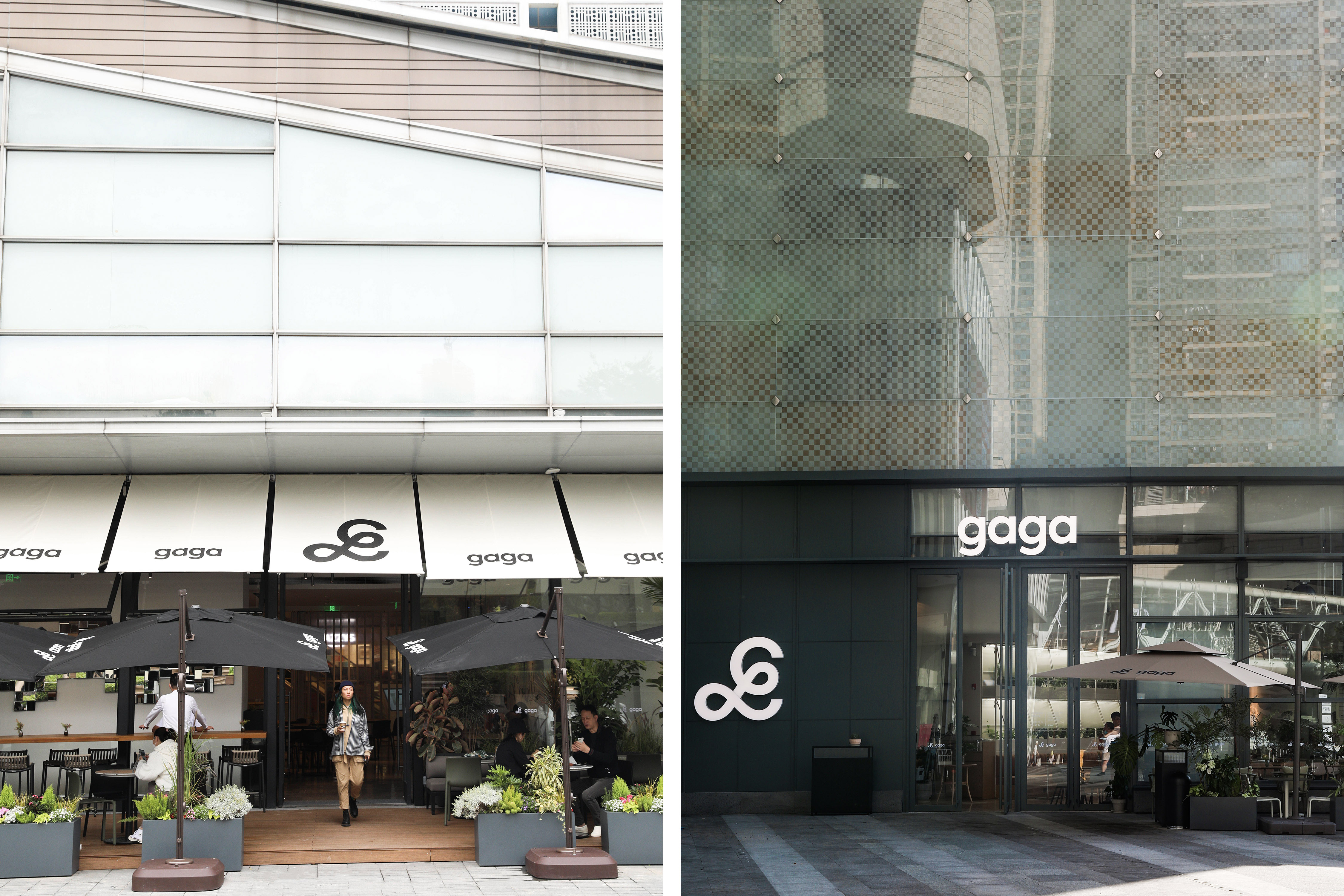
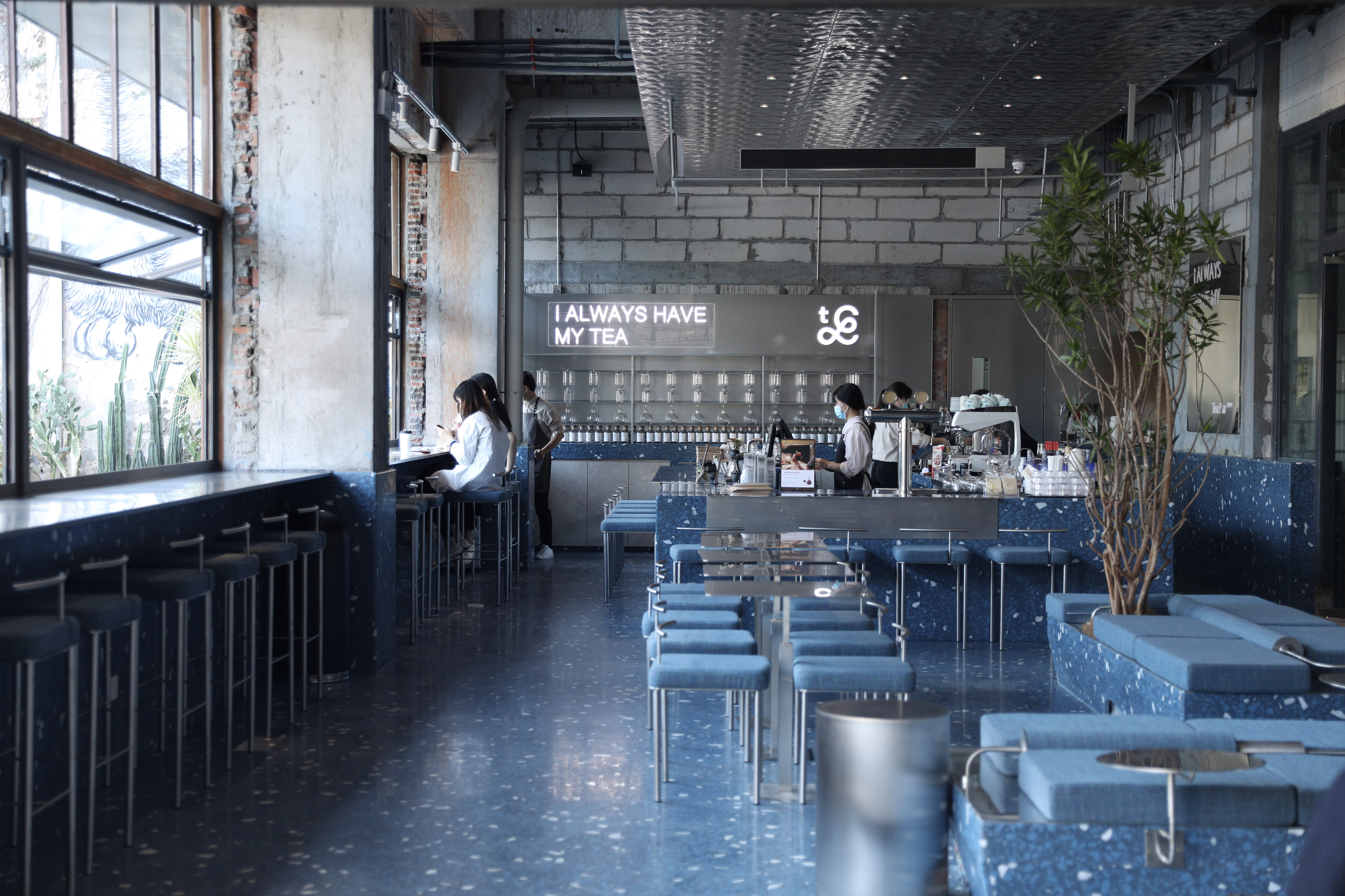
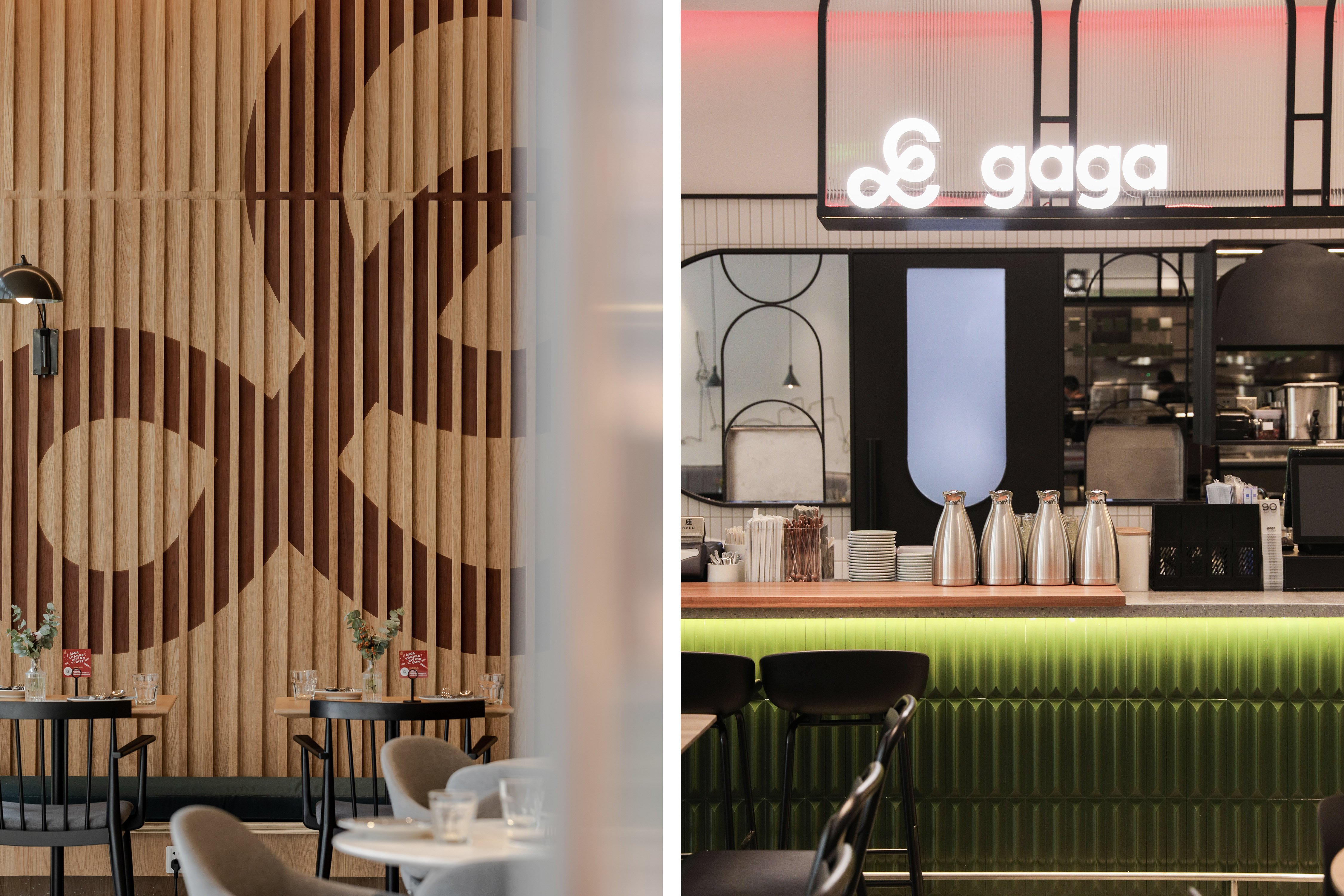
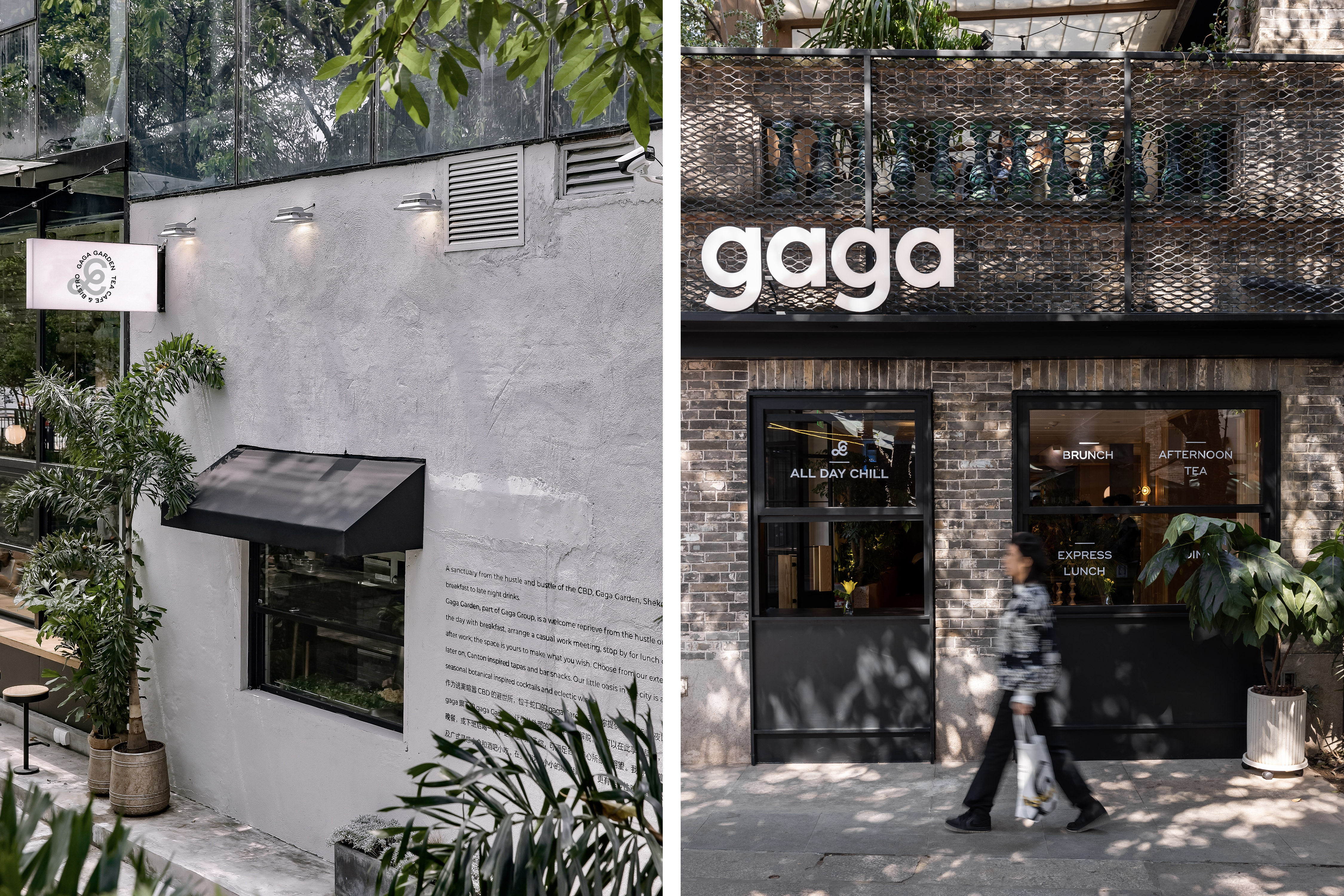
Gaga's mission is to provide consumers with not only delicious food and a quality environment but also a lifestyle that combines companionship, growth, and happiness. As we worked on rebranding the company, we discovered a warmth flowing through the Gaga team that comes from their love of life - a pure, slow, determined, and elegant attitude that we sought to convey through the redesigned logo. The new logo comprises two parts: the symbol and the logotype. The symbol, derived from the handwritten Latin letter 'g', is romantic, sprawling, and modern, reflecting the story of the founder's daughter writing her name, Gaga. We retained the meaning of this beautiful story and gave it a new, gentle, and dignified character, using a modern twist. The symbol is versatile and can be scaled, tiled, cropped, or overlaid with text for different sub-brands like Gaga Garden, Gaga Chef, and Gaga Tea Bar. It is the most significant element of Gaga's visual identity and embodies the restaurant's brand values of warmth, friendliness, and modernity.
ART DIRECTOR: Nod Young / Guang Yu
DESIGNER: Liao Liao
YEAR: 2020
CLIENT: gaga