Daisy Sky
Simple, Pure & Romantic
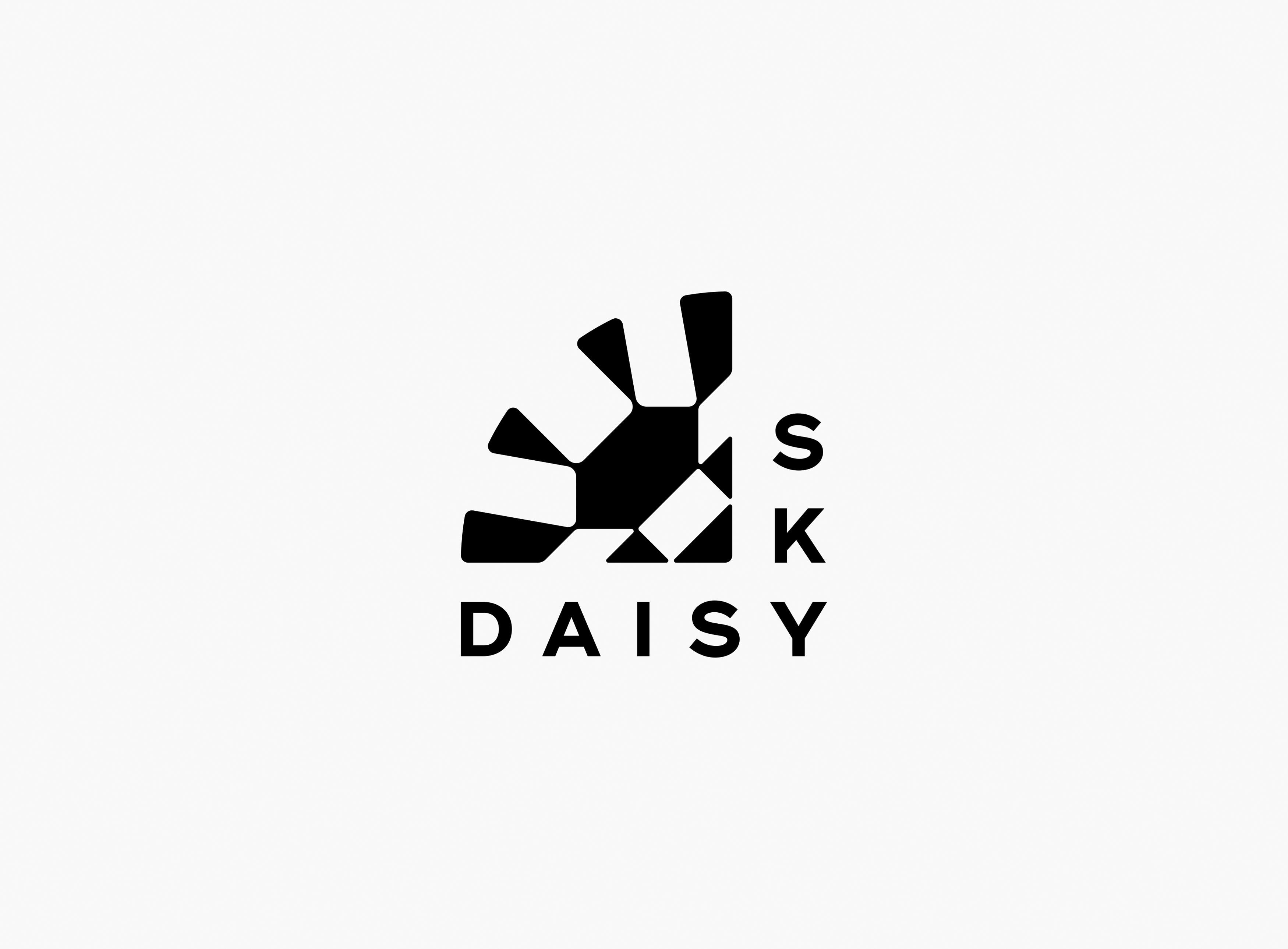
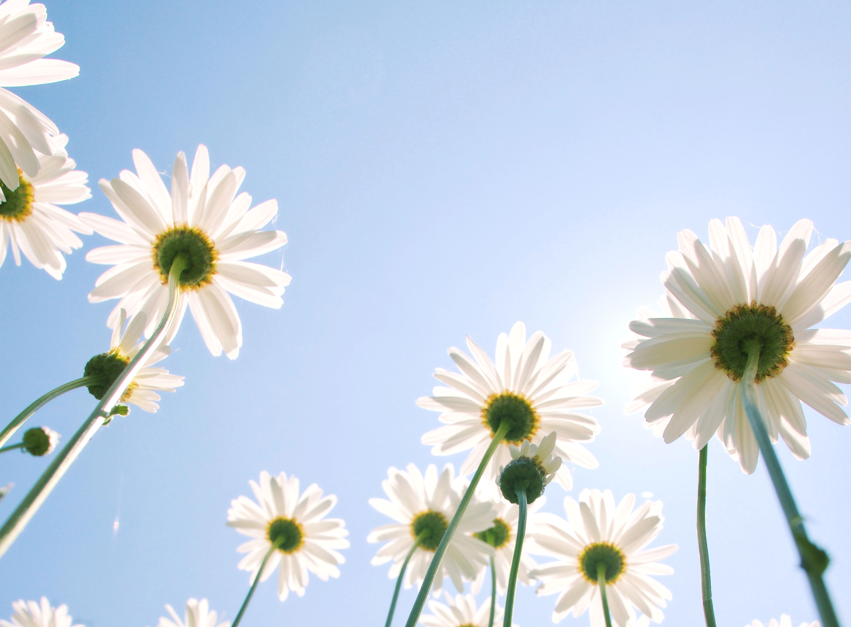
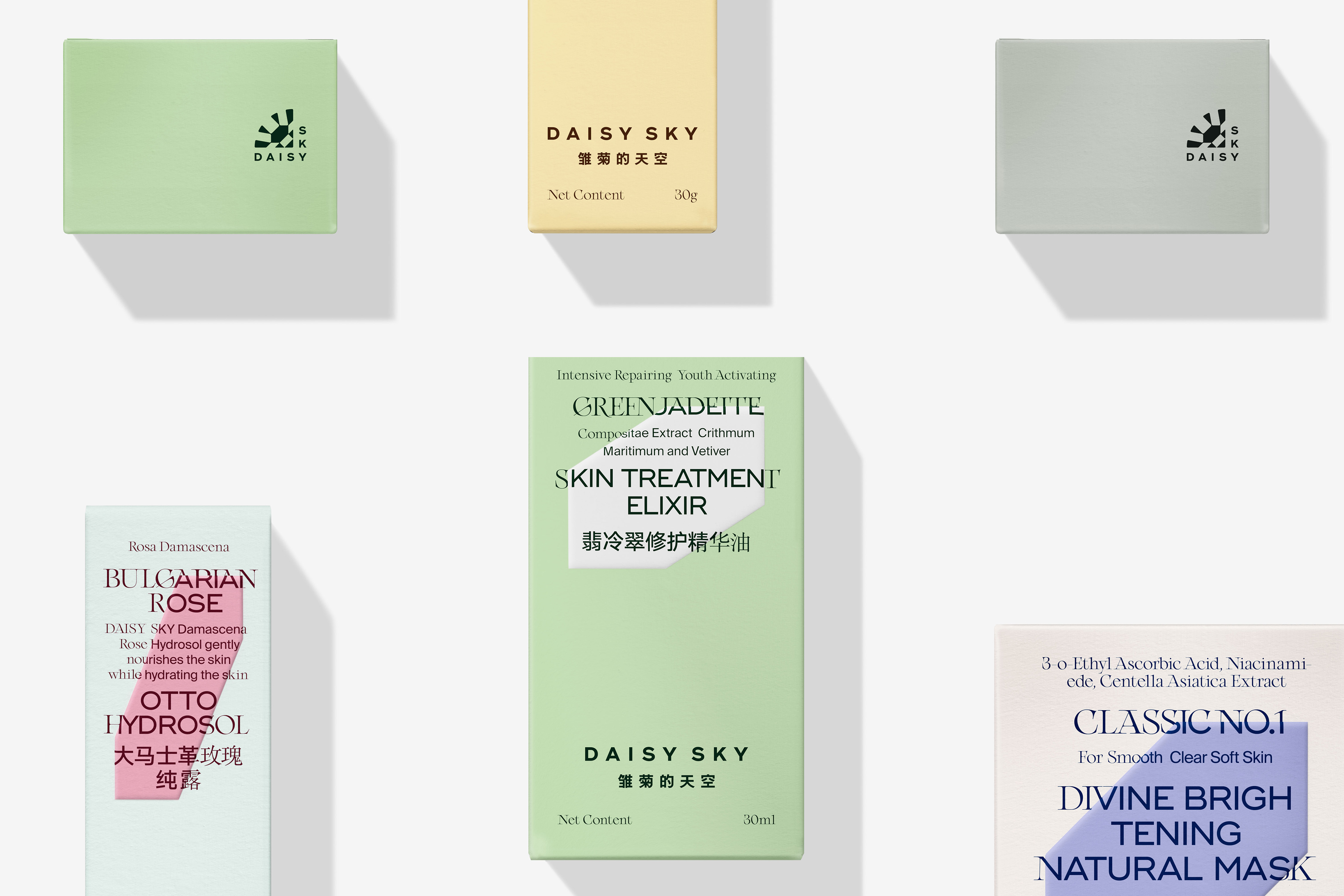
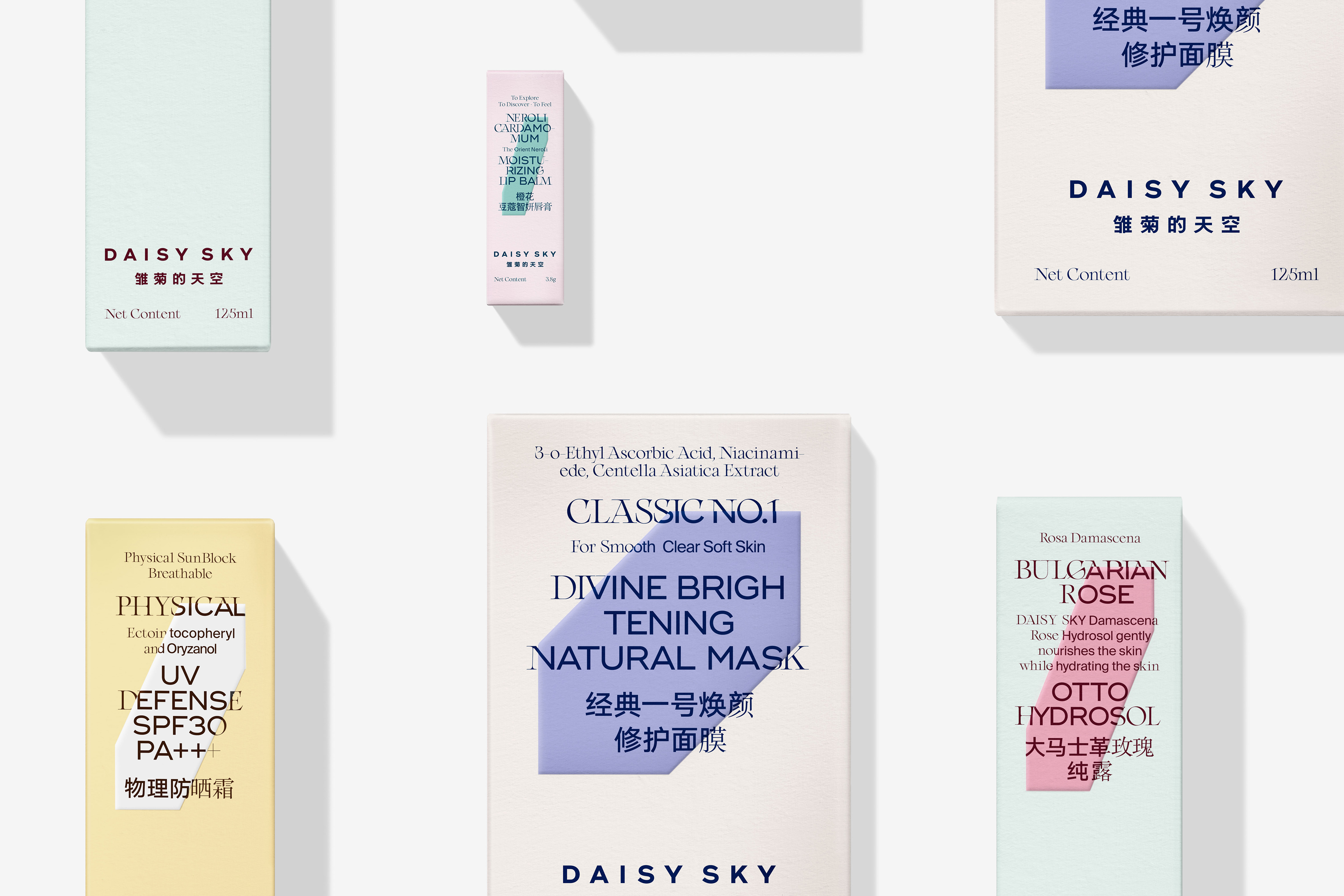
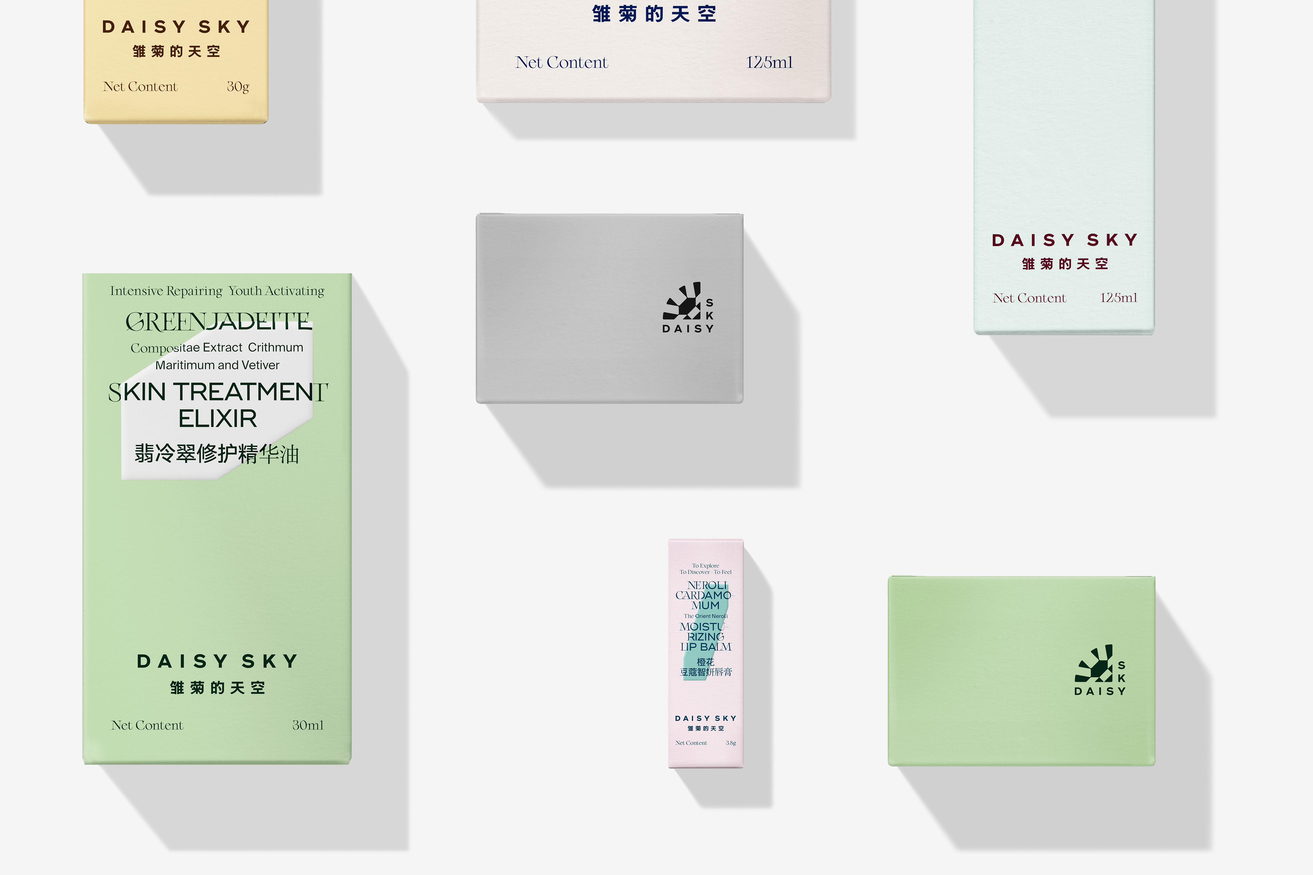
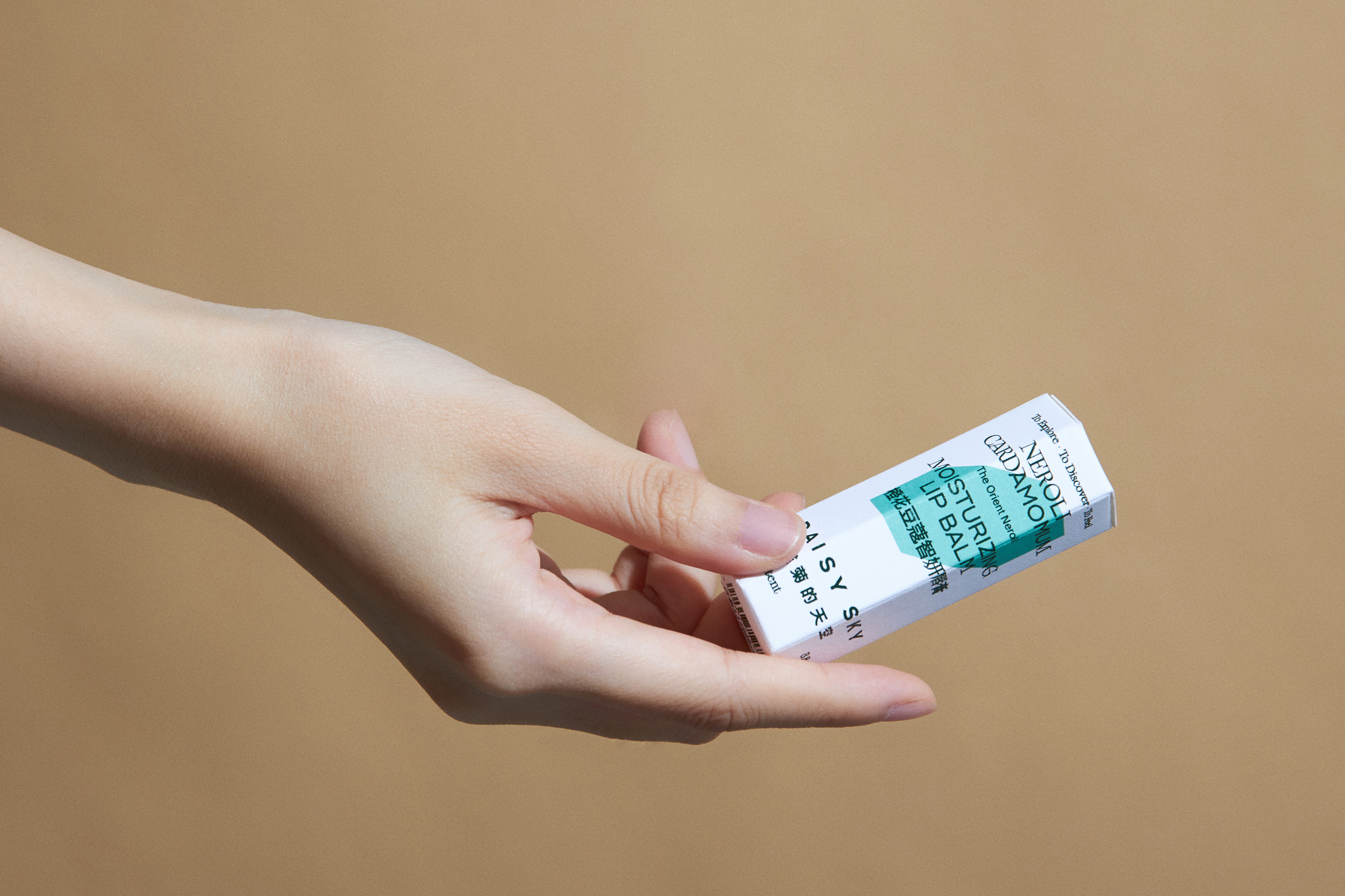
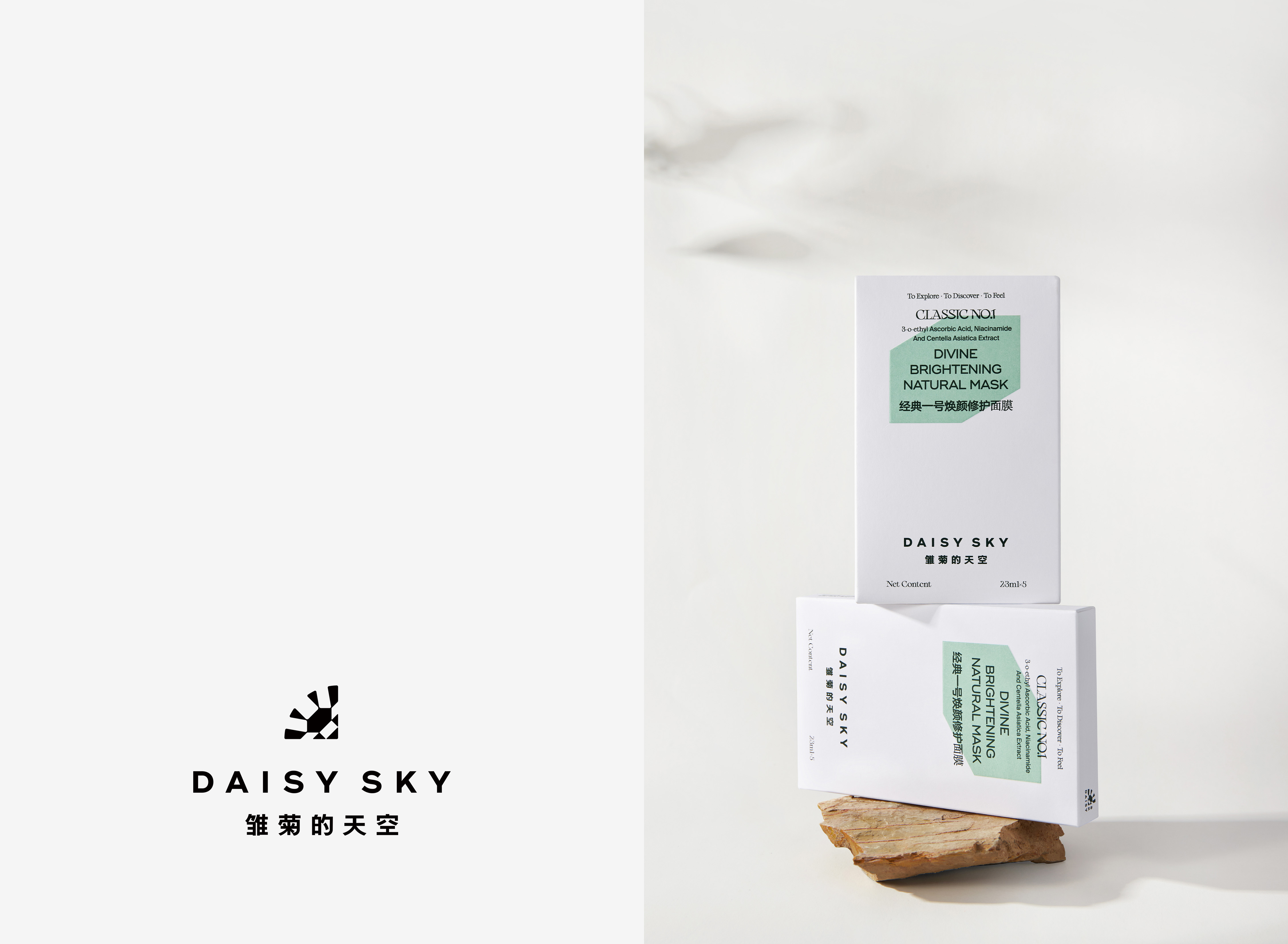
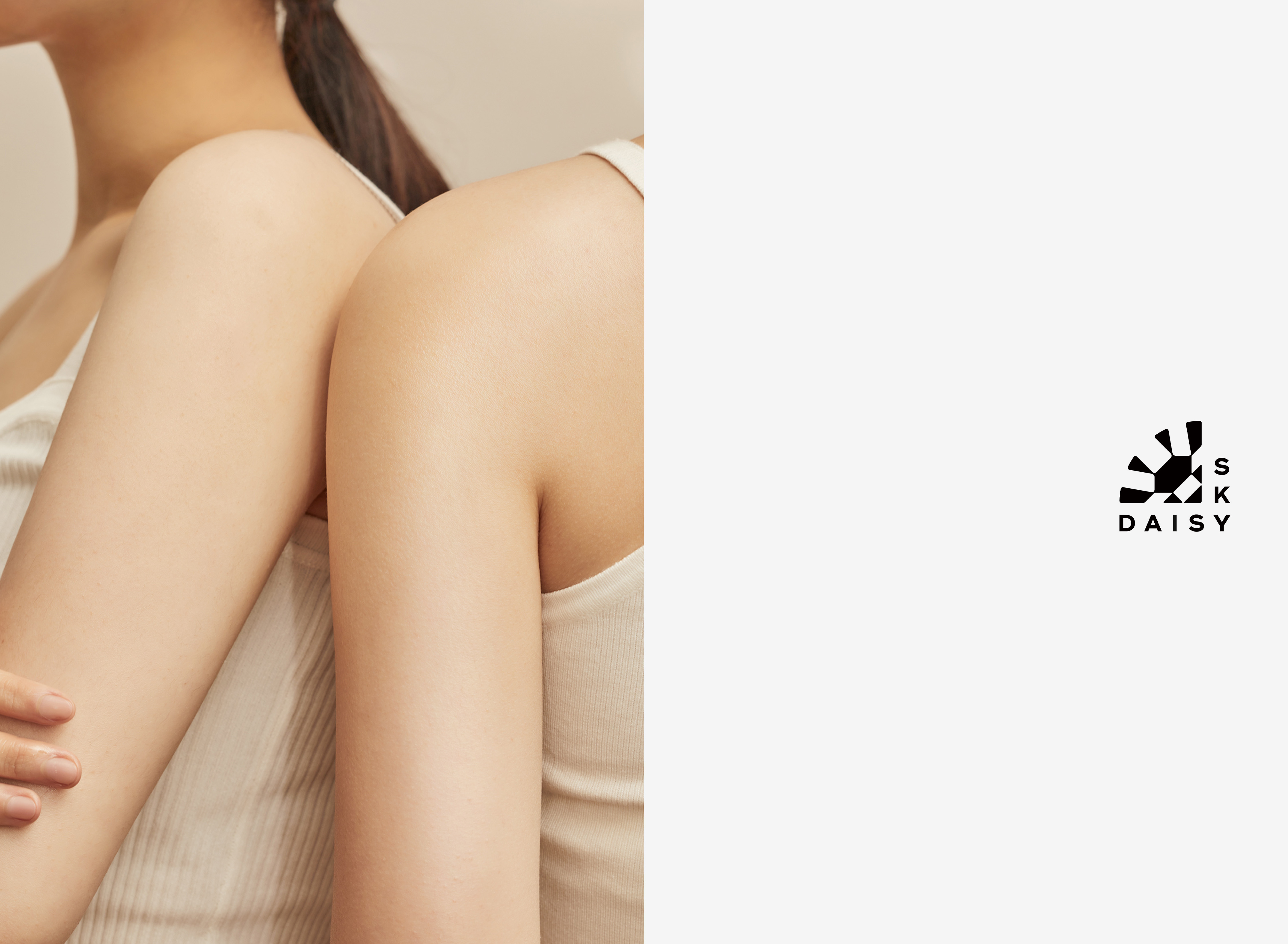
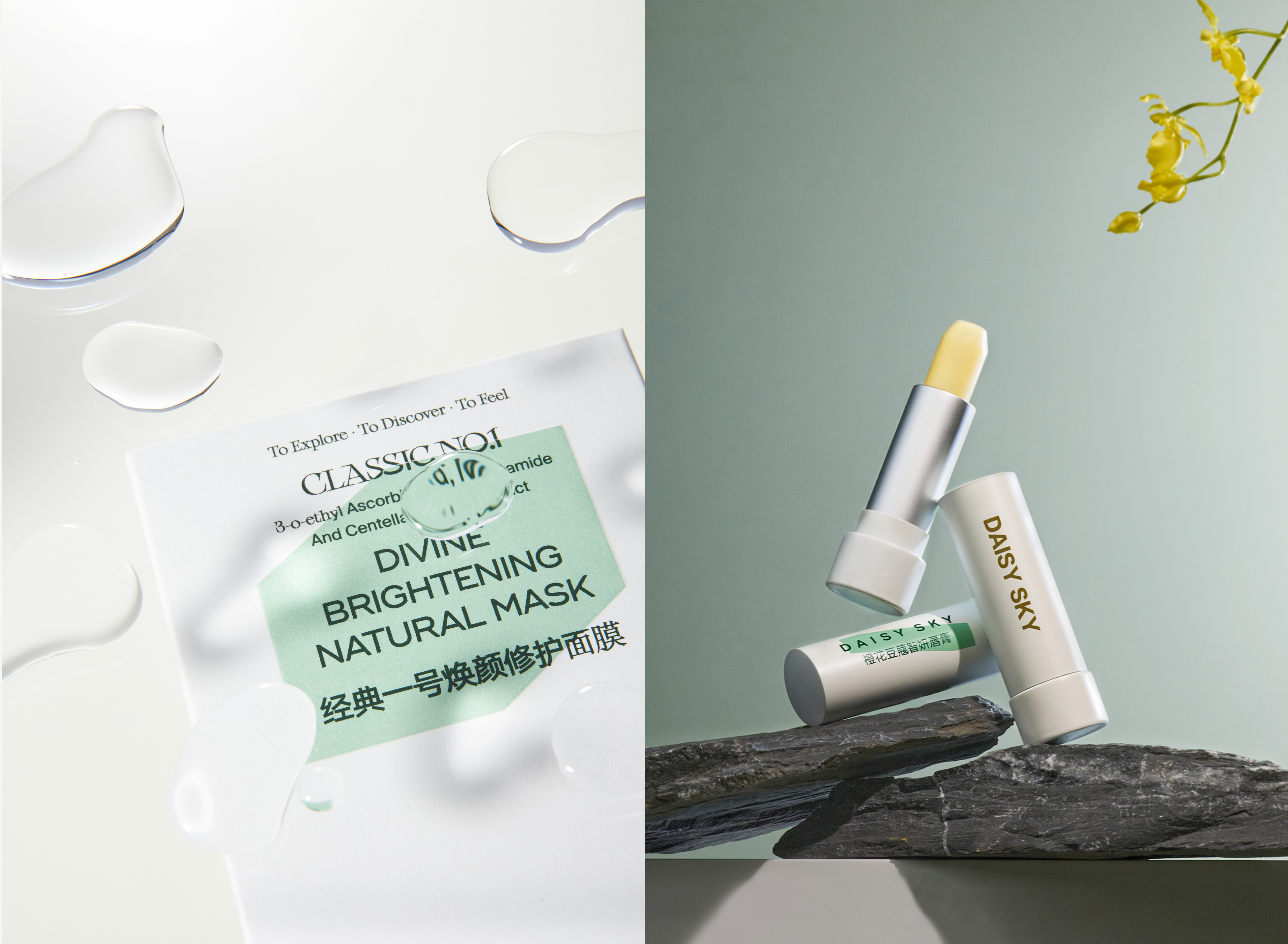
Daisy Sky is a beautiful, dreamy, natural and clear name. Its products are as simple, pure and romantic as the name suggests. The daisy is a small, short flower that blooms all over the hills and fields, whose petals are so numerous and dense that very few people pay attention to its shape. We focused on the petals of daisy, enlarging and simplifying them into a simple, variable crystal shape, which serves as the most basic and central element of Daisy Sky's identity. In our opinion, the weakness of the daisy petals and the strength of the logo, just describe the unique brand attitude of the Daisy Sky. The logo is a quarter of a daisy flower, the reason for avoiding the conventional expression of a full flower shape is that we think the strong straight lines on both sides of the logo can better present the independent attitude of the brand, balancing the scales of romance and modernity, and amplifying the weak daisy into a naive and temperamental female spirit.
ART DIRECTOR: Guang Yu / Nod Young
DESIGNER: Han Lu / Wang Xiaoshuai
YEAR: 2021
CLIENT: Daisy Sky