CHOCDAY
Respect Tradition, Break Tradition
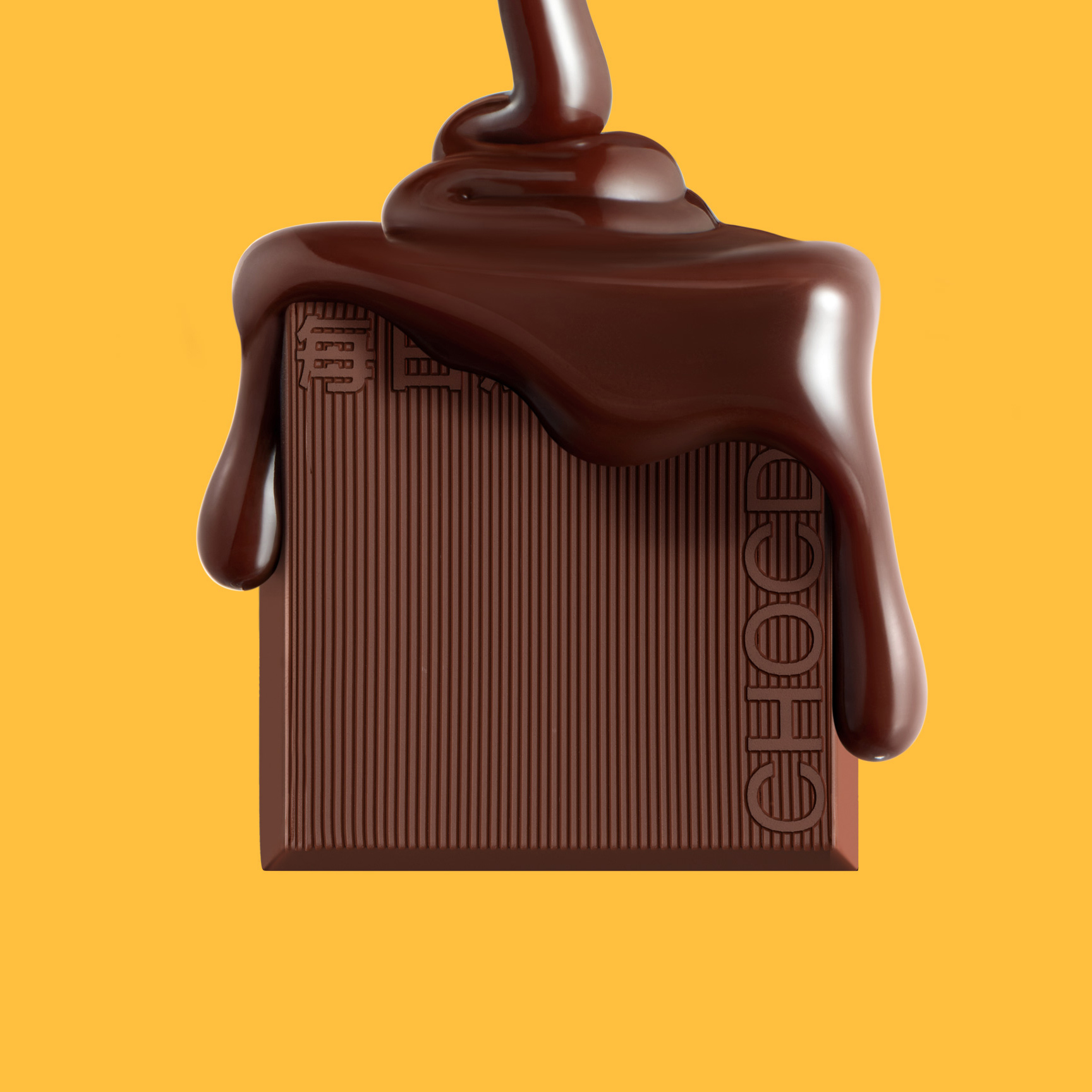
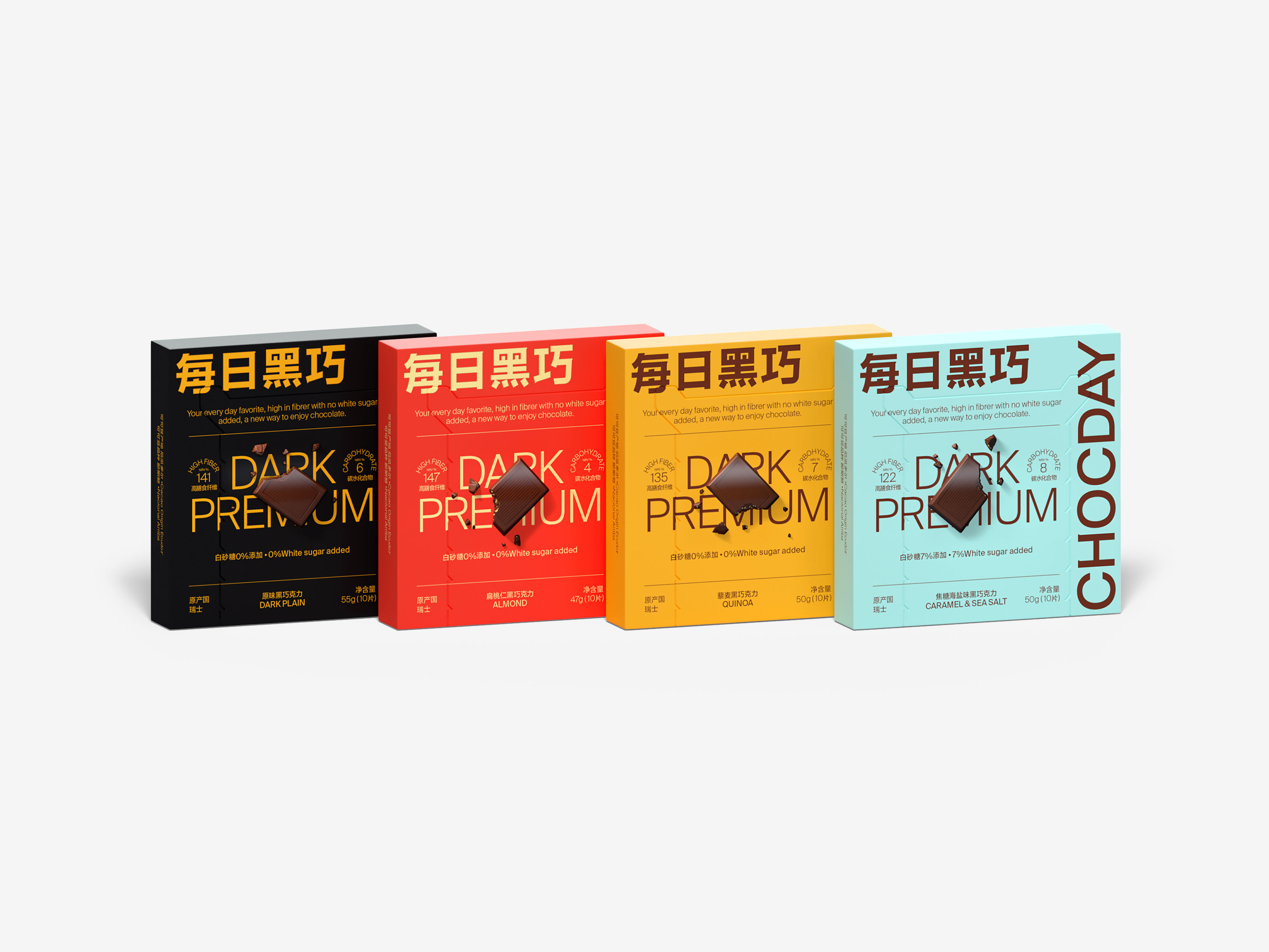
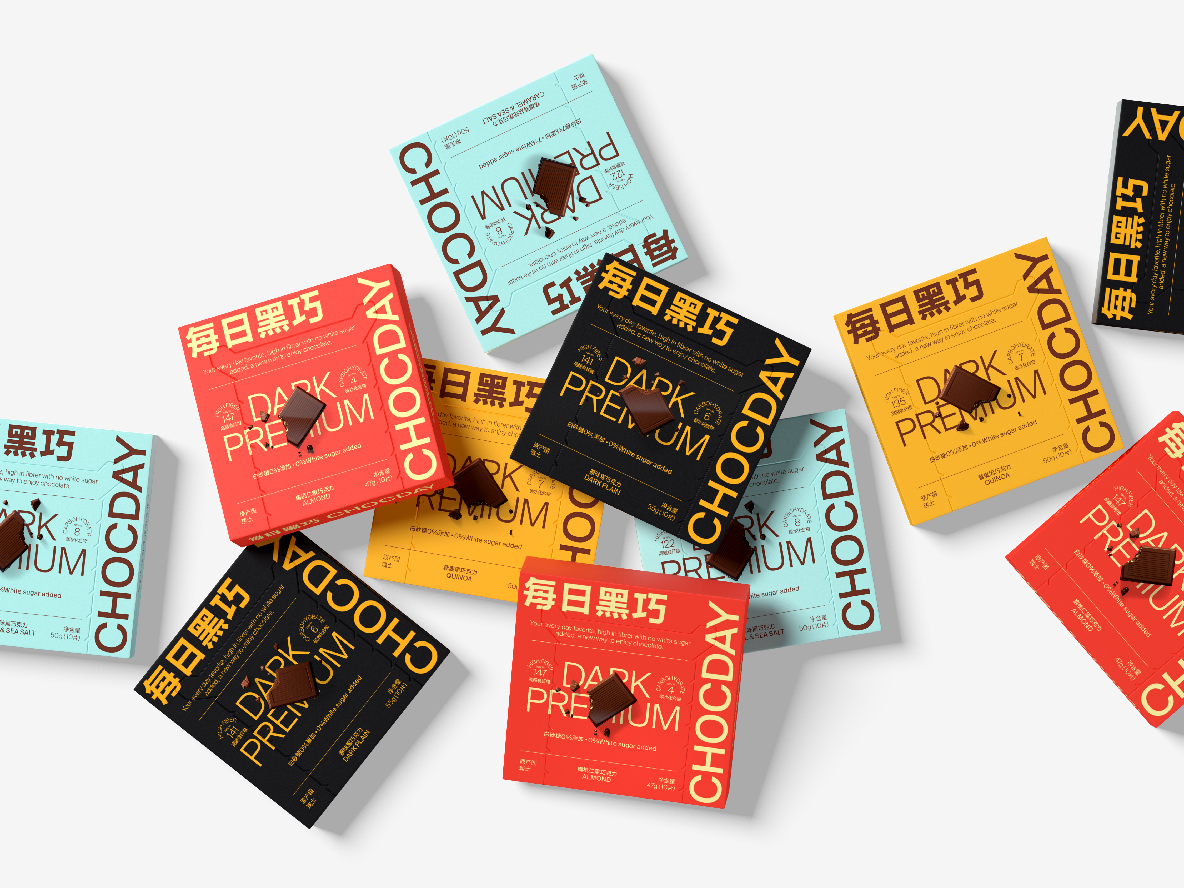
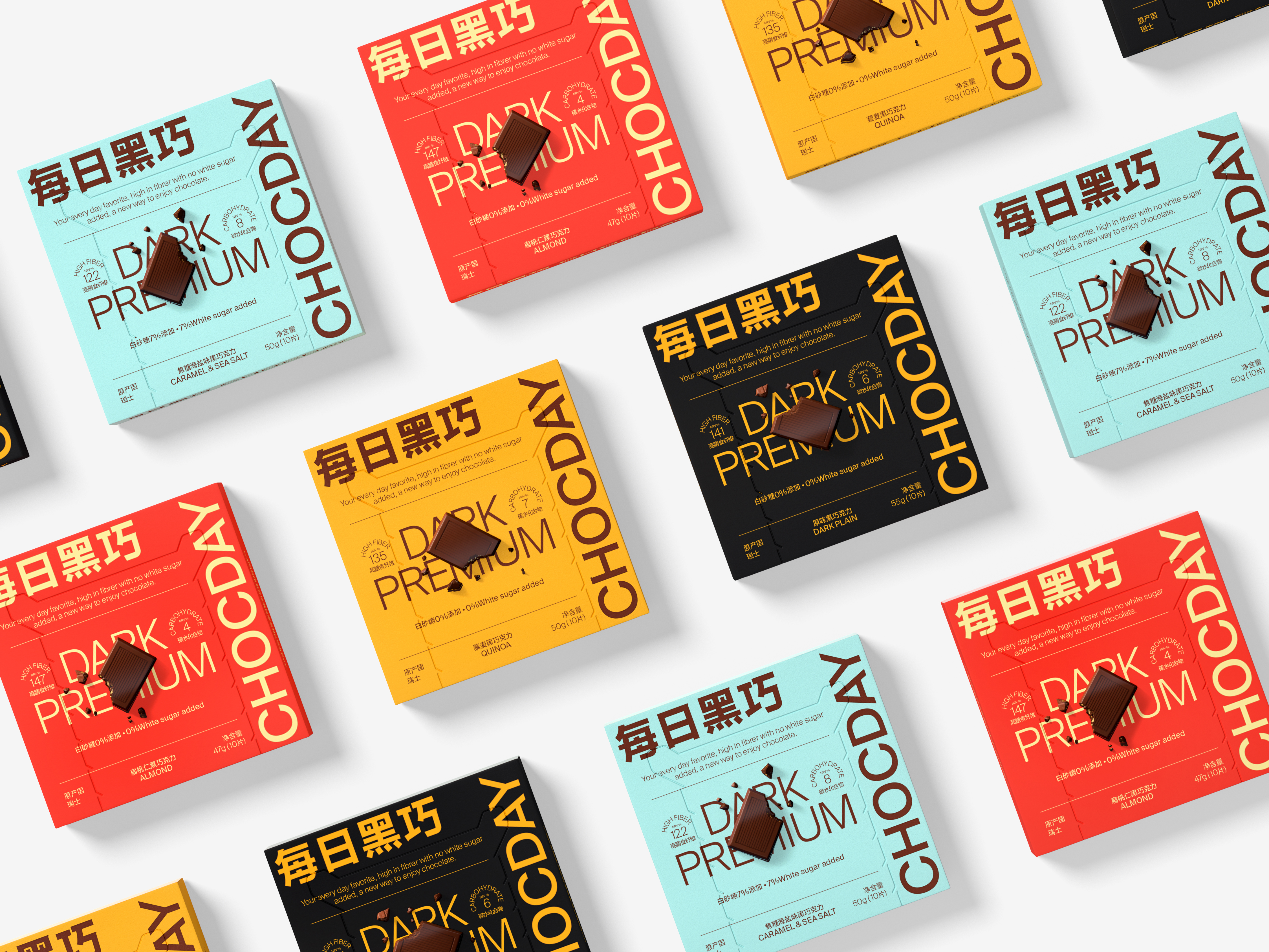
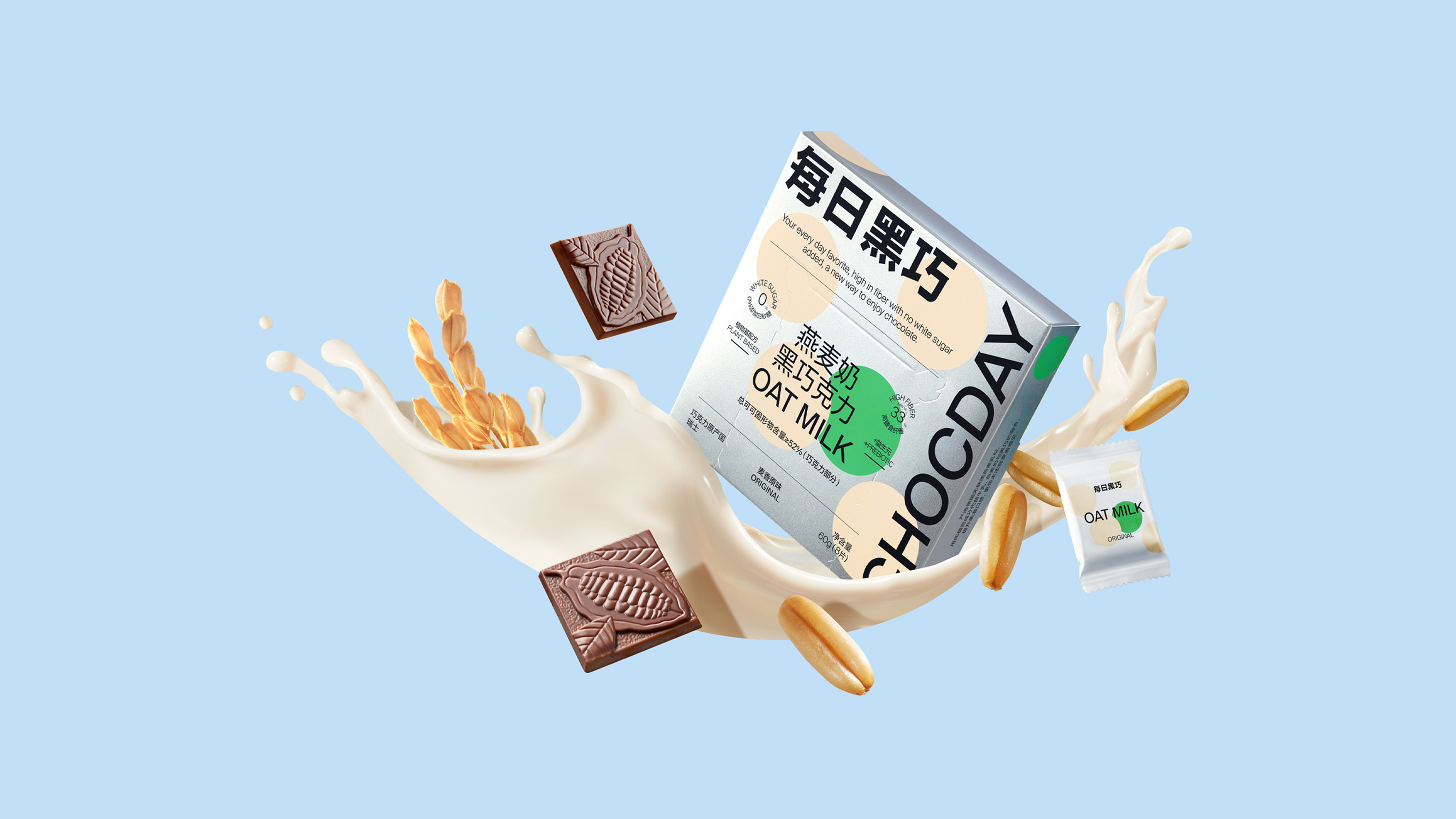
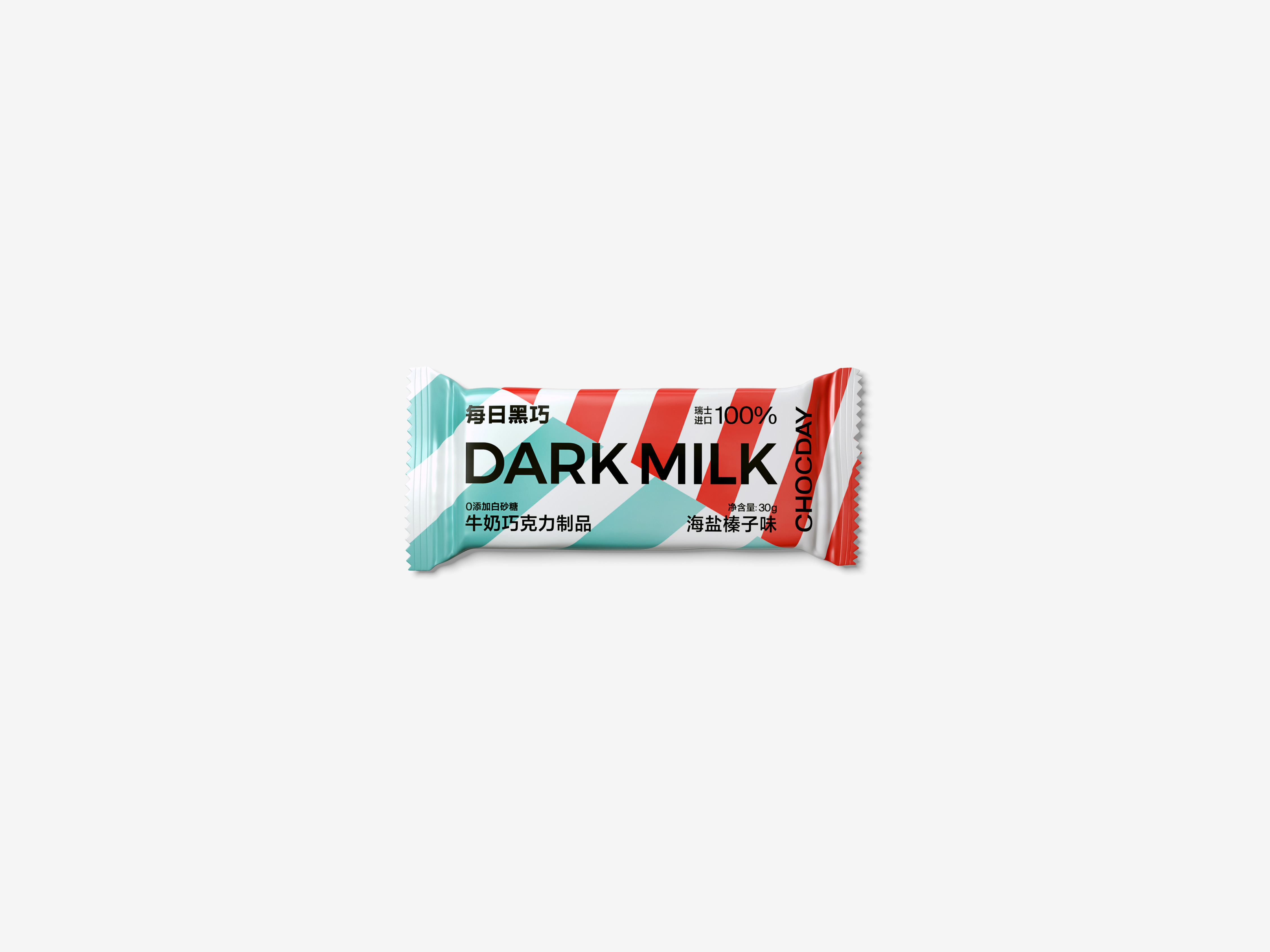
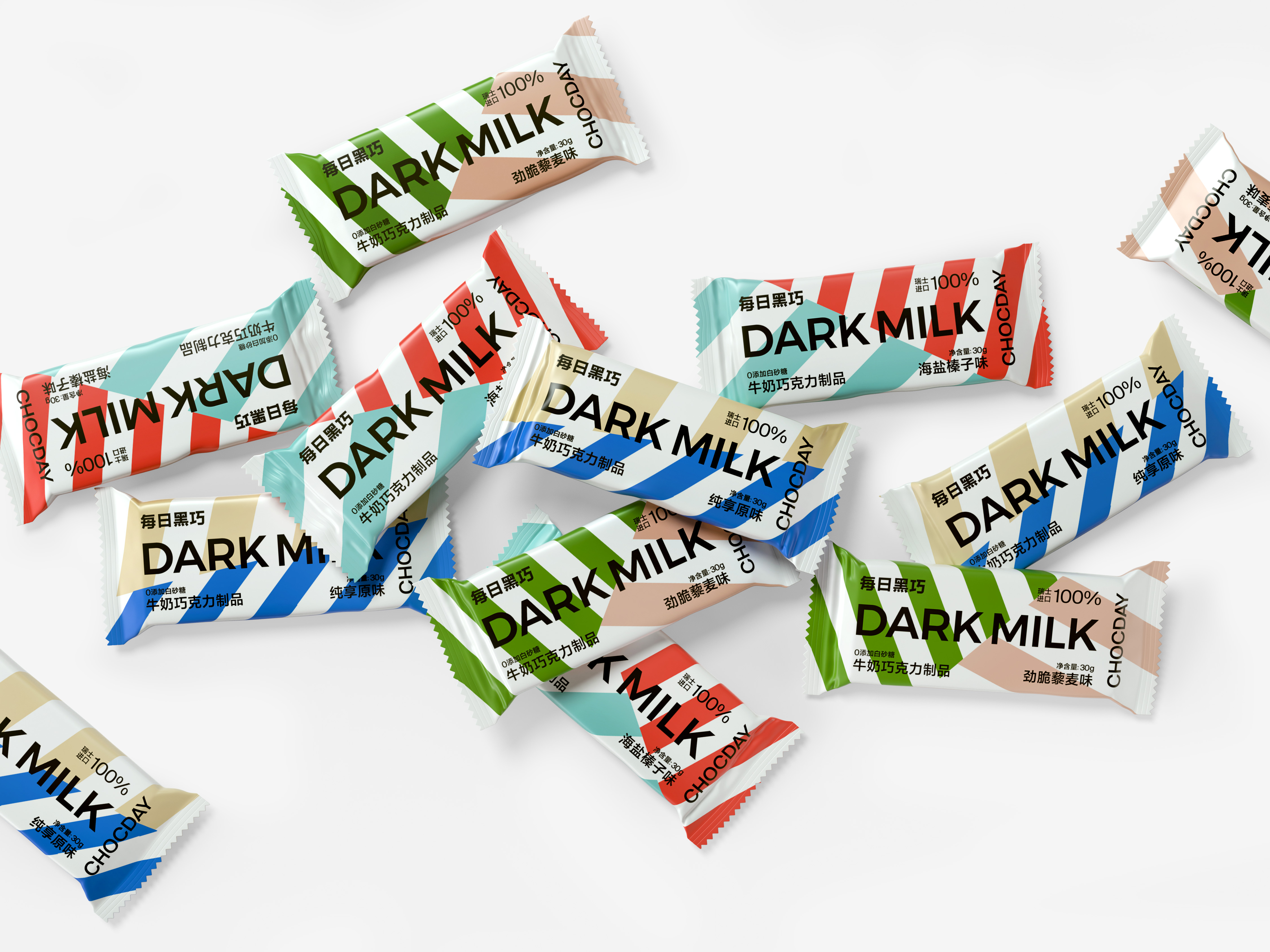
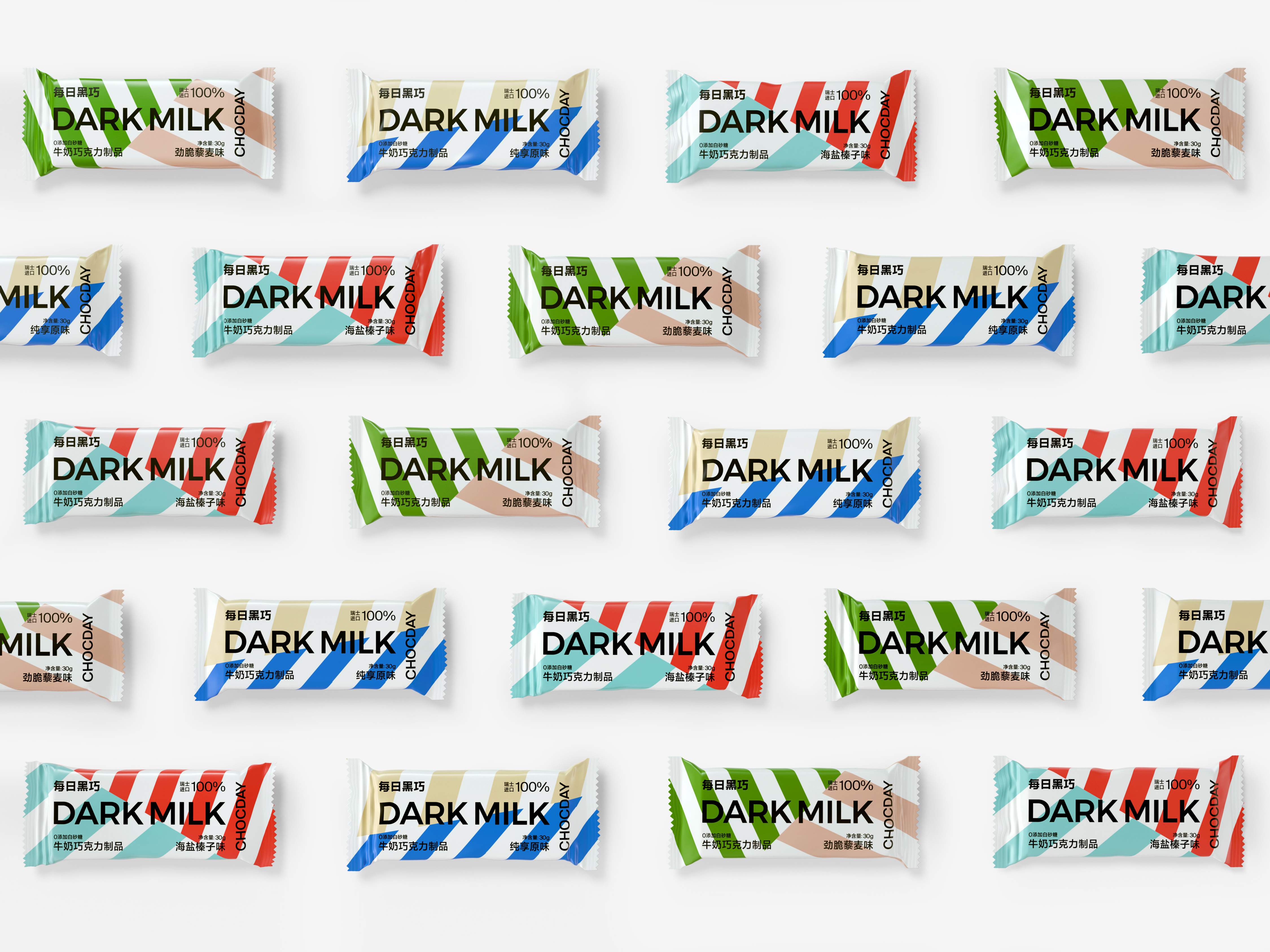
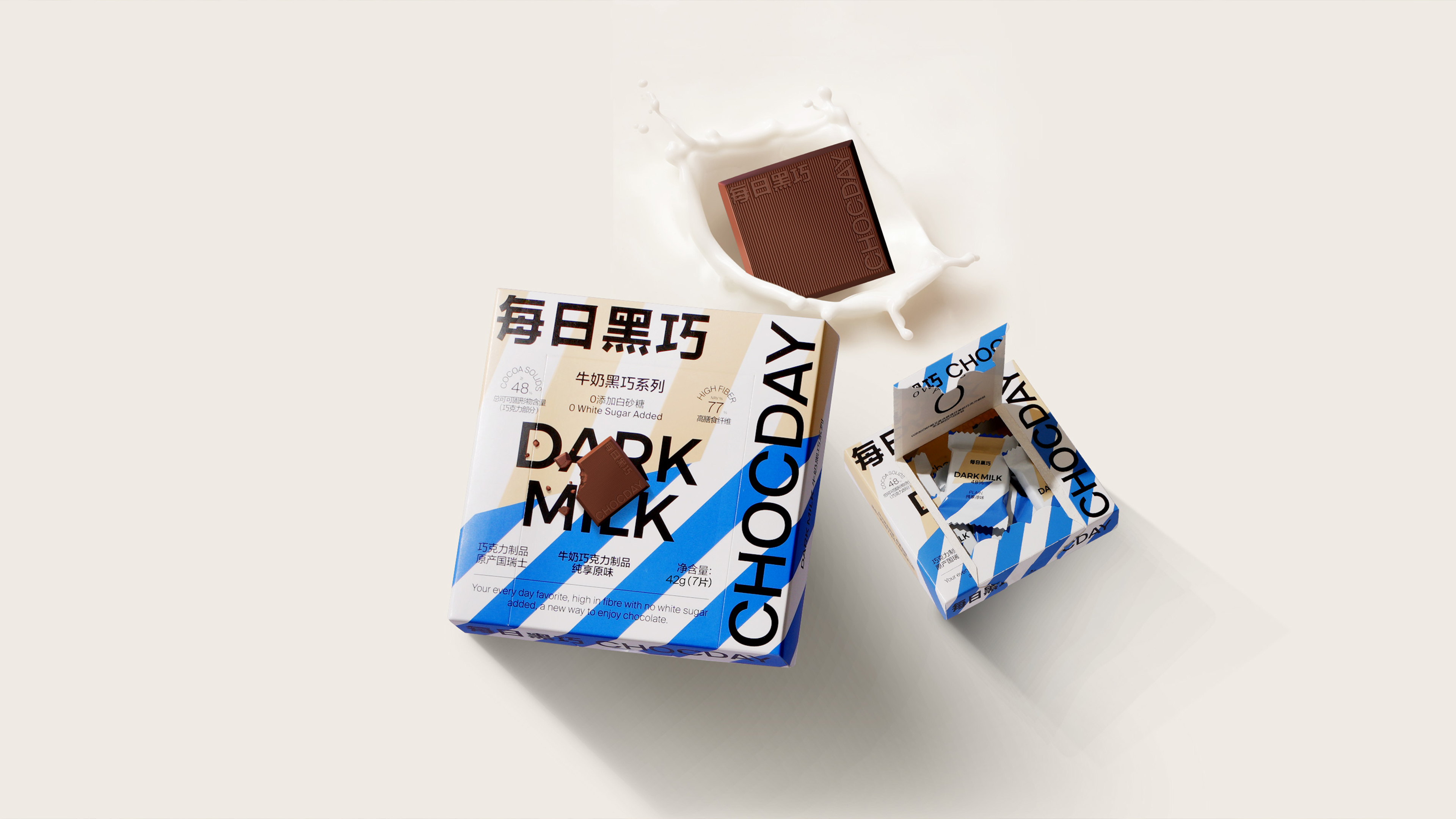
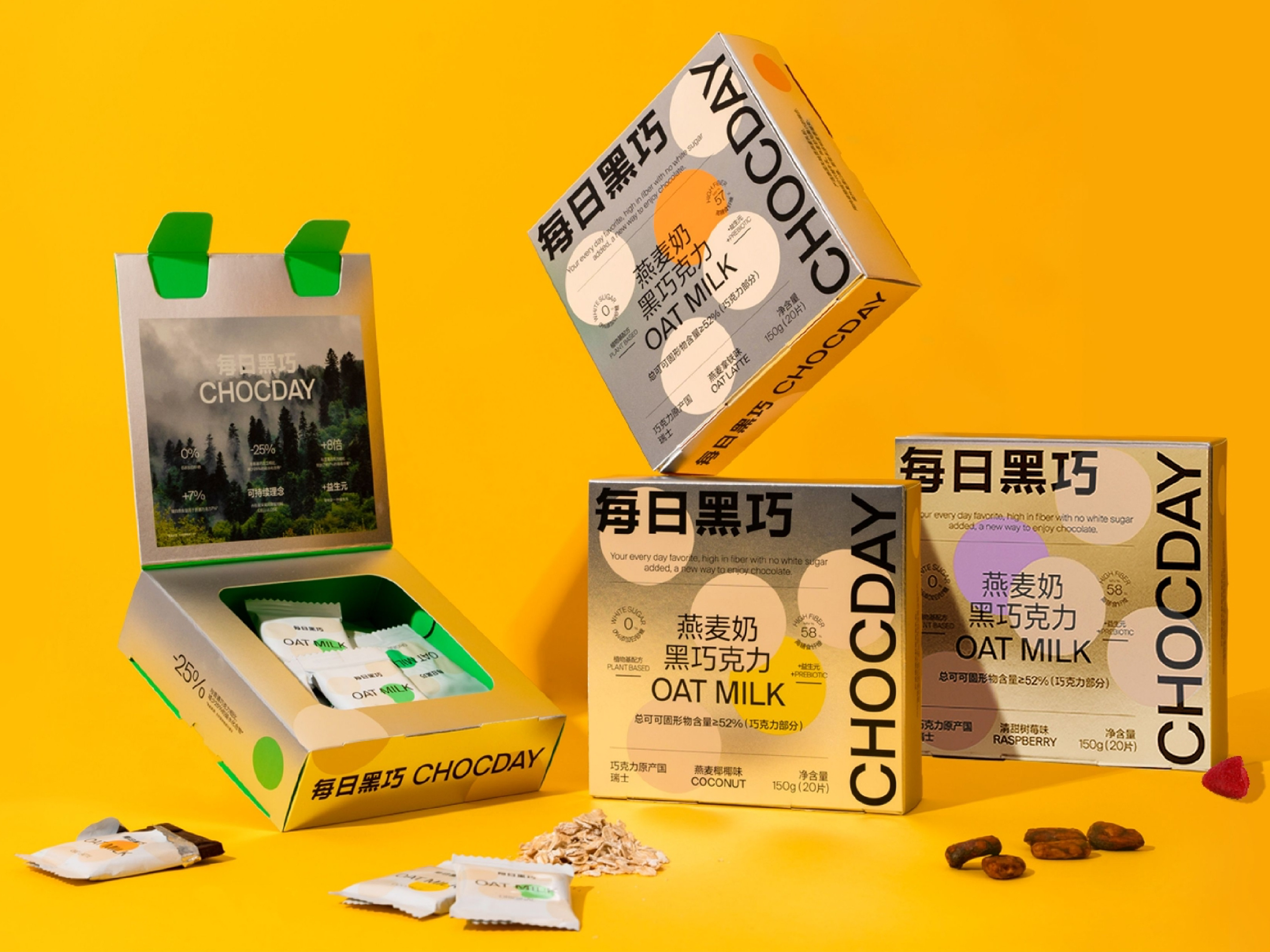
The visual identity of CHOCDAY is the result of a unique approach that involves deducting the design from its package design. This approach is unconventional and rarely seen in previous design cases. The importance of the package design is much higher than that of the brand identity in the sales of an upscale chocolate. However, the brand logo has gained recognition from consumers due to its high quality and differentiation, which aligns with the concept of CHOCDAY - long-standing dealings and continuous update.
The new visual identity of CHOCDAY was launched with the aim of respecting tradition, but also breaking tradition. It borrows from the classic style of traditional chocolate and makes bold changes to it. Respecting tradition means respecting the experience of most consumers, which is crucial in the consumer industry. However, blindly repeating classic language can be dangerous and too conservative. Therefore, the design of CHOCDAY package makes full use of the traditional and classic language, but boldly places the logo on the edge of the package, which is eye-catching and modern, successfully appealing to young consumers. The new visual identity of CHOCDAY has gained popularity among the market and consumers, becoming one of the best-selling brands of chocolates in just one year.
ART DIRECTOR: Guang Yu / Nod Young
DESIGNER: Hu Wen / Han Lu
YEAR: 2019
CLIENT: CHOCDAY